Where Accessibility Lives
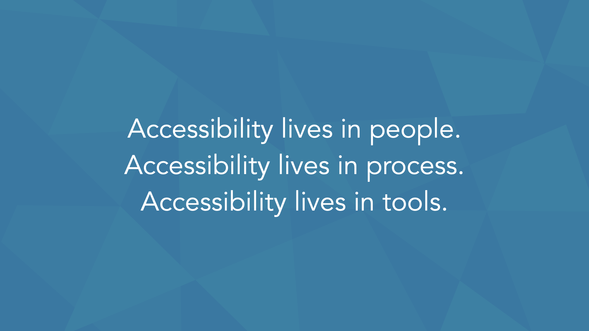
Accessibility that depends on a few passionate people is fragile; to last, it has to live in three places at once — in people, in process, and in tools.
From An Event Apart in Denver, my talk called Where Accessibility Lives. It starts from something I see in almost every organization: accessibility begins in people — a few passionate folks who decide it matters. That's exactly why it's fragile. When those one or two or three people move on, it can leave with them. To make accessibility sustainable, it has to live in three places at once: in people, in process, and in tools.
Here's the whole talk, three ways. Watch it, take the two-minute read, or go through the full talk. Use whichever fits how you work right now.
Watch
▶ Watch the full talk on YouTube.
Prefer to read? Jump to the full talk. The complete narrative is below.
The two-minute read
Accessibility almost always starts in people: someone gets passionate, gets a few others on board, and the work begins. That's also why it's fragile — if it only lives in one or two or three people, it leaves when they do. To make it stick, accessibility has to live in three places at once, and be built into all of them.
The three places accessibility has to live:
- People — aim for "better," not "perfect"; start small and learn fast; do real research with people with disabilities.
- Process — capture smart defaults and a shared language so accessibility is built in, not remembered.
- Tools — automated checks that support people while they work.
Aim for "better." Drop "perfect" from the accessibility vocabulary. 60% better than yesterday beats 0% toward perfect. Accessibility evolves the same way every other web practice does — so commit to being better in six weeks than you are today, and better again after that.
Where to start when the list looks overwhelming: keyboard, images, and forms. Across five years of audits, 60–70% of the issues we log fall into those three — even though they're only about a quarter of WCAG. Fix the keyboard issues in your most critical flows first; they affect the most people. Then prioritize by business value, by the highest impact at the lowest complexity, by risk, and by the other problems a fix lets you solve.
Make it sustainable. Build accessibility into everything, and give it a dedicated thing of its own — an accessibility sprint every quarter, the same way teams set aside time for performance. Then commit to the future, because there's always more to do.
The full talk
This is the narrative I used to present the talk, lightly cleaned for reading.
In this talk:
- A meeting at IncrediWeb
- Accessibility lives in people, process, and tools
- People: aim for "better," not "perfect"
- Start, and learn quickly
- Research with real people
- The straw test
- Watching how real people work
- Prioritize: keyboard, images, and forms first
- Process: smart defaults and a shared language
- Tools: build the checks into your stack
- Commit to the future
- Where we landed
A meeting at IncrediWeb
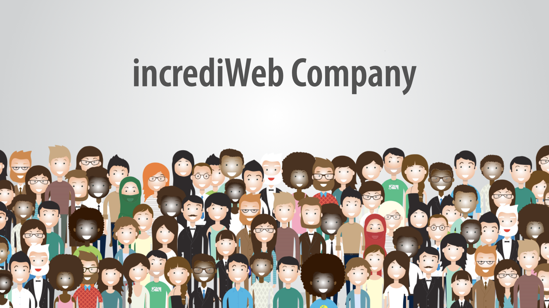
This is Jake, and Claire, and Sanjay. Jake works at a company called IncrediWeb, and one day he got called into a meeting with both Claire and Sanjay. They said, "We need to talk, because we've had some issues reported to us — they came in through our IncrediWeb company web form — telling us that people were having trouble using our site."
Jake got a little nervous. There are lots of reasons for that, but at the start of the meeting he was told there were a lot of accessibility-related issues found in the site, and people had been submitting feedback.
Now, IncrediWeb are masters at building websites and e-commerce sites — it's really what they do. (Don't look too closely, or you'll see they're also masters at cloning themselves, and at getting really good, highly productive workers.)
So Jake sat there with Claire and Sanjay, and they walked through the kind of feedback they were getting from real people using their stuff:
I'm really struggling to select a color for the T-shirt I want. The buttons are too close together for me.
I can't seem to change the size of the text.
I'm trying to buy this, but I can't do it with the keyboard.
I can't quite understand this video. There's too much background noise, and there's no captions.
I'm having a tough time remembering what went wrong and how to fix it.
People were trying to submit and make their payment, and they were getting errors, and they couldn't figure out what to do to fix the problem.
Jake prided himself and his team on being really good web designers and developers. But there were a whole lot of things they'd assumed would be accessible because of the way they'd built them — and they just weren't. All of this feedback came from real people, and it was difficult for Jake to hear, because he thought they'd done a pretty good job. He thought they'd made things accessible.
So the first thing he did was go into Slack and type, "We've got some work to do." And the team came running — Sheldon, Renata, Parker, Jason, Amina, the whole team. Jake was hard on them, and it wasn't a good place to be.
He said, "I thought we did this the right way. I thought we made things accessible. Why isn't this working?" They started to unpack it, looked at the feedback, looked at what they'd done, and realized they needed help.
So Jake called a friend. Jake called me. He basically said he had no idea what he was doing. He thought he had a good understanding of accessibility, of design, of development, of how to build and design things in an accessible way — but something in that environment just hadn't worked out.
Jake had some fundamental questions. "Whose job is this? The designers did their thing, the developers did their thing, but something broke down — so whose job is this? How does this actually work?"
When we got in touch, here's what we told him: we'd found 237 issues across their e-commerce flow — the product page, search, adding things to the cart, the whole checkout process, the confirmation.
We rated them all: some high severity, some medium, some low, all with different priorities.
They didn't know how to start. "Whoa, 237 issues? But it's only like four files." And I said, "It doesn't work like that. There are 237 issues because you've got this big flow, and all kinds of things that just aren't quite the way they need to be."
They also needed to know one more thing: "What are we missing?" They really did think they knew what they were doing. They had good standards-based developers. They had designers who knew color contrast and how to design accessible color palettes. But there was obviously a lot more to it.
So Jake asked these questions — and the first thing I did was go to my four-year-old and ask him, "How do we approach this problem?" He's totally fearless. (I'm sorry to those of you out there who are dads, but his shirt says, "My dad is the best in the galaxy.") And here's the advice he gave:
We have to work as a teamwork, and we're not afraid! One, two, three, go!
That's it. That is it. If nothing else, I hope you all utter this phrase as you leave here: "We have to work as a teamwork."
And as funny as it is, this is our reality in the world of accessibility. We have to work as a teamwork. We can't be afraid. And we have to actually make some progress.
When you hand a team a report that says "here are the 237 things that weren't quite right," they say, "Whoa — that's way too much." We've had teams expect about 15 things, and then watch the number mount week after week, because there's no big reveal; we reveal things as we go.
So this team got to 237 and thought, "This is way worse than we expected." They needed to not be afraid of it, and to tackle it in a sane, logical way. And then: one, two, three, go. You have to start.
Accessibility lives in people, process, and tools
I swear I didn't prompt my son to say any of that — he's four, that's just what he does.
But we have to take all of it and package it into something that makes sense. So here's what we've started thinking about: accessibility lives in people, it lives in process, and it lives in tools. If we can make it live in all three of those places, and not just one, then we can create something sustainable.
Accessibility usually starts in people. In almost every organization we work with, it starts there — someone gets a good idea, people get passionate, and they say, "Yes, we're going to do this."
But it lives in maybe one or two or three people, and it doesn't necessarily grow the way we want it to. And then what happens when those one or two or three people move on, or move up? So we need it to live not just in a few people, but in all people.
We need it to live in process, so it's built in — so we have checks and balances that make sure it's taken into account through our entire process, whatever that process is. And we need it to live in tools, so it can support people in their work.
For most of the rest of this talk, we'll spend our time on the people and the process sides. We'll touch a little on tools, and then we'll use all of that to think about what we're going to do in the future.
People: aim for "better," not "perfect"
In terms of accessibility living in people, the most important thing for Jake to do was this: set a goal.
A lot gets talked about in the world of accessibility. When we're designers and developers and we put our work out into the world, we get critique from all kinds of people — and I use "critique" loosely, because sometimes it's more of an attack. Innovative designs and development techniques get attacked: "That's not accessible." That happens.
But one of the things I'd really like you to do is eliminate a word from your vocabulary when we talk about accessibility. We should not be thinking about perfect.
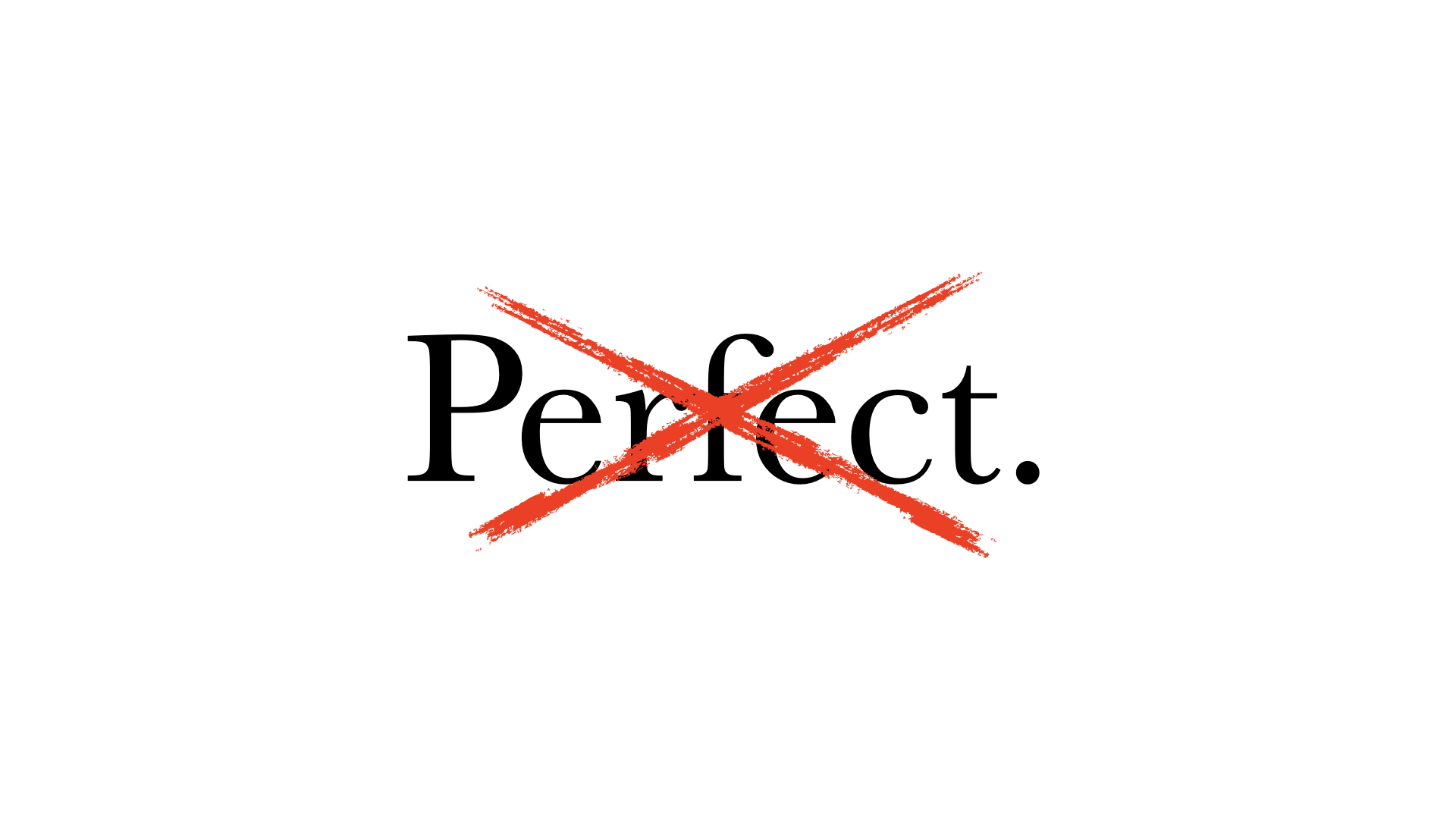
Lots of people expect perfection, and there are reasons for that. But when we think about perfect in accessibility, it brings all these connotations with it: that it's an absolute, that when it's perfect it's finished, we're done, there's no more work, no room for improvement. It creates a feeling of overwhelm — that it's unachievable, if perfection is the only thing that's acceptable.
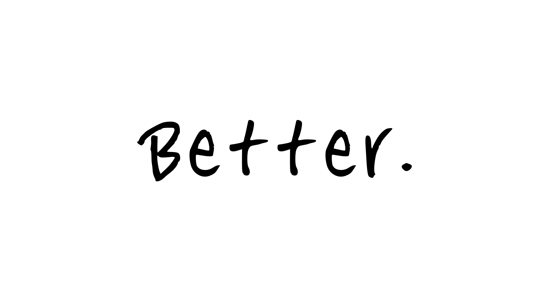
So instead of perfect, I'd much rather we all focus on this word: better.
I will take 60% better than yesterday over 0% toward perfect — and you should too.
Better is where we should be headed. "Better" is a relative term, not an absolute. It tells us there's always going to be more work to do; we're never going to be done. And any improvement over a previous state is a win. We have to look at it that way.
Too often, when we focus on perfection, 99% of it is great, but that 1% makes us feel like a failure. So focus on better. The goal isn't "we're going to achieve perfection." It's "it's going to be better in six weeks than it is now, and better six weeks after that." Let's make that commitment.
When we focus on better, we get the belief that we can actually make progress — that it's not all for nothing if we don't achieve perfection right away. Every accessibility expert, every person who's really experienced with this, will tell you they learn new things every day.
Our definition of what's accessible right now is very different from what it'll be a year from now. It evolves. That's how this world works, and it's how we need to approach accessibility — exactly like every other piece.
Best practice for React or Angular or whatever stack you're using evolves all the time. Accessibility is no different; we invent new techniques for it all the time too. It belongs in that same mindset.
Start, and learn quickly
The second thing we shared with Jake: start, and learn very quickly. You've probably heard "fail early and fail often." When we work with teams on accessibility, we often say it the other way: we want success early, and success often.
A small win can take a team that thought something was absolutely not doable and lift them so high that they take off — better and better over time.
To do that, you take some simple steps. Look to the standards. The Web Content Accessibility Guidelines 2.0 — WCAG 2 AA — is the standard you need to meet, generally speaking. That's what basically the entire world is standardizing on.
And if you're not aware of it, WCAG 2.1 is in the works right now — an update — because WCAG 2.0 came out in 2008. We're almost a decade on, and we're getting the next revision, with updates for things that weren't nearly as important back then.
The spec came out in 2008, which means the work was being done in 2006 and 2007 — before smartphones were really the thing. So WCAG 2.1, in draft form, is going to help us take into account mobile phones and the assistive technologies people use on them.
Now, that team had 237 things to fix. We said, "Don't look at it as 237 things to fix — put that out of your mind." When they estimated how long the work would take, they said: two developers, full-time, for 10 months.
The first thing we said was, "Prove it." Let's validate or invalidate that assumption as fast as we can. They'd never done focused accessibility work before, so this was important.
And — I don't say this tongue in cheek — they had zero skill at estimating accessibility-specific work. They could estimate their own work, put story points on things, do all of that for the work they did regularly. But not for accessibility issues. They needed to get skilled at it, and the only way is to try, and then learn from the experience.
They were an agile team, and we worked with them in a very agile way. They said, "We're going to take one week — basically half a sprint, since we're on two-week iterations — and try to fix 20 of those 237 things." We helped them choose the 20: some easy, some much harder and more complex, some design-related, some pure CSS, others heavy JavaScript. A cross-section, so they could see what they could really do in a week.
They went in open-minded. They were a little scared. But they started, and they got 17 of the 20 done.
And they knew right away that "two developers, full-time, for 10 months" was way off. They revised it almost immediately to two developers for three months — not even spending 100% of their time on it. That was a huge win, and not mainly because of the accessibility fixes (though getting those 17 things done mattered). The biggest win was that they now understood how to estimate their velocity for the other 217 issues.
That was their win, and it was wonderful to see. The team's energy lifted. They stopped thinking "this is going to take forever," and started thinking "we can do this." And they made progress.
So think about that. Most of you work in agile or agile-ish environments — or environments where you say you're agile but really aren't. It doesn't matter. Pick something, start there, see what you learn, and use that to estimate and attack the rest.
Use every sprint as a learning opportunity to figure out what you'll do next.
The reality is, when you're doing accessibility work, you think you know things, and then you go down the rabbit hole and end up with more questions than answers. And that's good. It means you're thinking about things. It means you're ready to move forward.
Research with real people
The third thing: we worked with Jake and his team to research and create a plan. And when I say research, I mean actually working with real people with disabilities. We'd given them 237 results, and they'd had all that feedback from people filling out their form — but they needed to see how this stuff played out in the real world. So they grabbed a panel, did some sampling, and ran usability tests. That's what research looks like.
We have to do research, because we create things that are pretty technical — and, in case you don't know this, we're all nerds in here. The people we're mostly building for are not like us. They just aren't. We don't know how things will actually work until people use them in the real world.
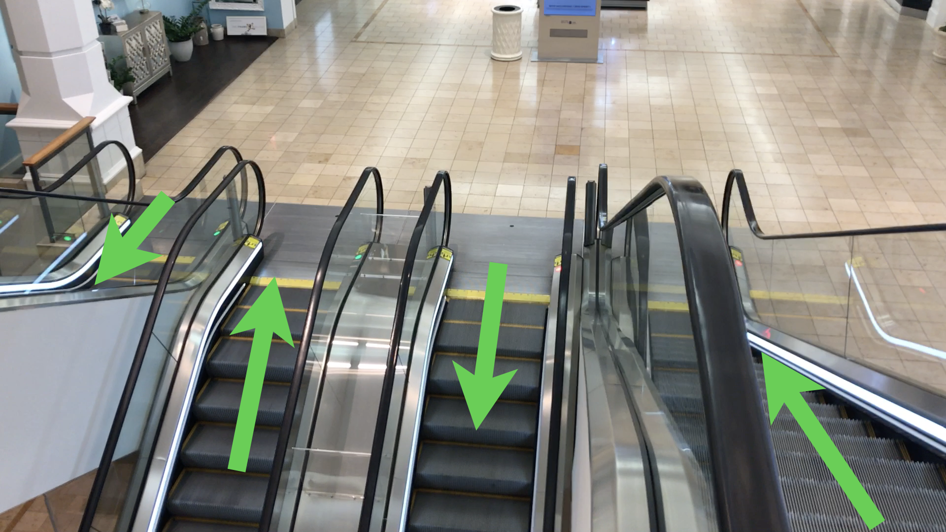
Here's an example. This set of escalators is in a mall in Florida. It's a still photo, so you can't tell which way they're moving — but they're all moving the same way. If I give you one, you can fill in the rest, kind of like a Sudoku puzzle.
If I tell you the one on the far right is going from the top floor down to the middle floor, which way is the next one going? Down. And the one beside it? It's going up — 50/50 chance, people. We almost all look at this and intuitively know what should happen.
And yet here they all are, going the wrong way.
I don't know why — maybe the person who turns on the escalators was hungover and turned the key the wrong way. Maybe it's nefarious mall ownership: "We need everybody to go right over there and buy from that one store, because they paid us extra rent this month." I have no idea. But we intuitively know something's wrong. We know it doesn't fit.
The point is: we can do all the testing we want in a lab, but until we see how something works in the real world, we don't really know how it's going to work.
And this little escalator problem has a different impact depending on the situation. If the mall isn't busy — five or six people on each floor — probably not a big deal.
But now put 100 people on the top floor, 200 on the middle, 100 on the bottom, all trying to get to different floors. Think about what has to happen. I come down the far-right escalator from the top, get to the bottom, and instead of just turning the corner and going down, I have to cross the path of people coming up the other one. It's a classic Ghostbusters "don't cross the streams" moment. We get streams of traffic that don't work well together.
Now take 20% of the people on each floor and give them a disability. My grandfather hated taking the elevator in malls — he'd take the escalator.
He'd had a stroke in the mid-1980s and used a cane, and he couldn't really bend his knee anymore, so he had to walk a certain way. What's it like for him to come down that escalator and have to cross a stream of oncoming traffic to reach the next one?
What's it like for someone who's blind, or who expects to step off and just turn the corner, and suddenly meets a wave of oncoming people?
That's not to say it's an unsolvable problem — maybe they do it by design to manage flow. In airports I'll sometimes see three escalators, two going up and one coming down, because of the traffic at that time of day. But until we see how things work for real, we don't actually know how it'll be. 100% test coverage in a lab doesn't mean the experience is going to be great.
The straw test
With that in mind, let's do a quick thing — this might be the last time I ever do this. Take your left hand or your right, whichever you want, and hold it up. Now make it like you're holding a tiny straw.
Look through that straw, close your other eye, and look at the screen. Don't be surprised — there's nothing on the screen yet. I'm going to reveal an interface, and your job is to complete it.
It's a form you have to fill out. Make sense? All right — straws up, other eye closed. Here's the interface. And while you do that, I'm going to take a photo of you.
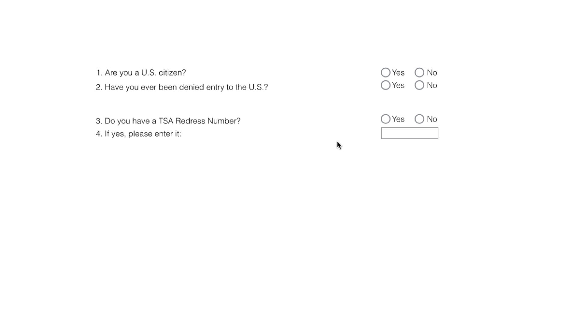
Some of you are finished, some are still working — that's totally fine, we all go at our own pace. (Can you tell I used to be a high school teacher? Everything's cool. It's all good.)
This interface was coded to perfection. It was technically correct, and it tested well in the lab. It worked really well for people who used a screen reader and were completely blind. But out in the real world — testing in usability sessions with people with low vision — it failed in a whole lot of ways.
When you look through the straw, you're limiting your field of view, and that's very similar to what someone with low vision might experience using a screen. Some people have central vision only and no peripheral vision; others have no central vision and only peripheral. But very often, people with low vision magnify their screen so they can only see a small portion at a time — exactly the situation the straw puts you in.
So as you used this, you were on the left for the question, then over to the right for the answer. And because of the magnification and the limited field of view, the questions and the answers are now effectively miles apart — the answers have almost no relationship with the questions they belong to.
That's a big reason the interface started to fail for people with low vision. What motion did you find yourself making?
I'm seeing a lot of people go back and forth, back and forth: left for the question, right for the answer, back to the left, back to the right. And your next move was back over to the left — which is exactly where we put our least desirable call to action.
Some of you may also have noticed that after the first couple, you knew how far to pan over — you developed a muscle memory for where the next thing would be, and how far to move the mouse to bring the next block of content into view. So muscle memory kicks in, and it carries you right to your second-least-favorite call to action.
Now look at the buttons together: a Quit button, a Previous button, and a Next button. In design terms, they have all the same visual weight — roughly the same size, color, and shape. The only way to tell them apart is to read them.
And what if you have low vision and struggle to read what's on them? We've created a conspiracy against people with low vision with this interface — even though it worked perfectly for someone using a screen reader.
We didn't see this in the lab. We saw it in real life.
There's a bunch to fix here. The questions and answers were chunked together incorrectly. We created a pattern of use that landed people on exactly the wrong call to action.
And then the equal visual weight made it worse.
The fix is simple: redesign the form into something more like a single vertical stack — which, conveniently, also works really well on a mobile phone. That single column is far better for someone with low vision, and it turns out it's far better on mobile too.
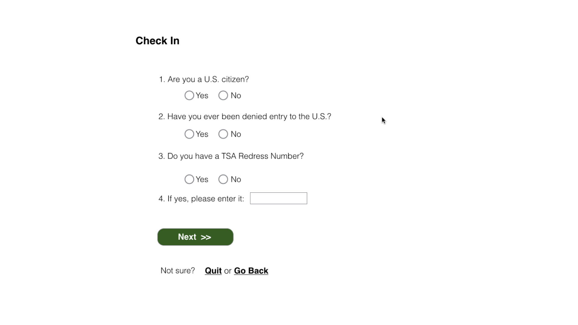
So let's do it again. Straws up, go fill this one out. I know it's a bit of cheating, because you've already seen the form — but follow this one. We don't completely eliminate panning; some questions might be long. But now they're in one column, with the correct pairing between question and answer, and it's much, much easier to use. And if you magnify it, the pattern of use is basically straight down, right to the call to action you're after.
So this was technically perfect for screen-reader users and horrible for people with low vision, so we redesigned the form. I'm not saying every form you ever build should be a single vertical stack — but there's a pretty good case for it being a good default layout for most of your forms.
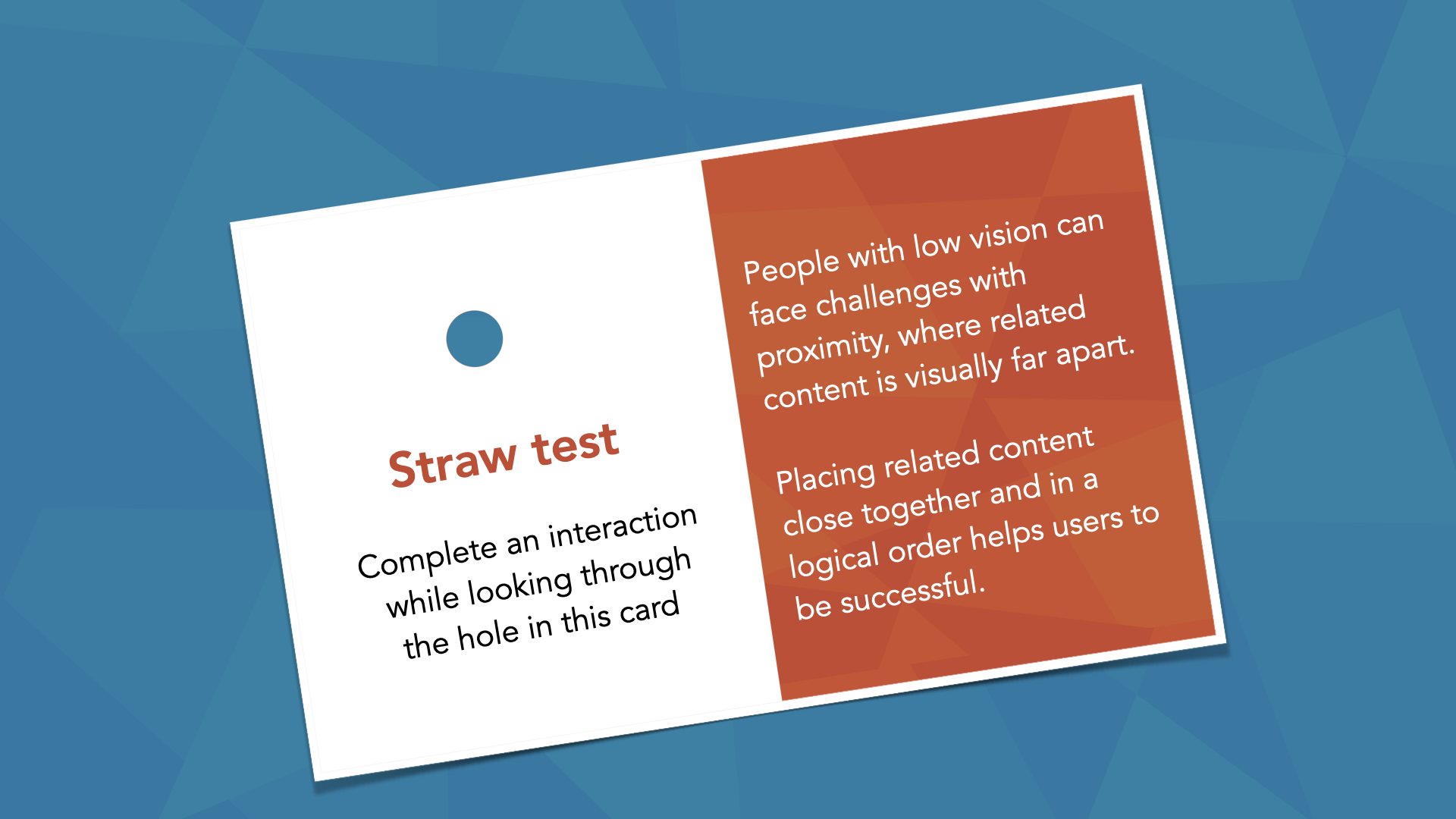
What we just did is called the straw test. We have cards we use with teams: think of the interaction you're trying to complete, and complete it while looking through the hole in the card — or just use your hand. We do it with wireframes, comps, mock-ups, prototypes — all the time. It really helps you find things that might go wrong for someone with low vision, so I'd encourage you to use it as much as you can.
Watching how real people work
In the real world, we find feedback. And when we test with real people with disabilities, we learn about the way they actually do things.
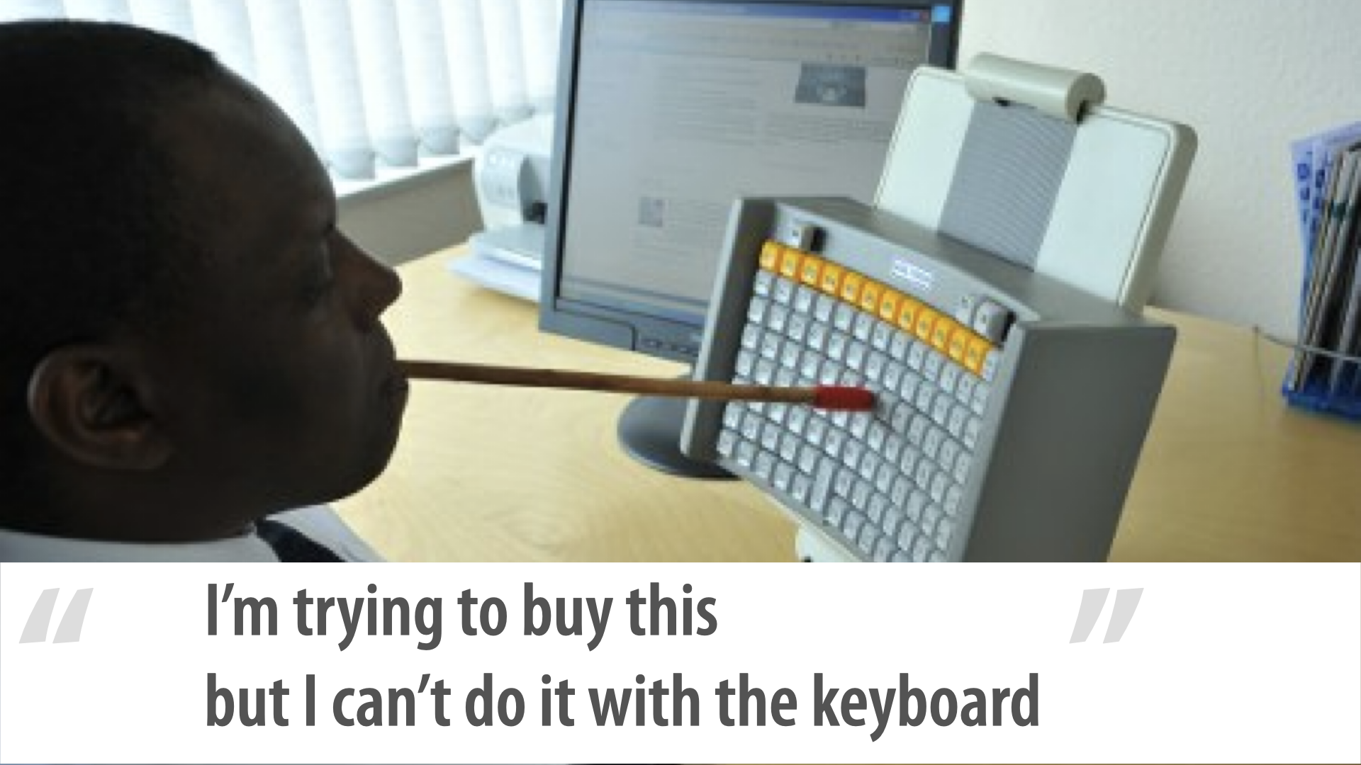
Look at this gentleman's keyboard. He's using that e-commerce site with it. He doesn't have any use of his hands, so he's using a mouth wand.
There's a lot to notice. The function keys are a different color, kept visually separate.
It's a straight grid — not like your old 101- or 102-key keyboard, with letters, a big space bar, a number pad off to the right, cursor keys and an insert/page-up/page-down/delete cluster. He has a very tight grid, because he's typing with a mouth wand: compressing the grid means he's just turning his head to type.
My favorite feature, though: the space bar is in the middle, and it's vertical — because that makes much more sense for him. And can you see the slight curve?
It's slightly concave around his head. If the keyboard were completely flat, he'd have to lean over to reach some keys; the gentle curve means he can just turn his head. He was trying to buy that thing but couldn't do it with the keyboard — and he only uses the keyboard.
The cool part is, it doesn't matter which keyboard he's using: as long as you make things work for the keyboard, he's covered, because he'll have the tools that help him use computers the way he needs to.
This woman's keyboard is very different, and I love it too — it's like a little archaeological expedition, trying to understand how people use their tools and what that tells us about how they use the web. What's completely different here?
The buttons don't stick up — they're inset, or recessed. Why? She's not blind; she has full sight.
Here's how she types: she uses mostly her left arm, types with one finger, not very fast, moving her arm across one key at a time. The keys are very touch-sensitive, so she doesn't have to press hard. She has very low arm strength, so she needs the recessed keys to rest her forearm on the keyboard while she types — it supports her arm.
And that tells us about another feature: her keys are spread far apart — the complete opposite of the gentleman's compressed grid.
The spacing makes her typing more accurate and leaves more room for error; she's less likely to hit two keys at once. If she had that same arm rest but the keys were really close together, she'd probably hit a bunch by accident. Her low arm strength also makes a mouse hard to use.
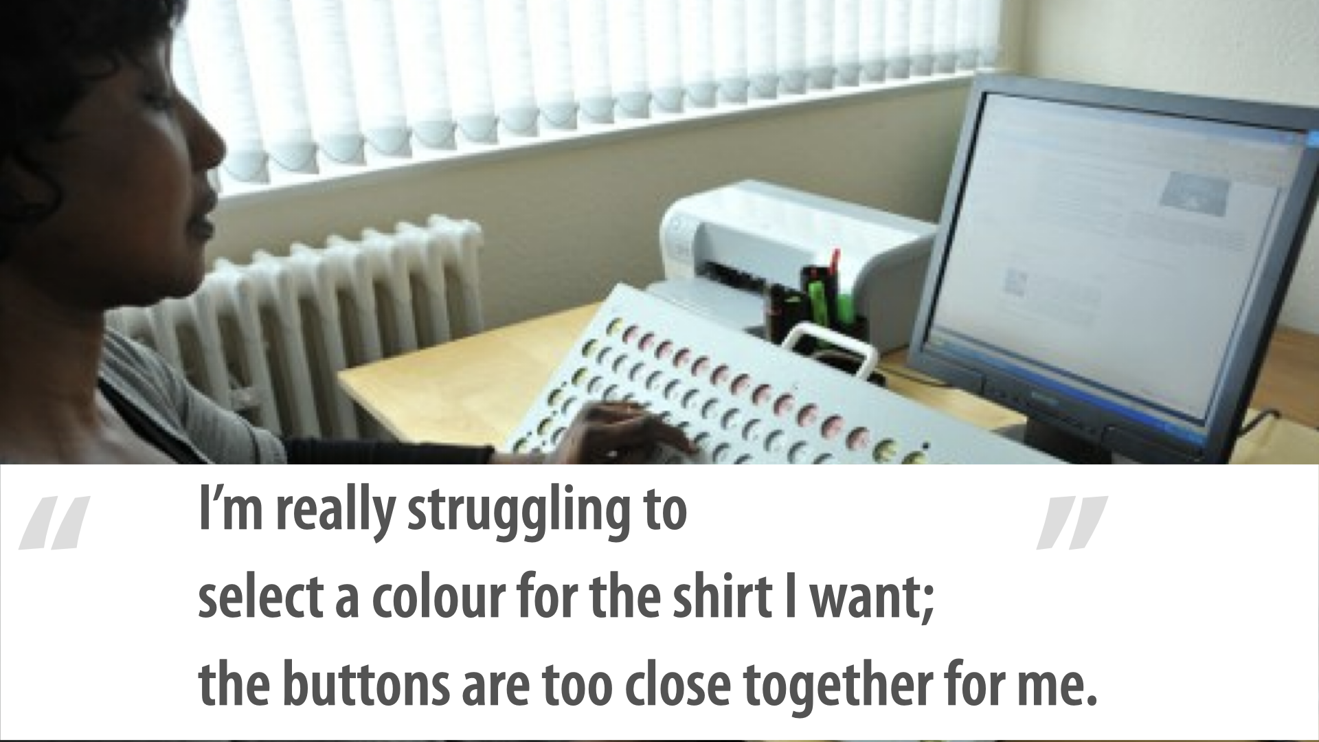
She was trying to select a color for the shirt, but the buttons were too close together for her. She needs clickable targets with some white space around them; if they're really compressed, it's very hard for her to hit the right one.
This is a real photo of a guy using a computer on a train — looking at his screen through a big magnifying glass. I don't know if he doesn't know how to increase the size in his browser, or change his operating system settings.
Maybe he was on a site where he couldn't change the text size, and this is what he had to resort to. He's doing what he can to use the computer the way he knows how.
Remember when I said we're nerds and the people using our stuff aren't? This is a great example.
I'm not afraid to say it: as an older guy, my eyes aren't nearly as good as they used to be. When I read now, I very often bump the font size up to about 150% just so I can read what's on the screen. That's our reality — we're all aging, and particularly in our profession, staring at screens all the time, our eyes are going to get worse. Spoiler alert.
"I can't quite understand this video — there's too much background noise and no captions." Some people are hard of hearing, not necessarily completely deaf, and for them it can be very difficult to distinguish foreground noise from background noise.
Think about podcasts: some are recorded in a studio or over a call with little background noise, but some are recorded at conferences. It can be challenging for someone who's hard of hearing to separate the conversation from the buzz.
I'm not talking about recording in here — I mean recording in the break area, where there's a lot of noise and people talking. Recording a podcast there might not be a great idea. The ability to distinguish foreground from background is actually pretty important. And captions are pretty important.
"I'm having a tough time remembering what went wrong and how to fix it." Have you seen interfaces — I love them; they're Basecamp now, they used to be 37signals — that pioneered the yellow fade technique? Here's this really important thing you need to know, and now it's gone.
Think about what that means for somebody with short-term memory issues. My brother was in a car accident almost a year and three-quarters ago.
Bad concussion, and his short-term memory is horrible now — he can't remember things. He needs errors to persist on the screen so he can keep track of what he needs to fix. And this could affect a lot of people in a lot of different ways.
Prioritize: keyboard, images, and forms first
When we looked at how to approach the research and planning, we prioritized things for and with the team in a couple of ways. We looked at five years of data — not just from that one client, but across all of our clients — to find the most common issues.
And we found that 60% to 70% of the issues we found and logged were related to one of three things: keyboard, images, or forms. When I say images, I really mean any kind of media — audio, video, a complex infographic, whatever.
But 60–70% of what we find across all our clients comes down to keyboard, images, and forms.
Here's the striking part.
If you look at the Web Content Accessibility Guidelines, keyboard, images, and forms make up only about 25% of all the things you need to do. About a quarter. And yet they account for 60–70% of the issues we find.
That's a big difference. So we tell almost every team: fix these things first.
One of the biggest reasons to fix keyboard issues first is that they impact almost everybody — people need to be able to use the keyboard to complete tasks.
And it's worth asking teams: how did this get to the point where you're finding, in QA for the first time, that a widget you built doesn't work with the keyboard? We should never get to that point if we can help it.
The team looked at it and said, "We've got 237 issues. We're not done until we finish all of them." Yes — absolutely. We're not saying don't fix the others. We're saying start with these three, because they tend to have the biggest impact. You probably have accessibility issues sitting in your backlog right now that need prioritizing.
If you had 100 of them, I'd find the keyboard-related ones in the most critical flows and fix those first. They benefit the most people.
When we talk about prioritization, we have to go back to business — to business value. Think about the IncrediWeb e-commerce site. The ability to use the keyboard on the checkout form is a pretty severe issue; it's a thing we need to do. The ability to use the keyboard on the contact form is significant.
But the ability to use the keyboard on, say, an FAQ page is a little less important. That's from a business-value perspective.
We always look for the highest impact at the lowest complexity — things that are low-complexity to fix but have huge payoffs.
We look at risk, too: you might have a marketing campaign or paid advertising sending millions of people to a specific page, and that brings it into a higher-risk category, because it has higher visibility — we're actively telling people to go there, not relying on them finding it randomly.
We also ask: are there other problems we solve by fixing this one? Almost every team we've worked with says, "Yes, accessibility — we're going to do this," and then, "Yes, and this means we finally get to do that re-architecture we've been dreaming about for three years." Accessibility becomes the impetus to standardize, to build the pattern library they've been putting off. Sometimes that helps drive a priority.
Process: smart defaults and a shared language
We've talked a bit about people. Now process and tools. It was important that Jake created their standard, and I'd like you to think about doing that too.
That's not to say your standard is different from everyone else's — we're still going to hit WCAG 2.0 AA. But "your standard" means this: a standard that says we always evolve to get better. We could solve a keyboard-accessibility problem five different ways. We could build forms multiple ways and still have them be accessible.
The important part is being able to say, "This is how we do it at IncrediWeb. This is how we do things." That comes down to your design patterns, your style guide, your pattern library, whatever it is.
You — or your teammates — need to document these things and build them into all of your process.
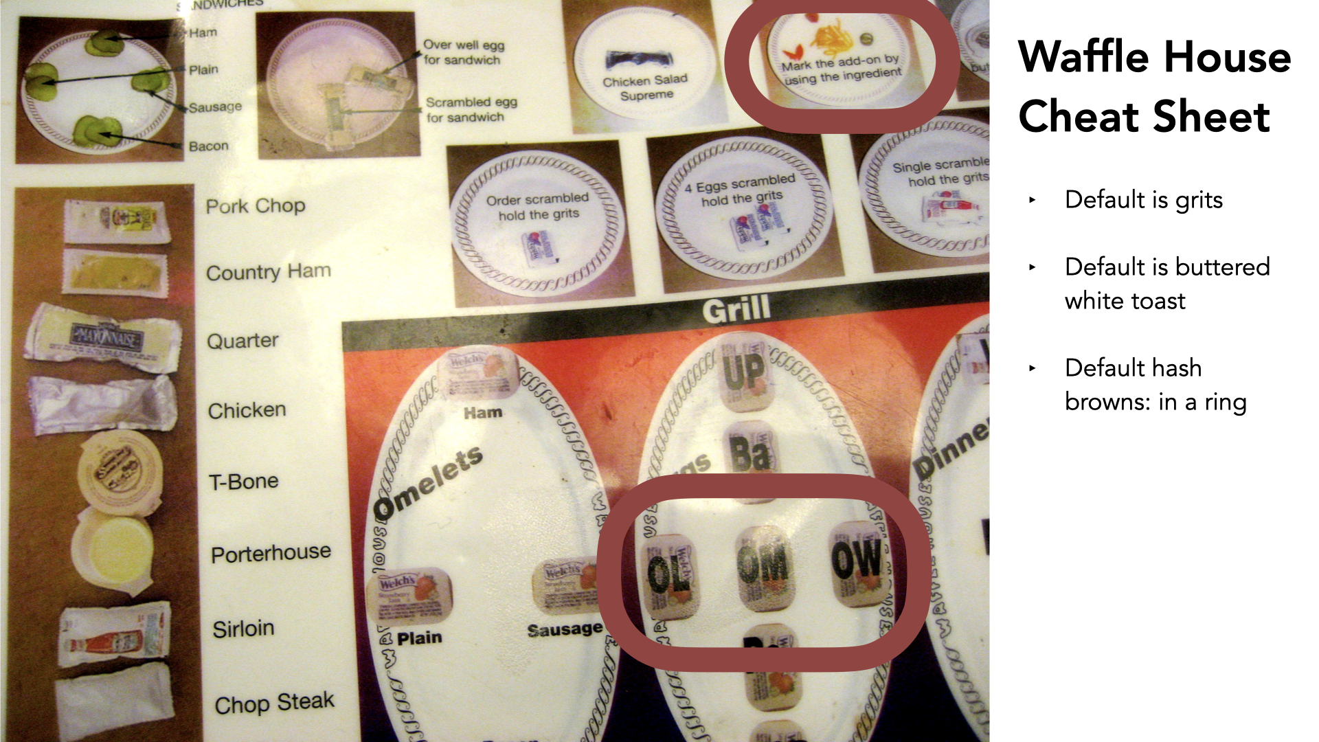
This is one of my favorite things of all time on the internet. Does anyone know what famous restaurant uses this? It's the Waffle House. This is the Waffle House cheat sheet — basically how they keep track of orders. They have a really smart set of defaults and a whole system for plating food.
Quick example: you order breakfast, and there are extras you might want. If you want a bunch of cheese, they put cheese on the plate to mean cheese. If you want jalapeños with your hash browns, they put a jalapeño on there, so it's tracked.
They have a system for getting breakfasts out, and doing it quickly. The eggs are denoted on the grill — basted (I'm Canadian; I'd never heard of basted eggs, but I'm going with it), over light, over medium, over well, poached.
They have a whole language for omelets: ham if it's at the top, plain if it's at the left, sausage if it's on the right. It's all about a way of denoting things, with smart defaults baked in.
The default is grits, the default is buttered white toast, the default is hash browns in a ring. So if you just need a breakfast, you say "scrambled," and you get all the rest of the defaults. But if you want scrambled with brown toast, it's "scrambled brown."
That's really all a pattern library and a design system is: a set of sensible defaults, with an agreed-upon language for doing things. You need to build that into your process — that's the most important thing I could share with you. Take it on as a thing.
Shopify's Polaris has accessibility built in — maybe not in as much detail as I might like, but it's there, which shows it was on the minds of the people building it, and it puts it front and center for the people building with it.
The Lightning Design System from Salesforce — their UX team does fantastic work, with accessibility built in. You can see it in the slides: here's the base element, here's the code for it, and here's the accessibility-related information.
"Don't change this thing, because we need it for accessibility." Leave this the way it is; anything else is fair game — modify, adjust, do whatever. They even go through multiple states: here's how we do it with a placeholder, a label, an icon, a statement that the field is required. It's all there, documented, ready for anybody to use. That's a critical piece of what I mean by accessibility living in process.
Same for modals. Here's how that works: make sure the modal has a role of dialog; when it's open, everything behind it gets aria-hidden="true"; and so on. Accessibility is just built in. That's the only way to make it sustainable — move it out of the heads of one or two or three people and make it part of your process overall.
Here's another variation we built for a client: a list of the things we think make a good pattern-library entry from an accessibility perspective. You know the entry's status. You know how long it's been since it was updated. You have ways to contribute to it — not just in general, but specifically around accessibility. And there's a call to action: "If you have questions about the accessibility of this thing, get in touch with the accessibility team."
We document things, and we make sure we document them well.
We document source order at a micro level — putting numbers on things to show the order they go in.
We document interaction tables, which is one of my favorite things we do: you create a big grid of really useful information — in this scenario, here's the focus change we expect; when you click on this thing, focus needs to go there. It becomes unambiguous and standardized, and it makes development and design go much faster.
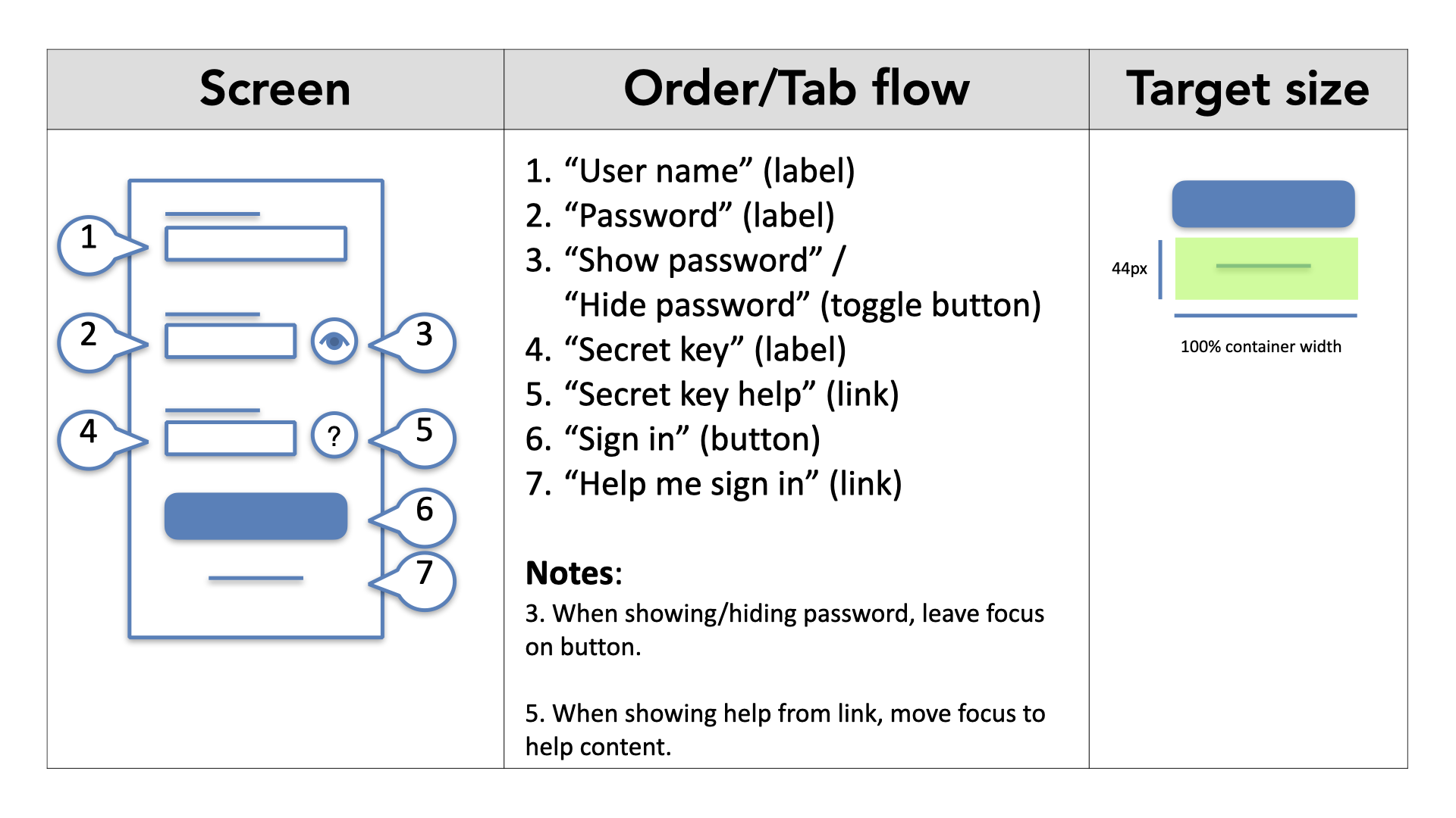
We work with teams that build this right into their design documentation: here's the screen, here's the annotated order and tab flow.
They created their own language for it — the thing that should be read out by a screen reader goes in quotes, and the thing in brackets is a cue to the developer: "make it this thing." When we have a Sign in button, we want it to actually be a button, not a link. When we have a "help me sign in" thing, we want that to be a link. So we call that out.
I've heard developers say, "Don't take my choice away from me," and I've also heard developers say, "Thank you for making it easier — now I don't have to think, and I can get caught up faster." We put notes in there, and they build in things like target size: "that thing is really small, but we're going to make sure it's 44 pixels high and 100% of its container width." It leaves less room for ambiguity, and it makes interfaces work much better.
There are a number of things I'll leave with you that are all in the slides, so we don't need to talk through them — the top five things we see happening with keyboard very often. I'm going to skip past them. Same with images and media: they're all there in the slides; you don't need me to read them to you.
Tools: build the checks into your stack
Accessibility also lives in tools, and we need that to make it sustainable. There's code you can use for this. Here's a simple example: some basic JavaScript checking built into a Jasmine framework, for doing real-time code checks while you're in the development stack actually building things. We check for images with missing alt attributes, we check for positive tab index values, we check for form-field labels, and we check that those labels are all unique.
Commit to the future
The last thing we shared with Jake: you've come all this way and taken all these steps — fantastic. The final step is to commit to the future. That means making sure this isn't a thing that dies — not something we do once. We're going to do it over and over and over, because we're never thinking we're done. There's no such thing as perfect; you're always getting better and striving for more.
The team said, "We're going to make accessibility part of everything we do — and we're also going to do one dedicated accessibility sprint every quarter." It was a great compromise.
Accessibility should be built into everything, but having it as a dedicated thing brings it much more attention and gets everybody on board.
So why not both — integrate it into everything, and make it a dedicated thing of its own?
We do the same with performance: everything should be performant, but we'll often say, "We're going to focus on performance this quarter," or "for these three sprints." No reason we shouldn't do the same for accessibility.
Preparing yourself for the future helps you prepare for future interfaces. I think about speech challenges. We're getting all these speech-activated, home-based assistants — Google Home, Amazon Echo with Alexa, the HomePod, whatever it is — and they're all speech-enabled devices.
I want to know how that's going to work for my friend Glenda, who has cerebral palsy and doesn't really speak very clearly. She speaks Glendanese. We correspond much better over email. I went out for dinner with her once, and I was getting used to talking with her, and I could understand what she was saying.
Then we went somewhere with a lot of people, and suddenly I couldn't understand anything, because I couldn't focus on her over all the background noise.
We need to be thinking about this as a new frontier — the new spot for us to go.
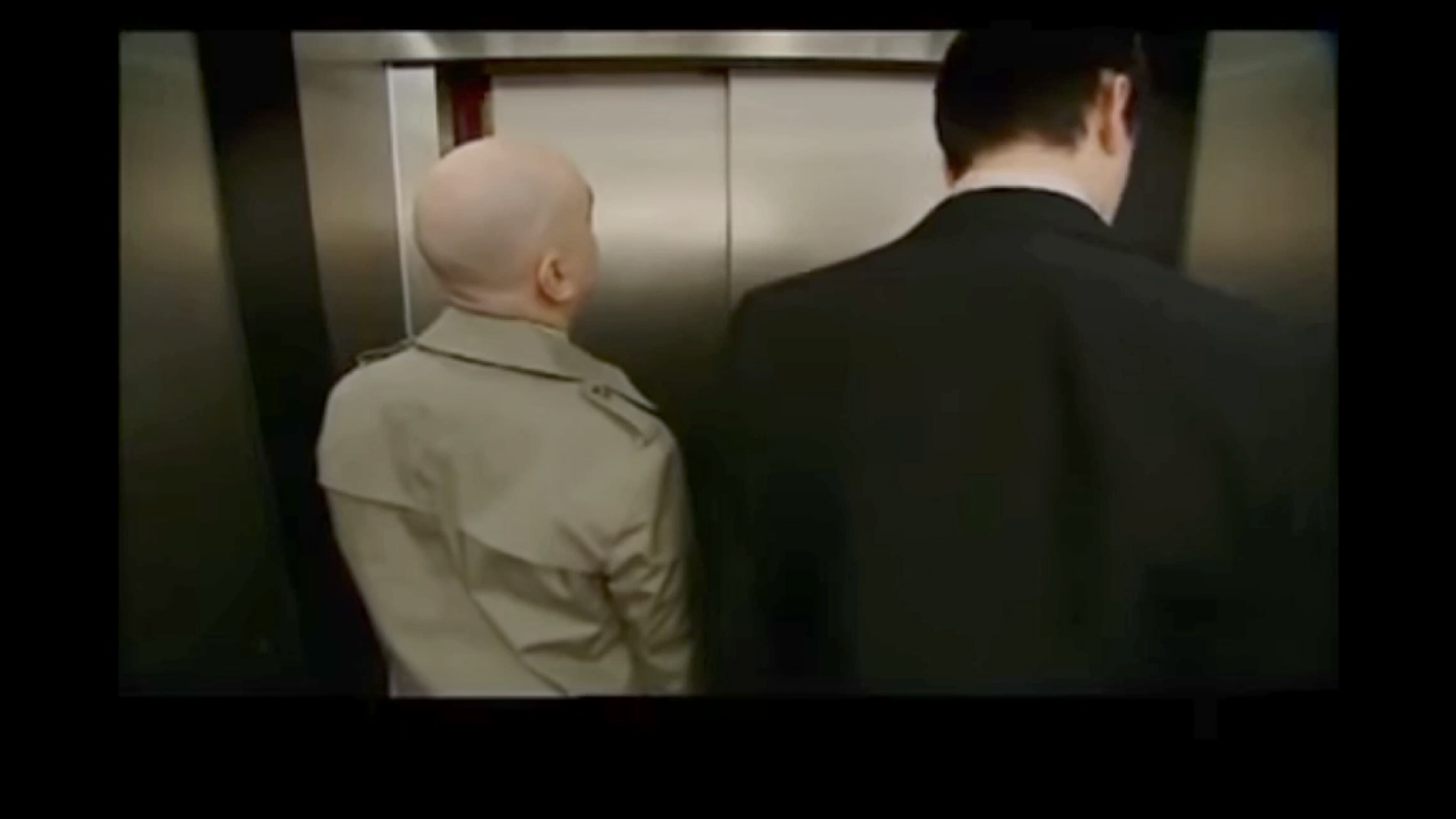
To show what I mean, I played a clip — two men stuck in a voice-recognition lift that won't understand their Scottish accents saying "eleven":
We face all kinds of new challenges when it comes to accessibility. We need to be thinking about the future and putting the systems and processes in place now, so we're set up to face them.
When you're designing for the HomePod, or Google Home, or the Echo, we need to be prepared that some people might not be able to use that interface. So what's the alternative?
By design, there should be another way to get those commands into those devices. If you're doing that, you're setting yourself up for the future.
Where we landed
Jake, Claire, and Sanjay finished all of this recently. They got everything done — and they're now in a mode where they don't look at those 237 issues as a bad thing.
They're actually asking, "How do we find more, and how do we fix them?" They've taken some incredible steps. I hope you can take some incredible steps as well, and consider accessibility in everything you do.
Thank you very much.