Inclusive UX: techniques for everyone
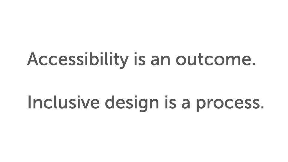
Accessibility is an outcome you can stumble into by accident; inclusive design is the process that reaches it on purpose — and a handful of team, designer, and developer techniques keep it a core value instead of a phase-two afterthought.
From An Event Apart in Orlando, my talk Inclusive UX: techniques for everyone. It's built on one distinction with a lot of consequences: accessibility is an outcome — a thing you measure — and inclusive design is the process that gets you to that outcome predictably, consistently, and sustainably. You can reach accessibility by accident. Inclusive design is how you reach it on purpose, by shifting the work left, before decisions harden into production.
Here's the whole talk, three ways. Watch it, take the two-minute read, or go through the full talk. Use whichever fits how you work right now.
Watch
Prefer to read? Jump to the full talk. The narrative below is the complete transcript.
The two-minute read
Accessibility is an outcome — something you can measure, and something you can land on by accident, by retrofit, or by building a separate accessible version after the fact. All of those reach the outcome; none of them are reliable. Inclusive design is the process that reaches accessibility on purpose: you treat inclusion as a core value, so it can't be deprioritized into a phase two that never comes, and you include people with disabilities in the work as co-creators rather than end-of-line approvers. The payoff of all this is timing — you catch and prevent problems at the pencil-and-eraser stage, where changes cost little effort and little political capital, instead of after a comp and the code are built and signed off.
The techniques — for teams:
- Better communication. Annotate your storyboards (not just flat wireframes) with source/focus order and focus-path notes, and use them as conversation tools. The value is in the disagreement they surface between designers and developers — and in the decisions that disagreement turns into.
- Reverse-engineer production back to wireframes. Take a live interface and deconstruct it into the wireframe it should have started as, to see the accessibility problems you'd have caught earlier (and how to catch them next time).
- Interaction tables. Map state, event, interaction, focus change, and ARIA notes into a grid — the same idea as Bill Scott's "Interesting Moments" from Yahoo's YUI library — and build it together as a team.
- Practice inclusive design. Include people with disabilities as co-creators, starting with usability testing. It puts you ahead of the curve: non-text contrast, character key shortcuts, and label-in-name were things we saw in testing for years before they became success criteria in WCAG 2.1.
For designers: document color combinations with their contrast ratios (good, large-font-only, and avoid) rather than just a palette; communicate design intent so it survives across screen reader, switch, and voice input; and let people transform an interface (a carousel into a list or a grid).
For developers: review your CSS class names and map the meaningful ones to ARIA (aria-current, aria-expanded, aria-errormessage, aria-hidden); make high-contrast tweaks so affordances and depth survive a high-contrast theme; offer complementary methods alongside gestures; and avoid black holes — put as much thought into how people get out of a component as how they get in.
The full talk
This is the narrative I used to present the talk, lightly cleaned for reading.
In this talk:
- The storyboard, the painting, and the final cut
- Shift left: the pencil-and-eraser stage
- Accessibility is an outcome; inclusive design is a process
- Technique 1 — Better communication
- Technique 2 — Reverse-engineer to wireframes
- Technique 3 — Interaction tables
- Technique 4 — Practice inclusive design
- For designers — Color combinations
- For designers — Communicate design intent
- For designers — Interface transformation
- For developers — CSS class-name review
- For developers — High-contrast tweaks
- For developers — Gesture alternatives
- Avoid black holes
The storyboard, the painting, and the final cut
This is one of my favorite scenes in all of Star Wars. Before we dig in, I need to give you this very strongly held opinion: we're talking about a movie that was out in 1980, so there can be no spoilers based on anything I'm talking about here.
If you don't know these things, I'm sorry. And I'm also Canadian, so hence my apology right away.
This scene takes place on a planet called Dagobah. This is where Luke is, in his quest to become a Jedi.
He's just come off blowing up the Death Star, he's on a real high, and he's like, "I know what I'm gonna do. I'm gonna go be a Jedi. I gotta go find this Yoda character." He comes into the hut, and he doesn't realize that this is actually Yoda — he's looked at this green character and doesn't realize who it is.
As the scene plays out, young, brash Luke Skywalker suddenly understands in the middle of it that this is actually Yoda, and that he's completely underestimated him. I'm gonna show you the scene, and there's all kinds of meta-messages in here that you can think of in terms of accessibility.
Let's start with the scene, and then we'll unpack it and look at it in a few different lights.
[The clip from The Empire Strikes Back plays — Luke on Dagobah, Yoda and the disembodied voice of Ben debating whether Luke is ready to begin the training. "A Jedi must have the deepest commitment, the most serious mind." "He is too old." "I won't fail you. I'm not afraid." "You will be. You will be."]
It's kind of chilling at the end there. This always was one of my favorite scenes, but I had a completely new respect for it when I went to the Star Wars Identity Exhibit.
I am absolutely a Star Wars fan. There are probably some of you out there who are bigger, nerdier Star Wars fans than I am, and I'm totally down with that — if you want to hang out and talk about this stuff after, let's do that.
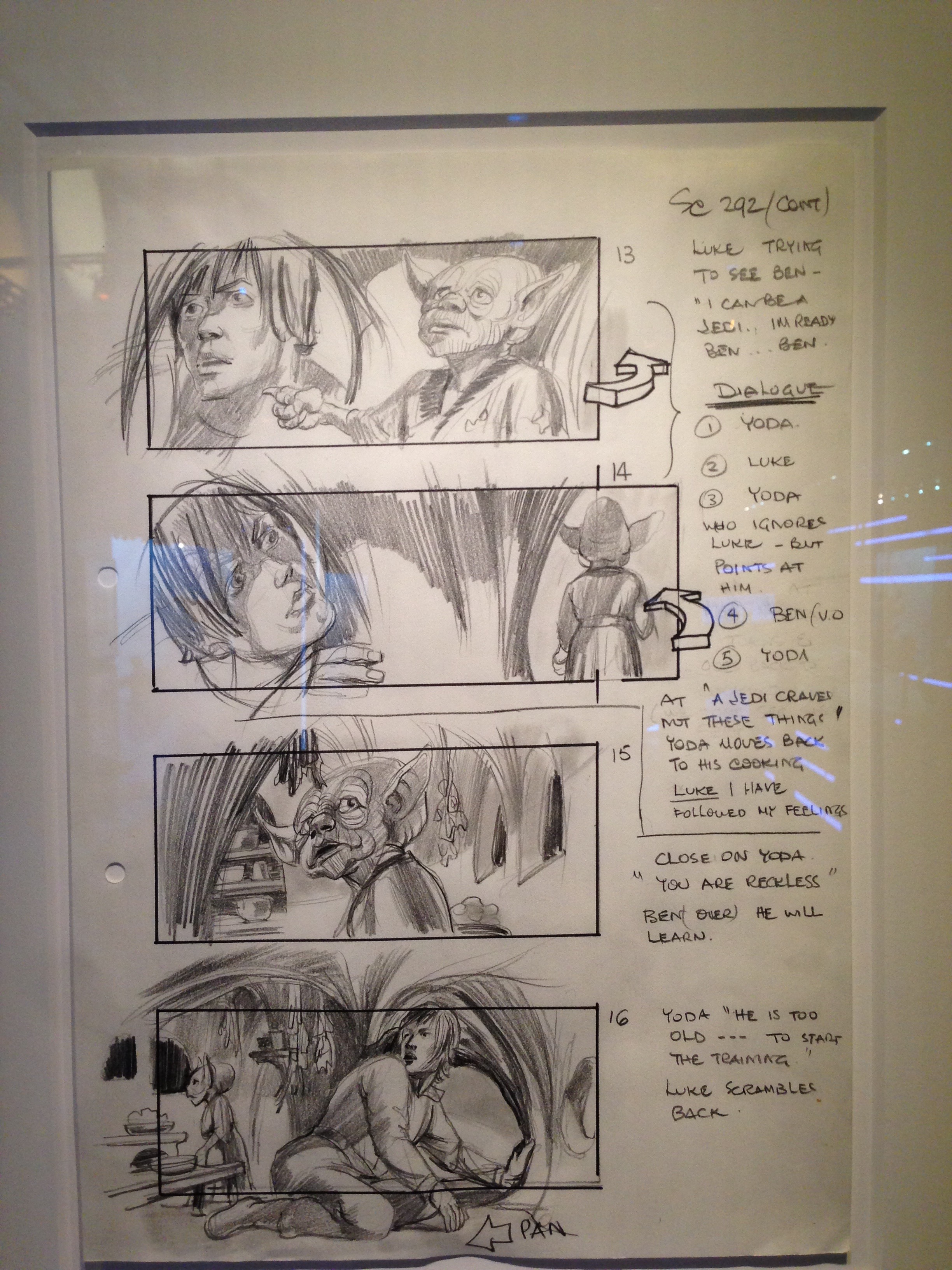
New respect for this scene, because at the exhibit I saw these: the initial storyboard sketches of that very scene in The Empire Strikes Back.
I love seeing the detail and the way these were put together. You see these really quick pencil sketches, and the frames of the storyboard are kind of drawn around them after the fact — they do the sketch, then they're like, "Yeah, I think this is how we want to frame it."
You can see they're slightly different sizes based on what the sketch looked like. Down the right-hand side you'll see frame 13, 14, 15, 16, and all these notations and annotations about what the scene is supposed to be about.
Right at the top: Luke trying to see Ben, "I can be a Jedi. I'm ready, Ben." The dialogue goes from Yoda to Luke to Yoda, who ignores Luke but points at him. Then Ben on the voiceover. Beside frame 13 and 14, on the very right, there's a little three-dimensional arrow drawn — that's a notation for how the scene should play out in terms of the camera work.
We go from Ben voiceover to Yoda, "A Jedi craves not these things." Yoda moves back to cooking. Luke, "I have followed my feelings." Close on Yoda, "You are reckless." Ben on the voiceover, "He will learn." Yoda, "He is too old to start the training." Luke scrambles back. All of the action is mapped out in these storyboards.
I love this next one. There's some meaning here — and I know film from a consumption standpoint, but I've never produced a film, except for a grade 11 English project, which doesn't really count. This storyboard has the big frame around the outside for number 17, but then there's a smaller frame around Yoda's head, so I'm assuming there's some kind of zoom action there, some instruction to the production crew as to how the scene should unfold.
We keep going down through the scene, through all the dialogue, right to the final frame: "Yoda," go in close on eyes. "You will be. You will be." Everything we saw in the production version of that scene is represented here in some way, shape, or form.
It's not exact. It's not every single word that was said. This is not the script. But it's the main blocking-out of the scene and how it should play out. This is the stage where we get to make changes really quickly. We can try things out. We can say, "Hey, I think it should look like this. I think it should work like this."
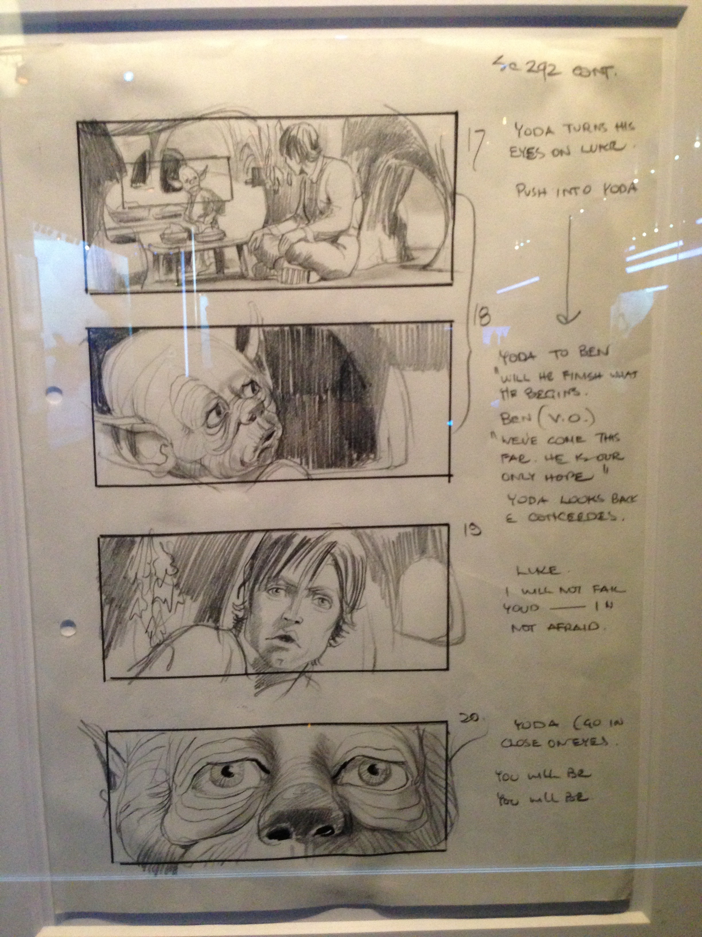
If this isn't quite connecting yet to the work we do on the web: think of the final movie as the production version of the site, and these initial storyboard sketches as where we're showing the interactions and the things we want to happen on a particular screen. There's a very different purpose for one versus the other.
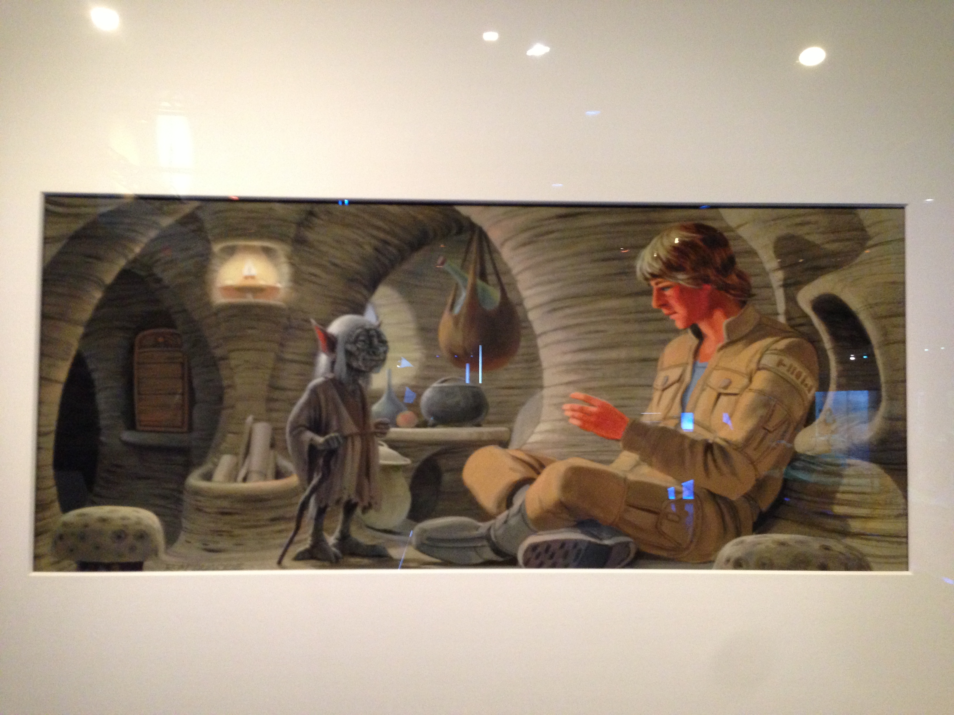
I also own several pieces of Star Wars art, and this is a painting of that same scene. They created production art back in those days — really wonderful pieces, created by an artist, Ralph McQuarrie.
He has incredible Star Wars art; there's lots of it out there, scenes painted by him before the movie was ever produced. The idea was: he's got a script, he's got some descriptions of the scenes, and he's going to make it come to life in a completely different way.
What he's got in this painting — there's nothing about the interaction. Nothing about how things move, or what the dialogue is, or how the camera should work, or any of the production notes. This is the highest fidelity we have apart from the actual produced scene itself.
It lets us see color. It lets us see texture, the surface of the walls. It shows the direction the costume and wardrobe designers need to take. It shows Luke's horrible 1980 hair.
All of that is a different level of detail than the pencil sketches, and a different level of detail than the final clip — and it has a completely different purpose. Think of this as your full comp: the Photoshop, pixel-perfect thing. We create things that look really rich, with all that color and texture, but they don't do much for interaction.
Shift left: the pencil-and-eraser stage
The teams we work with, we often see going straight to the comp, and then straight to code, without really considering or discussing what the interaction is going to be like. We've kind of skipped the storyboard phase. One of the things that's beautiful about that phase — doing things in pencil — is that we haven't invested a lot into the interaction yet.
It's a quick way of getting the basics blocked out and making sure we know what's going to happen here from an interaction perspective: how the interaction between the two characters goes, how the camera goes.
We're skipping this an awful lot these days, and that has some impact — and I want to share some of those impacts from an accessibility perspective.
We tend to treat the comp like a comp and the storyboard almost like a wireframe — and we love wireframes from an accessibility perspective, because we can use them to predict and prevent accessibility problems before they ever happen.
Getting a good look at wireframes, or those storyboard sketches, really lets us understand what the interaction or the interface is going to be like, so we can make sure accessibility issues don't get in there from the beginning. That is much, much better than trying to fix them after they're in production.
After they're in production, we've invested a whole lot, so making changes is hard.
When we're making adjustments at a storyboard level, we can have those conversations.
We can have disagreements — look at frame 13 with the arrow on the right, where somebody says, "The camera needs to go this way, we need to pan to the right," and the director says, "Actually, no, I think it should go to the left." We can get that disagreement out then, before we've invested in the shots.
Same thing on the web. I love the idea of annotated storyboards, because if we annotate them with instructions or notes or direction, we get the disagreement out much sooner. And getting that disagreement between, say, a designer and a developer — and I know where you work designers never disagree with developers, so this may not apply — getting it out right away makes it much better, because we don't have it surface in production after somebody has invested 30 hours in a comp and another 30 hours of code.
We can have it after we've put in two hours of sketching.
It's also very difficult to go back. Nobody signed off on storyboards. People sign off on comps, and on things that have been tested and are in production.
Making a change at the storyboard level not only costs less effort, it costs less political clout. If you try to change something in production for accessibility reasons, and it's in the final version, you're spending a lot of political capital to get that change made.
So let's get as many of those changes to happen while we're still at the pencil-and-eraser stage. It costs us much less politically.
These are the kinds of things I like to think about when I say inclusive UX techniques for everyone: how can we make all of this happen earlier in the process, rather than when it's too late?
Many clients try to deal with accessibility like, "Hey, we're launching this thing in two weeks. Can you just take a quick look and let us know how we're doing?" That never ends well. Never ends well.
So we want to shift as much left as we can.
This is the kind of stuff I spend my time thinking about. I'm Derek, Derek Featherstone. I'm @feather on Twitter. If you want to get in touch, you can email me, feather@levelaccess.com — I would love to talk about this kind of stuff with you. Also even just Star Wars things, if you want to talk about that, I'm totally down with that.
Accessibility is an outcome; inclusive design is a process
People ask me, "Derek, you talk about inclusive design a lot, and you talk about accessibility a lot. What's the difference between the two?" The bottom line for me is this simple: accessibility is an outcome, a thing we measure. Inclusive design is a process. Accessibility is an outcome. Inclusive design is a process.
We can achieve accessibility in a lot of different ways. Here's an example — I don't know if you remember this, from about May of 2016, this thing with Whole Foods. Whole Foods got raked over the coals a little bit for having pre-peeled oranges on the shelf.
The tweet reads, "If only nature would find a way to cover these oranges so we didn't need to waste so much plastic on them." Of course much discussion ensued. It seems like a pretty straightforward thing, but there was a lot of back and forth, arguing — of course, because it's the internet, and somebody was wrong.
Ultimately, a person with, I think, pretty severe arthritis raised her hand and said, "Hey, this is really good for me. I know it doesn't seem like it, but I can't peel an orange. Having that orange pre-peeled for me is actually really good from a disability perspective, because my severe arthritis doesn't let me peel an orange, and I want my independence." Wow.
And one of the comments that came back — this from a person with a disability herself — was, "I mean, accessibility is nice and all, but you know that wasn't the thinking behind this product. It wasn't designed for disabled people."
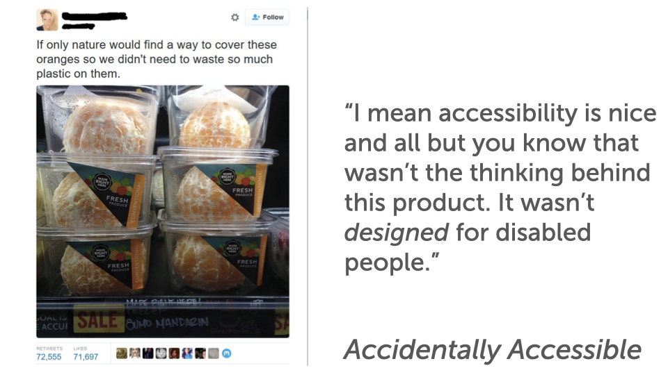
So we've achieved the outcome of accessibility. It is accessible — but it happened by accident. This is an example of something being accidentally accessible.
There are lots of different ways we can achieve accessibility. We can do it by accident — it just happened, and we got lucky. We can make a thing that's not accessible and then go back and retrofit it; it can still end up accessible. We can also make a thing, have it not be accessible, realize it's going to be a lot of work to retrofit, and make a separate accessible version.
Now, I don't condone any of those strategies, because I don't think they serve you well in the long run. But all of them achieve accessibility as an outcome. Totally doable. Inclusive design helps us get there in a much more robust and sustainable way.
So when I think of inclusive UX design, I think of it this way: it's the intentional facilitation and crafting of the interactions within an ecosystem that incorporates inclusion as a core value. I ask people all the time, "What words resonate in here?"
Some people talk about facilitation and craft, because that's part of what they do as designers, and I love that. Some focus on interactions, or on the word ecosystem — all the interactions and the ways the thing I'm building come together to make a whole experience. That's a very typical thing for service designers to think about when they're working on service blueprints and touchpoints.
For me, the most important piece is the phrase core value.
If we embrace inclusion as a core value, it means we will not allow it to be deprioritized. We will not allow it to be pushed aside and dealt with later.
I talk with teams about this all the time: "Hey, can we just deal with the accessibility stuff in phase two? Can we get to that later?" You all know what it means when you say, "We'll do that later."
Don't kid yourself — you know it means we are not going to do that. It's not important right now, we'll get there later, and almost all the time it ends up completely deprioritized.
But if we say inclusion is a core value, that changes the game.
If the organization is on board and everybody knows we're doing this — it's what we believe in as a company — you don't let it become deprioritized. When you do let it become deprioritized, we end up with things like this: a Jira issue created February 8th, 2013, status unresolved, priority major, still just hanging out there.
This is 2,000 days ago. That's what happens when we deprioritize things. We don't want this to happen. So if we make it a core value, it stays with us, and it makes its way through the entire process.
I want to share some inclusive UX techniques you can use to make sure this stuff stays front and center. A big piece of it is mindset, but these are actual techniques you can use all the time. And these are things for teams to do — not specifically for developers, or for designers, but for teams to do together.
Technique 1 — Better communication
The number one thing is better communication. The main reason is the design process itself.
I loved Dan's analogy of the designers dead-dropping their stuff — they drop it and they're like, "I'm out of here," and then the developer comes in, picks it up, and they never have to talk to one another.
We need to talk to one another. One of the best ways of doing this, I've found, is building things into the process where we have to find better ways of communicating.
Take this as a wireframe — and think of it as that storyboard with all those annotations. Instead of a flat wireframe that shows the position of things, the relative size, the colors, what if we made it much more like this, with a layer of annotations over top, specifying a rough order?
This is the rough source order for the stuff on the page, because there are lots of different orders somebody could take here. If you were a developer and got this wireframe or comp, you could code it lots of different ways — you could use flexbox and grid to move things around.
But we might want a very specific source order or focus order. So we put numbers there with annotations: here's the order things should appear on the page.
We start up in the nav, move down to the little left-hand sidebar, and when we go to the right-hand side, let's make sure we have the content first and then the image second, rather than the image first and the content second.
![A wireframe with a two-part numbered annotation layer. Purple badges 1–9 sit on page regions — 1 on the top nav bar, 2 on a left image block, 3–4 on a content block, 5 and 8 on a video, 6–7 and 9 on a right-hand list. On the right, ‘Order notes:’ lists the intended source order 1–7, and ‘Focus path notes:’ gives 8–9 — instructions like ‘when we click on [an item], move focus to [its target]’ and ‘after pressing [a control], move focus to [its target].’](/talks/slides/inclusive-ux-techniques-for-everyone-slide-019.png)
We also have focus-path notes. Number eight is the video — I'm not going to read the rest, because it's hipster ipsum and doesn't really mean anything. When we click on the video, we need to move focus here. When we click on this piece of the interface, we need to move focus here. And when they hit the escape key, focus needs to go back to here. We're really, really explicit.
The reason I love doing this with design teams: we can go through all of it, or hand it off and work with developers, and they'll look at it and say, "Well, I think this is wrong." And I'm like, "That's exactly the outcome I want." It sounds counterintuitive, but that's exactly the outcome I want.
I want a designer and a developer to disagree about something, so they can figure out the right way, talk about it, and make it a thing: "We've talked about this for 20 minutes, we feel really good about it, we're going to revise this and that, let's make this the way we do things from now on. P.S. — this is a good candidate for making its way into our design system now."
If everybody is just happy all the time — designer hands off, developer takes it, "Hey, this is great" — there's no disagreement, no tension, and we don't learn without that tension. So use these as communication tools.
The value is in the conversation itself, not just in the boxes on the screen.
When we skip that wireframing or storyboarding phase — and honestly, as I talk about this, I don't even like the phrase wireframing anymore; I want to just say, let's storyboard it, because that seems richer and much more useful — we lose that conversation. That's where the value is.
Technique 2 — Reverse-engineer to wireframes
We also like to look at things and reverse-engineer them. Sometimes clients go straight to code, without doing much sketching or having that conversation beforehand. Here's an example of a page that was in production. We looked at it and said, "There are some things here that we know aren't really all that accessible."
Look at the color contrast: you've got the header across the top, the main content, and the left-hand rail with all the navigation. Beside that, there's a green part of the subnav with white text on it — that doesn't have enough color contrast. The "mathematics" item on the far right is green on blue — we know that doesn't have enough contrast.
We'd need to look at the actual comp in more detail to be sure, but if we had looked at this as a wireframe — and we often deconstruct things and build these wireframes backwards — if we'd seen this menu system at a wireframe level, which is going to be a nightmare from a keyboard perspective, let alone an accessibility perspective, we would have looked at it and just said, "No."
If we skip the wireframing or storyboarding stage, we lose a lot of opportunities. So sometimes with teams we use this: we reverse-engineer to see what something would have looked like as a wireframe, and ask what we could have caught earlier. We take existing things and reverse-engineer them all the time.
Here's one from the Discovery Channel, Deadliest Catch. You see "Deadliest Catch" across the top, "all-new Dual Survival" — I don't even know what that means, but it sounds like a really interesting show.
There's a big hero image, another thing off to the right, sidebar content, two arrows, and two blocks down at the bottom. As a wireframe, we generally know what needs to be done.
And if I make one small change, you have a completely different understanding of what we need to do from an accessibility perspective. Look at the two little blocks in the bottom right — just blocks of content, a div with some stuff in it, you're not planning anything special. But at the wireframe or storyboard level, if I change one to have a little circle with a triangle in it, you now know that's a video.
That brings to light a whole new set of requirements. Simply by adding or removing those little round circles with triangles, we're communicating a whole lot of meaning. Reverse-engineering helps you see opportunities for better discussion earlier in the process.
There's other things we see. This was a responsive site — effectively the same carousel, but on mobile.
Here's the wireframe: a completely different setup. We can see very easily at this stage, with the main block, the arrow, and the little dots in the right-hand corner — if we'd seen this as a wireframe or storyboard, we'd immediately have said, "Those dots need to be bigger. They're way too small and way too close together."
We often think, especially if we're not designing mobile-first, that when we take a large desktop site and design the mobile experience, we shrink things down. But you can see at a wireframing level: maybe our content needs to get smaller, but our controls actually need to get bigger.
The things people interact with sometimes need to get bigger on mobile, not smaller. All things we could find earlier in the process. So asking "How could we plan for this earlier?" is what helps in the reverse-engineering phase.
Technique 3 — Interaction tables
Another tool we use is interaction tables, and these have a pretty long history. Usually when I put this slide up, people get their cameras out and they're like, "I need that."
Don't worry about the content that's in there. What you need from this is the concept of using the grid. This is, again, for a carousel — and I apologize, there have been three carousels already in this talk, and I'm going to try to avoid them, but I can't, because I always have to go here.
Carousels are hard. That's why we don't want to do them anymore.
You can see in this grid, we typically capture the carousel state, the event that happened, what the interaction should be, the focus change that goes with it, and any notes about what the ARIA state should be.
| Carousel / keyboard state | Event | Interaction | Focus change | ARIA states |
|---|---|---|---|---|
| Focus anywhere in the carousel that isn't on another control | Space bar pressed | Carousel play/pause is toggled | Focus stays wherever it currently is | No changes |
| Focus anywhere in the carousel | Left arrow key pressed | Carousel moves to the previous slide | Focus moves to the beginning of the new slide's content | aria-hidden="true" or "false" changes for the slides |
| Focus anywhere in the carousel | Right arrow key pressed | Carousel moves to the next slide | Focus moves to the beginning of the new slide's content | aria-hidden="true" or "false" changes for the slides |
| Focus on the play/pause button | Enter or space key pressed | Carousel play/pause is toggled | Focus stays on the play/pause button | aria-hidden="true" or "false" changes for the slides |
| Focus on the next or previous arrows | Enter key pressed | Carousel moves to the next or previous slide | Focus stays on the next/previous arrows | aria-hidden="true" or "false" changes for the slides |
| Focus on the slide navigation links | Enter key pressed | Carousel moves to the selected slide, carousel is paused | Focus moves to the beginning of the new slide's content | aria-hidden="true" or "false" changes for the slides |
I remember we started building this. I don't know if you remember Bill Scott and the YUI library from Yahoo. That library had some really interesting things in it. There's a grid of interactions that Bill and his team put together, called Interesting Moments. It was an artifact they created as part of the design process that said: here are the interesting things that happen in a drag-and-drop interaction. Here are the visual things you need to do, here are the code-level things you need to do, here's all the important stuff that makes this interaction whole. I love that concept of organizing things into a grid structure. It becomes really useful as a reference — whether it's a YUI drag-and-drop Interesting Moments grid or something more text-based.
But part of the value isn't just as a reference — it's in doing it together. Designers, developers, testers, whoever, working together to create a thing like that. This is that same conversation. If you think of the actual sketch storyboards as communication tools, this is exactly the same thing, just in a text-based format. We're talking about some very technical things, but getting these grids mapped out as interaction tables is a really useful tool. These are things teams should be doing together, to make sure they've got everything lined up so the interfaces you create work really well for everybody.
Technique 4 — Practice inclusive design
The other piece — this is the team-level thing I'd love for you to be thinking about — is to simply practice inclusive design. Inclusive design really means we're going to include people with disabilities in our process. We've been doing that for many years with a lot of clients, even though they weren't always ready for it.
When we practice inclusive design, we include people with disabilities as co-creators, and we find out a lot of interesting things.
One of the baseline levels of inclusive design is to include people with disabilities in usability tests of the thing you're creating. You find out all kinds of interesting stuff.
When you practice inclusive design, you find out things from that testing and those interviews that aren't yet codified in the accessibility standards — in the technical standards. That's why I say when you practice inclusive design, it puts you ahead of the curve for things that will be standards later.
The world of accessibility standards has been really interesting. The first version of the Web Content Accessibility Guidelines came out in 1999. The second version was 2008. And the version we're on now, 2.1, came out in 2018. So that's a nine-year release and a 10-year release.
That has a profound impact on the way people in our profession view accessibility. I don't know of any other thing we've ever done on the web with a release schedule that long — it just doesn't happen, especially not today.
One result is that people have viewed accessibility as a static, fixed-in-time thing that does not change, and that has a profound impact on how you approach it.
So what's happening now? I'm really thankful for this, from the W3C and the working groups putting hours and hours into it: there's talk now of more regular releases.
We're on 2.1 now — and I'm making this up, because I'm not on the working group — but if 2.1 is now, maybe 2.2 is 18 months from now instead of another eight years away. More regular, iterative releases will help people understand that this stuff changes over time.
Let me give you an example. Something that used to be seen as a nice-to-have is now in the standard.
In WCAG 2.1 we have success criterion 1.4.11, non-text contrast. We've long had a requirement that all the text you use has to meet minimum color contrast ratios — 4.5 to 1, or 3 to 1 depending on the size of the text and its font weight. But the rule only used to apply to text.
We were working with an airline, and one of the things you can see is a large grid of choices for flights from one place to another.
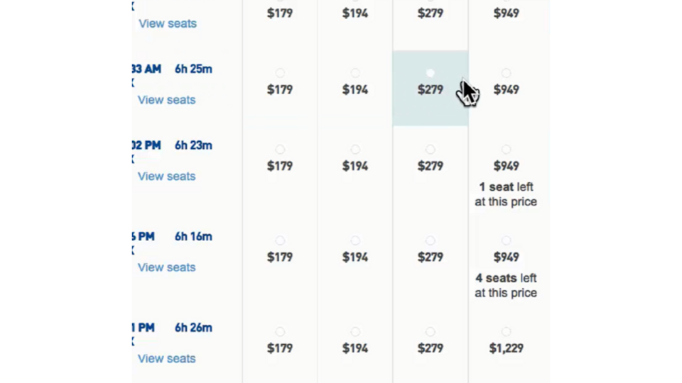 In the middle of each block is a price, and a little radio button. The radio buttons were custom designed to be part of their palette, but they were very low contrast.
We looked at the comps and said, "These are low contrast, and these are probably going to be an issue." Sure enough, we did usability testing with people with low vision and people without, and people had a really tough time seeing the low-contrast radio buttons.
It met their brand palette, but it wasn't usable in the real world. In fact, many people didn't even see them as something they could click on — they just saw a grid of pricing, and didn't know what to do next, because if you can't see those low-contrast radio buttons, there's no affordance telling you to click.
The client and their other providers, particularly the people who created the design, said, "Totally get that they don't have enough contrast. But that rule about contrast only applies to text, and these aren't text." We knew for sure, and they got it — "You're right, those aren't text, but we know that's going to be difficult for somebody to use." And we saw that bear out in usability testing.
Now it's in the standard, 1.4.11: non-text items important to the interface need to have enough contrast too. We can point to it and say, "We were telling people this four or five years ago, and now it's in the 2018 2.1 standard." It's not that it was accessible before and not now — it was always not accessible.
Now we have a success criterion we can point to and say, "Here's why."
Here's another, character key shortcuts, 2.1.4 in WCAG 2.1. If you're building an app with single-character key shortcuts — think Gmail, where many people use J/K navigation, C for compose, the pound sign for delete, X to select — all of those are single-character shortcuts that are really useful for power users.
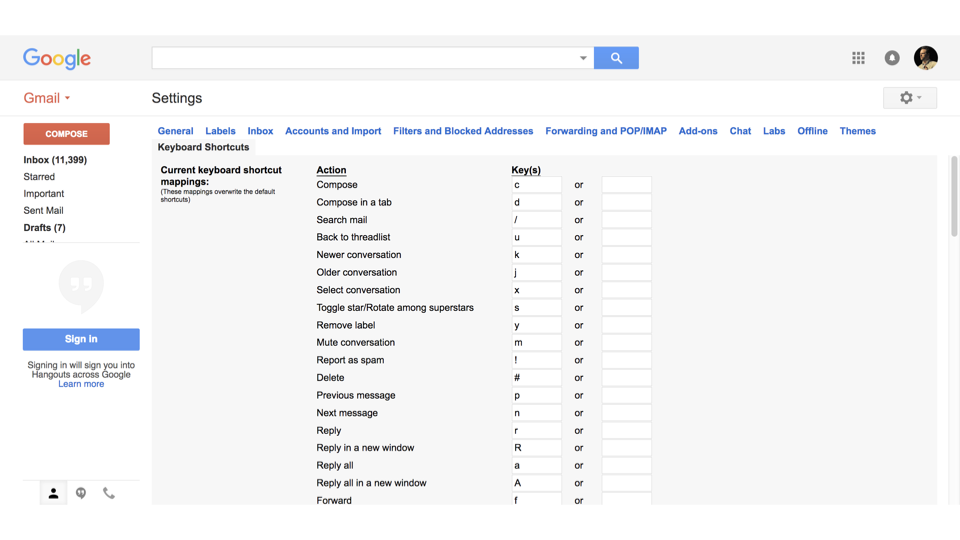 But one issue is that those character keys can interfere with somebody's assistive technology, or the assistive technology intercepts them so you can't create the shortcut.
We've been seeing this in usability testing for many years, and giving this advice: if you're going to use single-character shortcuts, totally fine, but make them so they can either be turned off, customized, or completely overridden. That's now in WCAG 2.1.
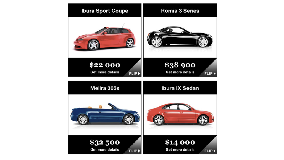
Another, label in name — WCAG 2.1, success criterion 2.5.3. What does that even mean? Let me give you an example. This interface is abstracted and anonymized, but we were working with a bank, and they had a top-notch accessibility team.
They had a card interface with a call to action in the bottom right that said "Flip." When you flipped the card over... they knew they didn't want four links that all said "Flip." Four links that all say "Flip" with no distinguishing features are kind of useless. If I'm tabbing through this with a screen reader, I hear, "Link, Flip. Link, Flip. Link, Flip. Link, Flip."
I don't know which one I'm going to.
So they knew they needed to make it better, and they did: instead of the text "Flip" being the call to action, underneath the link it said, "Details for Ibura Sport Coupé," "Details for Romia 3 Series," "Details for Mylra 305S," "Details for Ibura 9 Sedan." Really meaningful link text — details for car one, two, three, four. It was actually four different types of bank accounts.
But what they didn't think about was that once they did that, somebody using voice recognition software, like Dragon NaturallySpeaking, sees what's on the screen and says it.
So if they want to click one of these, they might say, "Click Flip," because that's the visible call to action. But now the word "Flip" isn't part of the link, so they have to do a bit more work to flip the thing around.
The team was super smart — they looked at it and said, "We've got to make sure this works for screen reader users," and then layered in another level. In usability testing, we saw it actually made it a little harder for somebody using Dragon NaturallySpeaking.
So now we had to find a middle ground. What we ended up doing was something like, "Flip to see details for Ibura Sport Coupé." We're building the word "Flip" in, because that's the visible call to action, and building it into the link.
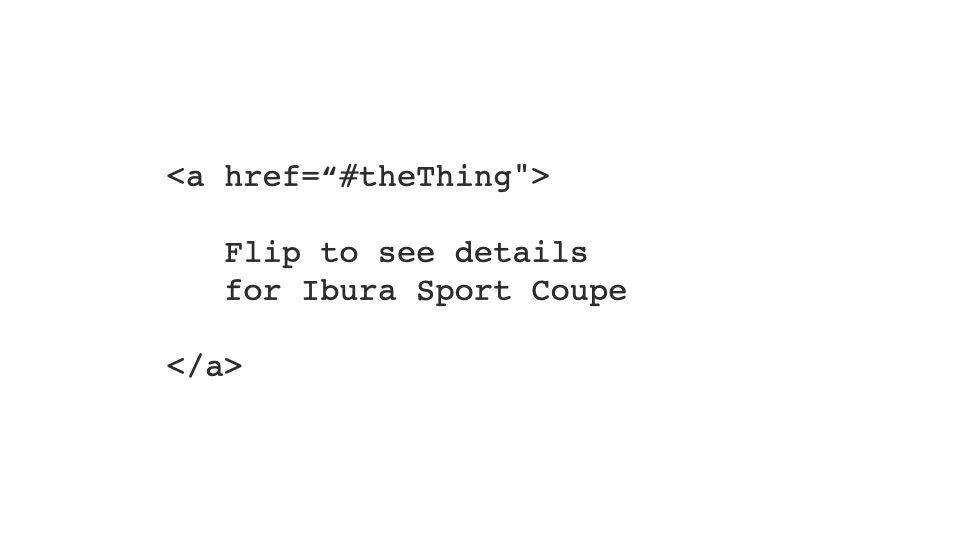
So what does that have to do with label in name? The visible label of something on the screen needs to be part of the accessible name of that thing.
An accessible name is a calculated thing the browsers and assistive technology put together through their APIs. The accessible name for this first link is "Flip." The accessible name for this one is "Details for Ibura Sport Coupé." And the accessible name for this one is "Flip to see Details for Ibura Sport Coupé."
At its base level, label in name means the visible label of a thing needs to be part of the accessible name. That's something we'd been seeing for many years, but it was never codified as a standard before — and now it's part of it.
Again, it's not that it was accessible before and isn't now; it's just that our way of understanding accessibility has moved and progressed, so now we have some new success criteria about it.
So ultimately, we want to be designing with people with disabilities, not for people with disabilities.
We need people with disabilities to be involved in the process. We do that through usability testing — that's the baseline level — and there are lots of other ways to include people too.
For designers — Color combinations
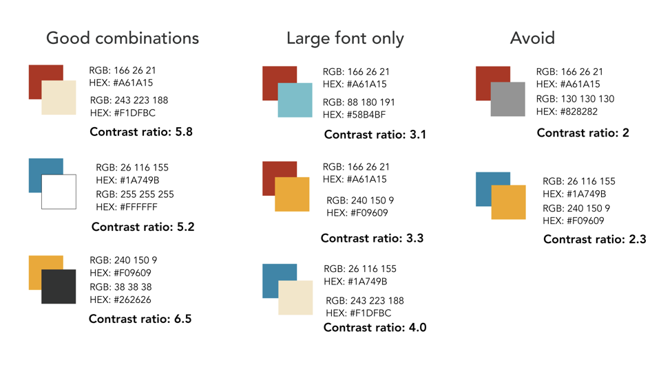
Now, techniques specific to designers. When you're creating your color palettes, we often see things in design systems like primary background colors, secondary background colors, supporting colors, supporting neutral colors, and so on — blocked out, reorganized to be useful, with the hex and RGB values in there.
That's a baseline level. But I'm a big fan, and I'd encourage you all, not to stop there. It's not about the colors; from an accessibility perspective, it's how the colors work together.
So take one more step. Show these are good combinations — this color with this color. These are combinations we can use for large font only. And these are combinations we should avoid.
The idea behind color contrast is that for a background and foreground color, you need a certain contrast between them so it's readable by as many people as possible. The baseline we've set is 4.5:1 for regular-sized type, or 3:1 if it's large font.
In each combination, not only have we used them together, we've said, "Here's the contrast ratio between these two things," so we start to socialize it — people know not just that these colors go together, but that they go together because the math supports it. 4.5:1, 3:1, and anything less than 3:1 we're going to avoid. So when you're building your design system, focus not just on color but on color combinations.
There are all kinds of tools out there to help with this. Whatever tools you use, show not just the good combinations but also the bad ones — things we should be avoiding.
For designers — Communicate design intent
Designers also need to communicate design intent. Here's a confirm-transaction slide from when we were working with a bank on their mobile app.
They wanted to do money transfers, and they used to have you accept — "Yes, I want to transfer this" — and then a dialog pops up, "Are you sure? This is not reversible. Really be sure." You hit yes, then confirm again. One of the things they were postulating — and Amazon does this in their app — is that you can slide across to confirm.
It's seen as a more intentional way of confirming. Tapping something can happen by accident; it's much more difficult to slide to confirm by accident, and it's a longer gesture, so it takes more to complete.
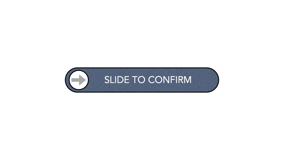
They knew what they were doing. They knew if you slid across to confirm, they'd put in a nice little piece of feedback.
And they knew how to make this accessible to people with all kinds of disabilities. If they made this thing a button that could be activated, somebody using a screen reader could double-tap on the screen to activate the confirmation.
They even set it up for somebody using a switch — somebody who has mobility challenges might be using a switch. If you think of the big Staples Easy Button, it might look like one of those; it's basically an input device you can use to activate things.
One thing we can do is use the switch to move a cursor to a specific point and then say, "Do this thing." So they made the target nice and big, easy to identify with a crosshair mechanism.
They even built in a little bit of literal wiggle room for somebody who doesn't have the fine motor control to keep it exactly within the target — if you slide and come off it, normally it releases and goes, "Oh, you didn't slide it," so they built in wiggle room so that somebody with mobility or dexterity challenges could still make it work. Wonderful work.
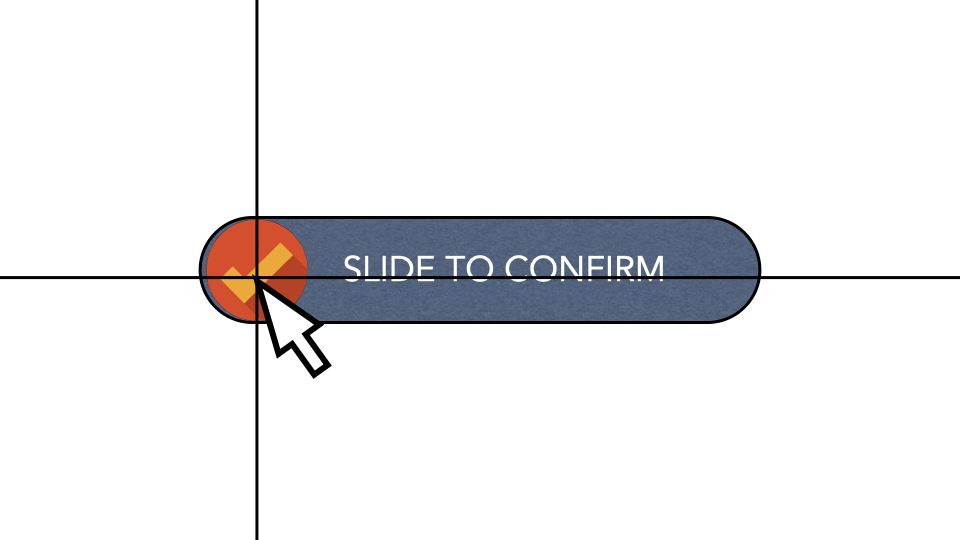
But one thing they needed to think about a little differently was a very key piece. The whole purpose of slide-to-confirm is that it's not a thing people do all the time — it's hard to do by accident, it's very intentional.
Now think about a screen reader user. Double-tapping is the way they activate probably everything.
So the same level of intentionality of interaction wasn't there. Slide-to-confirm is, "I have to be really clear, that's the thing I want to do." But if I activate that on a double-tap, that's something somebody using VoiceOver or TalkBack on an iOS or Android device does all the time. The same intentionality of the design was not there.
We can solve that. Maybe if VoiceOver or TalkBack is active, we have a custom gesture. I'm making this up, but maybe they have to literally print the word "Y" on the screen with their finger as a confirmation, or there's some other gesture — a double-tap, a multi-finger gesture, whatever — but something that reflects the intent of the design. So we need, as designers, to really clarify and communicate that design intent.
For designers — Interface transformation
We also need to think, as designers, about interface transformation. Here's our friend the carousel again. One thing I'd love for you to think about, the next time you're designing a carousel, is: maybe this would be better as a list, or as a grid.
Allow a person to transform the interface, so that instead of scrolling through three pages of three in a little carousel, they can tap on something that turns it into a list, so all the items are there. For somebody with dexterity issues, scrolling through that carousel might be really challenging.
Just having a mechanism to expose all the options at once could be really useful. Same thing — instead of a list, maybe we pop it out and make it a grid. We're not paging through things; we've got everything there, and it's much easier to tap on the control.
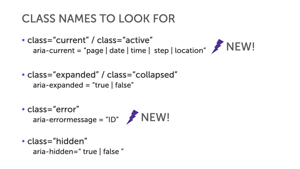
For developers — CSS class-name review
On the developer side, I'd love for you to do some CSS class-name review. Look through the names in your CSS classes and think about expressing those things in different ways. If you have a class of current or active, there's a new feature in ARIA — this isn't really well supported yet, but keep in mind it's coming.
When you see a class of current, that should immediately get you thinking, "I need to represent this programmatically, not just visually." When you have a class of current, you usually put a different background color on it, or a different border, or a little icon beside it.
aria-current is a way of saying, programmatically, this is the current thing — really useful for people who can't see that CSS class.
Same thing: a class of expanded or collapsed — look for aria-expanded="true" or "false", and build it in. We sometimes work with teams to build these as rules into their linting process, so it's looking for those things and saying, "Hey, we see you've got a class of expanded and collapsed; you might want to add aria-expanded."
It's not as simple as "take your CSS and do it in ARIA instead" — you're still going to use the CSS, you just need to start thinking about the ARIA side as well.
Same with a class of error: we've got a new thing in ARIA, again not well supported yet but it will be, aria-errormessage equals the ID of the error message — a way of being really explicit about what the error message is for a form field.
And a class of hidden maps to aria-hidden="true" or "false". These are things developers can do immediately to make their code better, so you've got that inclusion built in. So look for things that are meaningful in your CSS and move them to another layer, like HTML or ARIA.
For developers — High-contrast tweaks
We make high-contrast tweaks as developers too. We'll go through this one quickly. This is the Bell Canada interface. In the top navigation you can see Shop, Support, and MyBell, and they all have a little down arrow beside them.
What does that down arrow tell you? If you click it, something shows up as a dropdown. But if I switch this into a high-contrast theme and the background image disappears, this tells you a very different story.
If you're magnified and looking at this and you see the arrow there, you're now looking for things in the same page. But if you see it without that context and click it, you're expecting to load a new page. That little interface clue has an impact, so we need to make sure it comes through in a high-contrast theme.
Even something very subtle: look around the little chat dialog there — you'll see a drop shadow. When we flatten this interface and look at it in a high-contrast theme, certain things disappear. Because that drop shadow is gone, there's no depth; it's been flattened, and it's harder to tell the difference between that being a thing on top of the interface versus the interface itself.
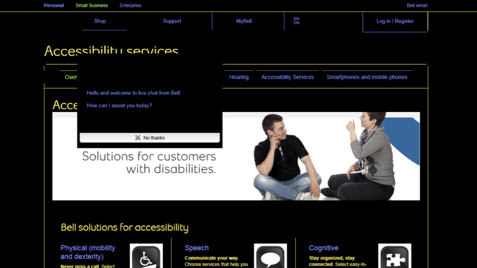 You can easily tweak that by putting a border around it. You can put a transparent border on something so it doesn't visibly show, but when you switch into a high-contrast theme, it'll be transformed by that interface. So look for things that are meaningful in your visual design and put those in HTML or ARIA as well.
For developers — Gesture alternatives
When we work with gestures, we need to think things through. We've done things before where we made a sortable table — if you swipe down a table, it sorts on that column, ascending or descending, based on the gesture.
Some people can't do that gesture, so what we build in is another mechanism: if you tap on the table header cell, that automatically toggles between ascending and descending. So think about the gestures you're building into things these days. We might need alternatives — different ways of making that work. We need to consider complementary methods to use alongside those gestures.
Avoid black holes
The last technique is finding ways of avoiding black holes — and I'm not talking about that really horrible, cheesy 1970s sci-fi movie. That was not a great movie. You should go watch it anyway, though, because you can. I'm talking about things like keyboard black holes. Many carousels become keyboard black holes to people.
You see at the top here, "page one of two." That's something we call a really good idea, part of the reason being that it sets the stage for what's about to happen.
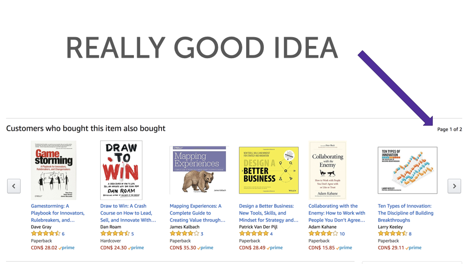 If I know it's page one of two, I'm like, "Maybe I'll go into that carousel." But if it's page one of ten, I might be like, "I don't know if I want to go in there."
Here's an interesting thing, though. How many items are in this carousel? You can shout it out.
There are six on the first page. If there are two pages, the math tells us there are twelve items max.
But if I can't see that there are six because I can't see the screen, "page one of two" isn't necessarily that useful to me — it could be two pages of a hundred each. So one thing we need to think about is not just doing "page one of two," but saying, "Customers who bought this item also bought..." and there are sixteen items — so we know it's a list of sixteen, or twelve, or whatever it is. We build more clues into the interface to set the expectation of what people are about to go into.
Because if you're tabbing through a carousel, you could be going forever. We do a lot of work to think about how people get into things, and we want to answer this question: "What happens if I go into this thing?"
As developers and designers, we have kind of an obligation to do that.
So we've talked about how people get into things. Look at this last example. This ramp — this is a pharmacy in Mexico, and I think it's well-intentioned.
But if you look at this ramp, this is a ramp people use to bring the dolly in. This is not a ramp for a wheelchair. This doesn't meet any accessibility standard ever, anywhere.
Fortunately, the door opens in — if it opened out, we'd be in a whole lot of trouble. The reason I share this isn't because of the ramp itself; there are some obvious things there.
I am scared for the person in a wheelchair trying to get out of the store, just as much as getting in. Because if you look at that ramp, it's steep, and it's a very short ride to being right in the middle of the road.
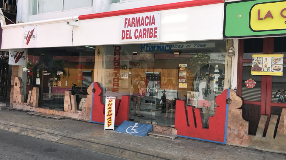
So we put a lot of effort into this all the time: how do people start using the thing I want them to use? But we don't put enough effort into how people stop using the thing we've got them using.
How do people get out of that carousel? If they can get in, how do they get out? They can get into this store — how are they going to get out? I want you to put that same level of thought and consideration into that as well.
In closing
I hope all of that makes sense to you, and I hope the distinction really lands: accessibility is an outcome, inclusive design is a process. 
I would love for you very much to embrace that process. Thank you very much.