Inclusive Design Systems
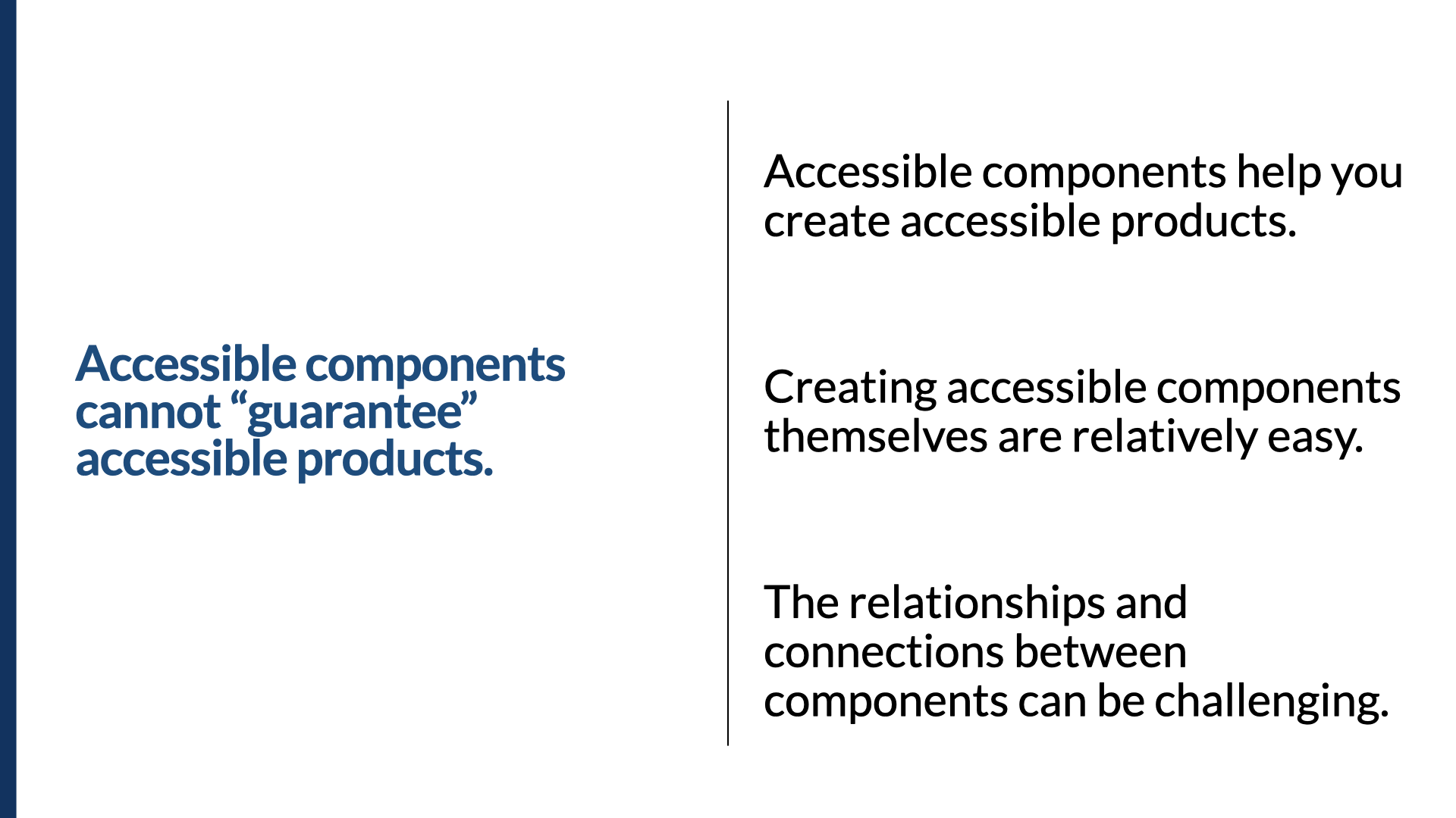
Accessible design system components don't guarantee accessible products; the relationships between them are where accessibility succeeds or fails.
From An Event Apart's Spring Summit, my talk called Inclusive Design Systems. It's built on one idea with hard consequences: a design system full of accessible components still doesn't add up to an accessible product. Accessibility lives in the relationships between components as much as in the components themselves — and a design system is the strongest leverage most teams have to get that right at scale.
Here's the whole talk, three ways. Watch it, take the two-minute read, or go through the full talk with the slides. Use whichever fits how you work right now.
Watch
Prefer to read? Jump to the full talk. A complete transcript is available in the player's captions and in the narrative below.
The two-minute read
We reach for design systems to scale our work — and that same scale is the strongest leverage you have for accessibility: it makes accessibility consistent not just within a product but across every product built on the system, instead of accidental and re-solved one component at a time. But accessible components alone won't get you there — the way components connect (programmatically, visually, in content) is where accessibility succeeds or fails. So treat the system like a product, make deliberate accessibility decisions inside it, build in guardrails, and bring disabled people into the work as co-designers, not last-step approvers.
The seven lessons:
- Accessible components don't guarantee an accessible product — the relationships between components matter as much as the components.
- Treat your design system as a product — roadmap, backlog, dedicated resources, accessibility built in from the start.
- A design system is an authoring tool — it has to be accessible itself and make accessible work the easy path.
- Be opinionated about accessibility — decide focus placement, button-vs-link, error patterns once, so implementers aren't re-deciding every time.
- Build guardrails — components that won't render correctly without their required accessibility properties.
- Bring accessibility into design-system pilots — score candidate projects on the accessibility wins they'll produce.
- Document for the people who use components — why it's accessible, how to keep it accessible, how to test it.
And if you're asking "what's the minimum?" — the accessibility MVP, in three buckets:
- Component essentials (the ~70% of issues we've logged): keyboard interaction, visible focus indicators, text equivalents, basic semantic markup, form labels and error messages, color contrast.
- The hard-to-retrofit stuff (decide early): flexible layouts for text resizing and dynamic content, orientation on mobile, and user preferences — reduced motion, color scheme, contrast.
- The system-level stuff (needs a whole-product view): color and contrast systems, landmarks, consistent calls to action, page heading structures, error-messaging systems, and content.
The full talk
This is the narrative I used to present the talk, lightly cleaned for reading.
In this talk:
- 1. Components ≠ products
- 2. Treat it as a product
- 3. Authoring tool
- 4. Be opinionated
- 5. Guardrails
- 6. Pilots & scorecards
- 7. Document for users
- The accessibility MVP
- Test the whole
The evolution: style guides, pattern libraries, design systems
If you've been in the field of the web for a while, you've likely seen the evolution of the tools and artifacts we produce as part of our work. We've seen things like style guides and pattern libraries, focused on two different parts of the work that needs to be done. The style guide tended to focus on colors, typography, sizes, and other visual treatments, whereas pattern libraries tended to focus on the code side of things. Design systems seem to bring these together.
Design systems serve as our best current understanding of best practice when it comes to creating efficient and sustainable practices for teams that design and build digital things. It will be no surprise if there's a new way of doing things in a few years, and we'll look back and ask ourselves: how did we not see that design systems were just the beginning?
The promise: consistency, speed, and freeing people to be creative
The promise of a design system is that it creates efficiencies in our work, and those efficiencies come from a lot of different perspectives. Consistency: when it comes to building things, we'd ultimately like one source of truth when possible, so that designers and developers and testers and product managers are all working in unison — so we don't have four different versions of the date picker and 17 different styles of buttons in the app we're building. That consistency is also key to creating great user experiences.
When we have that single source of truth and a set of baked-out design assets in a UI kit and a component library, we can, in theory, get things ready to launch to market faster. This is also good.
I've heard lots of people say that design systems take away their opportunity to be creative, but codifying — and freeing designers and developers from having to spend time on mundane, boring things — is potentially a huge win. Josh Clark wrote about his work with Dan Mall and Brad Frost: that the design system carries the burden of the boring, so that designers and developers don't have to.
Accessibility as leverage
One of the first design systems I remember coming across that included accessibility was Salesforce's Lightning Design System. It was still relatively new at the time, and it included accessibility as part of the package. Sure, there were loads of copy-and-paste code repos out there that were accessible — but this was different. The components were well thought out and organized. There were simple things, like plain old form fields with labels. And there was one main difference: they all included accessibility — not just accessibility built into the components, but very thorough accessibility documentation that included all the background material you'd need on how the components were built and why they were accessible. They included modal dialogs, complete with documentation. So they had it all: the promise of consistency, speed, and accessibility in their design system.
What all of this amounts to, when it comes to accessibility, can be summed up in one word: leverage. The leverage you need to scale accessibility. We're already using design systems to scale our efforts in the design and development of web-based things, and the parallels with accessibility are pretty clear. We're focused on scaling good design and development practices — and accessibility is part of that. That's part of the promise of inclusive design systems, and why they're important to scaling accessibility across large organizations or large digital properties.
Hopefully you're either already working on a design system, or at least thinking about it. This presentation is for you — to help guide you, or inspire you, to do accessibility right in your design system.
A quick framing
I've been working on web accessibility and inclusive design for the past 22 years, and for the last five years I've been helping a lot of teams integrate accessibility into their design systems.
One clarification before we go further. If I'd given this presentation five years ago, I'd likely have called it accessible design systems. But for the last five years or so, I've tried to focus more on the inclusion side of things. There are lots of different lenses on inclusion; disability and accessibility is just one of them. This presentation specifically focuses on design systems that help you create products that are inclusive of people with a variety of disabilities. It does not explicitly tackle the many other forms of exclusion we see in the digital space — discrimination and exclusion come in a lot of forms, but I'm going to focus on the accessibility side of inclusion here.
If you're looking for more on the inclusive design side of things — the process of including people with disabilities — check out my 2019 An Event Apart talk, Inclusive, by Design.
Where the lessons come from
Based on the work I've been doing for the last five years with design systems, I wanted to distill some of the important lessons I've learned. It's worth noting up front: these are not lessons on how to build accessible components. You can find that out there fairly easily.
In the days before we called things design systems, you could already find great documentation on how to build accessible components. One of the best and most authoritative places to start is the W3C's ARIA Authoring Practices (you can follow the working versions on GitHub to keep up with the debates about how certain components should be made accessible). In version 1.1 you'll see a long list of design patterns and widgets — accordions, alerts, checkboxes, modal dialogs, list boxes, almost anything you can think of. These aren't production-ready code samples, though; they're more like a set of well-thought-out requirements ready for implementation. Some design systems use them as the guidance for how to build their components.
And there's no shortage of design systems that include accessibility. I already mentioned Salesforce's Lightning Design System. A few more worth checking out: IBM's Carbon design system, Rocket's Spark design system, the U.S. Web Design System, Adobe Spectrum, and Shopify Polaris. They all include accessibility prominently and are strong in both execution and documentation.
These are lessons about the design system as a whole — the way we think about them, the way we work with them, and the way we implement them to create accessible things.
The seven lessons
Lesson 1 — Accessible components can't guarantee accessible products
Here's the first important lesson: accessible components cannot guarantee accessible products. I've even heard clients and leaders at companies ask: "If we invest in the accessibility of our design system, can you guarantee we'll build accessible apps?" The short answer is no. There are no guarantees. Just because you start with accessible components doesn't mean you automatically get accessibility in the pages or screens you create with them. Why not? Because anyone can take an accessible component and change it to be not accessible — and you can take three accessible components and connect them, or nest them, in a way that makes the result inaccessible.
Here's a non-technical example. Say I have an accessible Word doc with a logical structure of first-, second-, and third-level headings, nested appropriately. Now what happens if we include that document inside a larger one as an appendix? First we add a heading at the top indicating it's an appendix — and now the original heading structure doesn't make sense anymore; we have to adjust the levels so the hierarchy fits the new context. There's a high likelihood we'll make other changes too: if there were figures called "Figure 1" and "Figure 2," they may become "Figure 18 and 19," or "Figure A1 and A2." The parent document will likely need to make references to "Appendix 1" or to those figures. So it's not just about the individual document; it's about the whole, and how it's used in context.
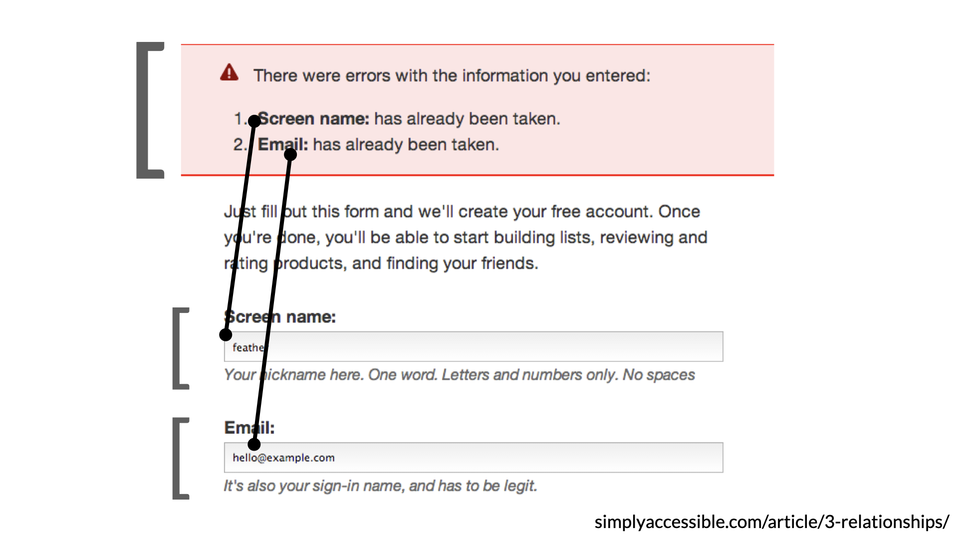
This is no different from putting accessible components together. In this web example, to make the screen accessible we need to look at three different types of relationships. We have explicit programmatic relationships, like form labels connected to form inputs with their for and id pairs. We have implied relationships created by the visual design — the background color of the error-messaging area tells us those things are all together, all part of the same thing. And we have a content-based relationship: the error messages up top reference the field names down below, so someone who hears that "Name" and "Email" are in an error state can find those fields in a few different ways. (If you want the full details, I wrote about it years ago — "three types of relationships and what they mean for accessibility," over on simplyaccessible.com.)
So break this interface into components: accessible notification messages, and accessible form inputs. Both can be self-contained in terms of basic accessibility — but at some point we have to connect them to create an overarching accessible experience. We have to connect those error messages to the fields. The connections between the components are just as important as the components themselves.
Here's another example that came up in a design-system Slack: how should we make this list-box widget accessible? It starts out looking like a very standard list box, but open it up and there's more complexity. At the top is a search field, and the results each have a checkbox. It's really a multi-select select box wearing a list box's shell — as you type, the results filter; you can select one or many; and the top control shows either the single selection or how many are selected. There's a lot to communicate, and making it easy to understand for someone using a screen reader is a real challenge. Even though the base list box, input, and checkbox components are accessible, the connections and relationships between them are critical to an overall accessible experience.
So: you cannot guarantee accessible products will be created from accessible components. They'll help — making the individual components accessible is actually relatively easy. The relationships and the connections are where the challenge lies.
Lesson 2 — Treat your design system like a product (that includes accessibility from the start)
Outside accessibility, it's already a best practice to treat our design systems like products. If we want to do it right, we treat it like a product that includes accessibility from the start, not as an afterthought.
In 2015 Nathan Curtis tweeted: "A style guide is an artifact of design process. A design system is a living, funded product with a roadmap and a backlog serving an ecosystem." I love this because it expresses a lot of what we should be feeling — not just about design systems, but about how we approach accessibility within one. In one of his articles he even shows how he breaks the work down in Jira, with epics and sprints and a good tagging system, treating the design system as a product.
And if we're going to treat it like a product and we care about accessibility, how we do the work matters. We need to practice inclusive design — and to practice inclusive design, we need to work with people with disabilities. You might ask: how would people with disabilities contribute to a design-system project? We can dig in to find out about their lived experience and the barriers they've hit. We can ask how they'd want to contribute — and I don't mean as testers. I mean as co-designers, as contributors to the roadmap. We engage customers about other things; why not about this?
I don't know of anyone who's done this before with a design system. Plenty of teams have engaged people with disabilities to test components, but I can't think of a single team that has engaged customers with disabilities in prioritizing the accessibility of components on the roadmap. Here are three ways to work with people with disabilities as we build design systems, particularly since design systems are used to make products:
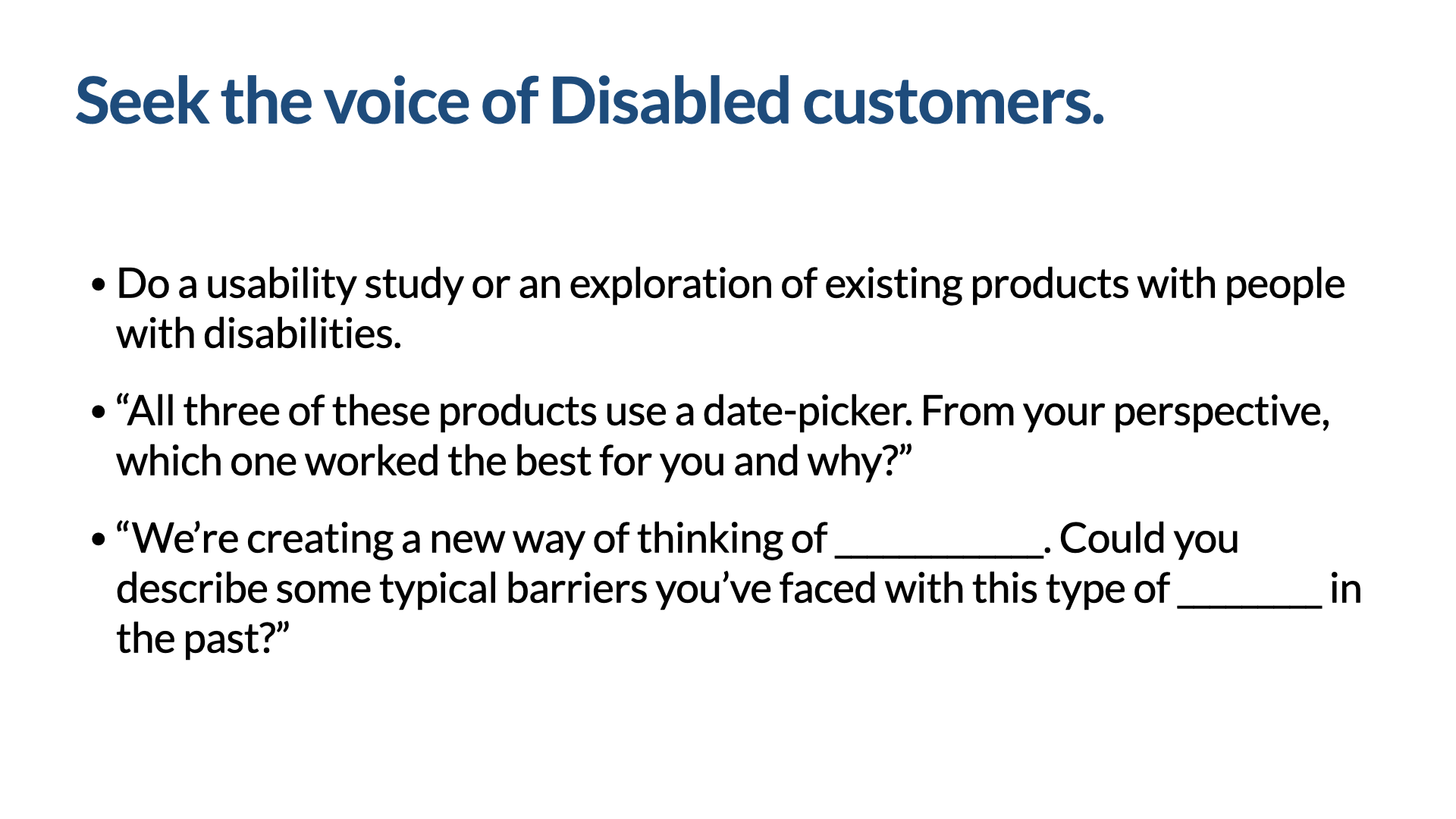
- Explore existing products together: "All three of these products use a date picker — from your perspective, which one worked best for you, and why?"
- Ask about past barriers: "Could you describe some typical barriers you've faced with this type of widget?"
- Involve them in prioritization, so the most valuable components get aligned to accessibility sooner — which helps us ship accessible MVPs instead of inaccessible ones. "We've got a list of 40 building blocks we want to get into top shape. Which ones are most important to you? Which would have the most impact when we get them right? Were there any we didn't include that you'd want added?" (I say "building blocks" because it's unlikely our customers will know what we mean by "component," but "building blocks" tends to carry meaning.)
![Slide titled ‘Prioritization — How might we include people with disabilities in the process?’ It opens with ‘We’ve got a list of 40 web building blocks we want to get into top shape from an accessibility perspective. Let’s say we’re building a ____,’ then four questions: which ones are most important to you; which building blocks would enable you to most effectively use [Product Name]; which will have the most impact when we get it right; and were there any building blocks we didn’t include that you’d want added.](/talks/slides/ids-slide-033.png)
So treat your design system like a product that includes accessibility from the beginning. Operationally, I recommend building accessibility and inclusion into everything — every feature, every component, every sprint — and creating dedicated time and space for it. For example, every quarter, plan and schedule an accessibility-and-inclusion-specific sprint. Include it all the way along, but also give it a thing of its own, where it gets the attention it needs.
Lesson 3 — Your design system is kind of like an authoring tool
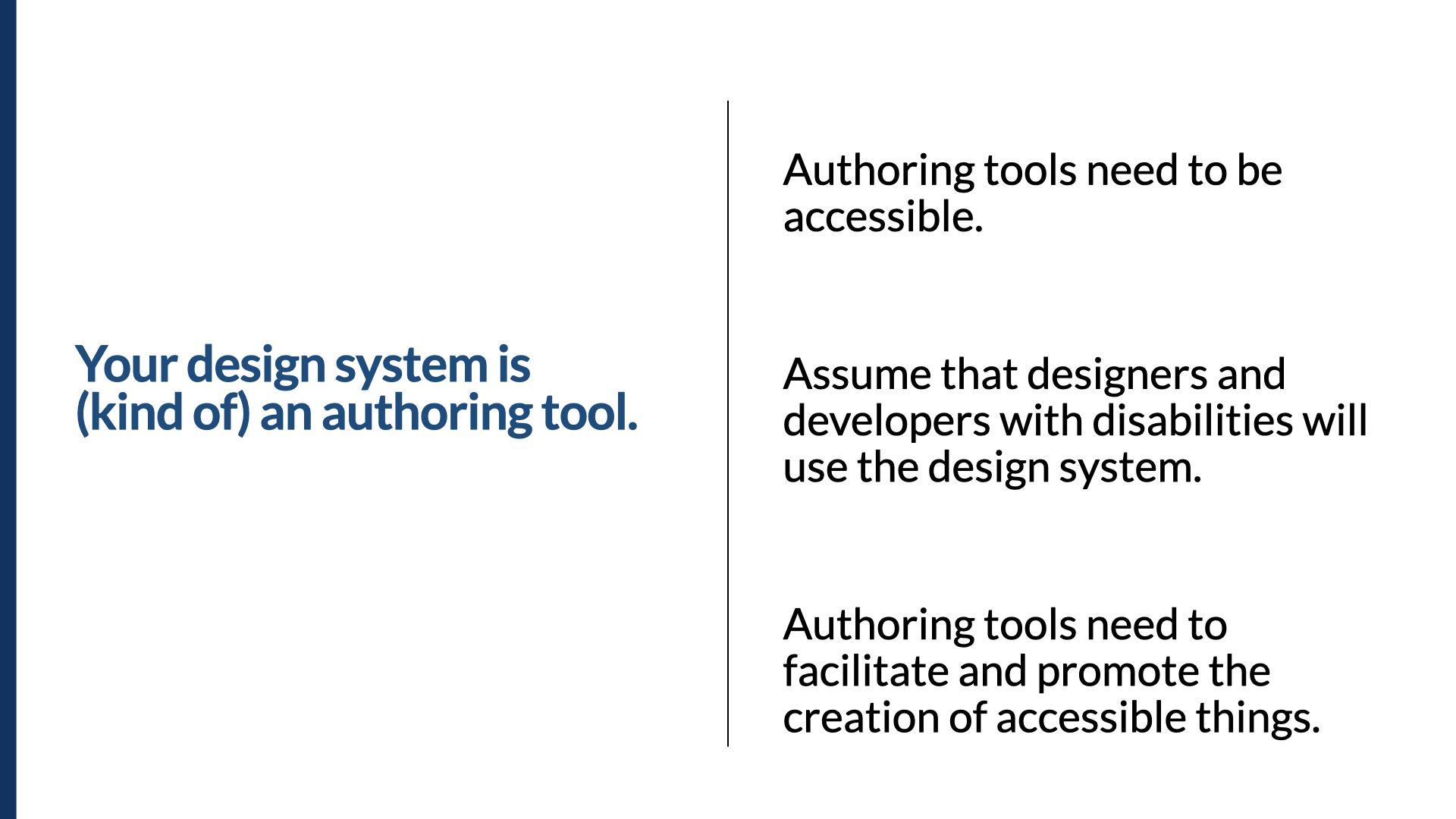
When we think of authoring tools, we usually think of something like Dreamweaver. Authoring tools have two main accessibility requirements: the tool itself needs to be accessible, and it needs to facilitate the creation of accessible things. When you add an image, Dreamweaver has to call attention to the fact that alt text is needed and provide a mechanism for adding it — right below the source field is a field for the alt text.
Many of you know the Web Content Accessibility Guidelines, but you may not know the Authoring Tool Accessibility Guidelines (ATAG), from the same folks at the W3C's Web Accessibility Initiative. A few examples of what ATAG calls for: instructions for using accessible-content features appear in the documentation; examples in the documentation demonstrate accessible authoring practices per WCAG; the tool doesn't let you turn off its accessible-content support (or, if you can, it warns you that doing so may increase the risk of accessibility problems); and if the tool provides mechanisms to set content properties, it also provides mechanisms to set the accessibility-related ones.
Even though your design system isn't exactly an authoring tool, that guidance is instructive. If you think of it as one, there's a good chance you'll make it accessible by itself and ensure the components, documentation, and examples you create are accessible too.
Lesson 4 — Be opinionated about accessibility
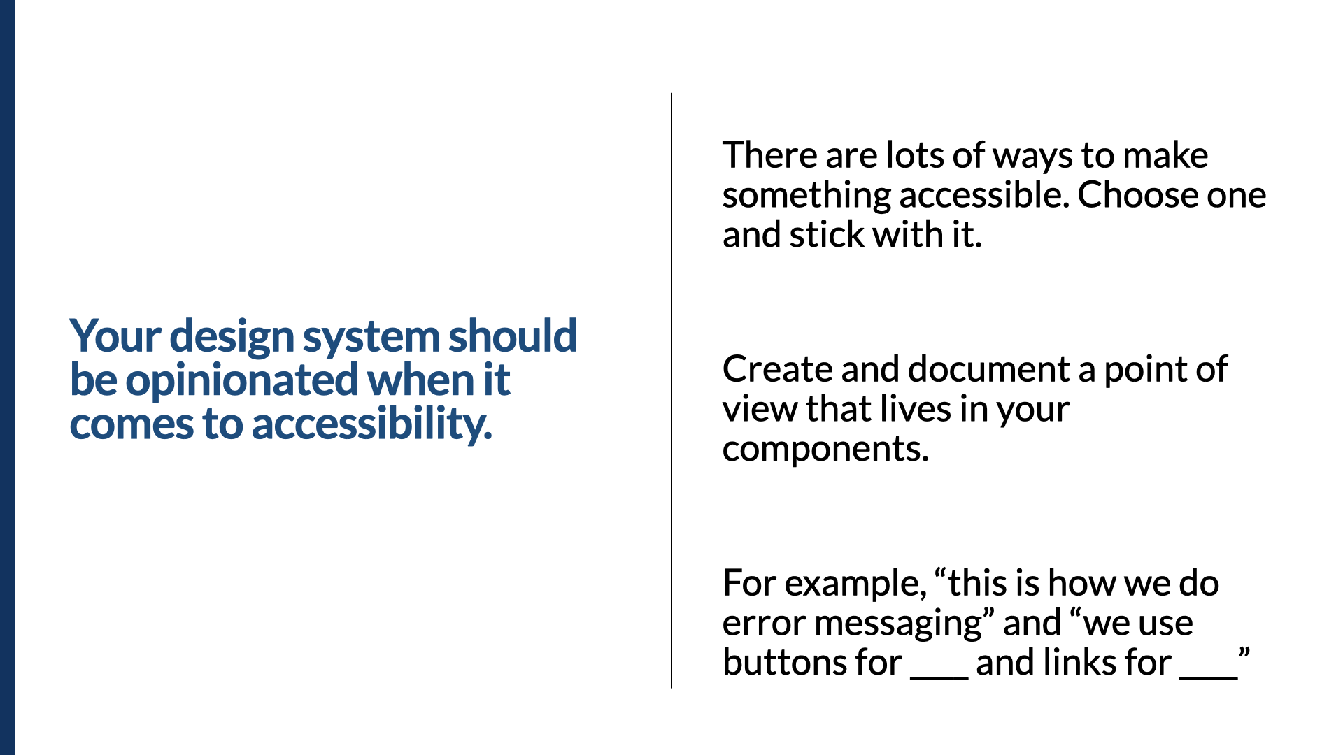
One of the trickiest parts of making things accessible — and judging whether we've created inclusive products — is that there are so many ways to make something accessible. Because of that, your design system should be quite opinionated about accessibility. Most of the good ones are; you just have to know where to look.
I'll be honest: I often judge a design system's accessibility by the quality of its modal dialog. The gov.uk design system is referenced a lot. I was surprised there wasn't a modal or dialog — searching for "modal" returns literally no results. Digging into their discussion, I found really good advice: they've updated their guidance to make clear you should avoid modals in most cases (a timeout is one of the few where a modal is appropriate). Many uses of modals aren't appropriate, but because the pattern is available, people see it as a quick fix.
Eventually the modal made it onto their to-do list, and they refined it significantly. Here's their acceptance criteria for adding a modal — and there's an entire section on accessibility criteria. Some are general and apply to any component; some are specific to modals. The best part: they've gone to the effort to say these are the acceptance criteria, and they've included accessibility criteria very specifically within the definition of "done" for a modal to become part of the design system.
One of the most debated areas is where focus should go. Focus has to go to the modal when you launch it — that's clear. The old general rule was that focus should go to the first focusable item in the dialog. I remember debating that, because in certain cases it's the opposite of helpful. If we're presenting an important message and we focus the first focusable element — the OK button — screen-reader users would miss critical information, because their focus was placed after it.
The guidance from the spec is evolving. The latest ARIA Authoring Practices describes several scenarios where you'd focus somewhere other than the first focusable element: (1 & 2) set focus near the top of the dialog on a static element (give it tabindex="-1") so focus lands before the important content rather than after; (3) focus the least destructive action — if the first focusable element confirms a destructive action like deleting data, focus the Cancel button instead; (4) focus the item used most frequently in that dialog.
So back to that original modal: there are three general options that work — focus the first focusable thing (the OK button); make the dialog title focusable with tabindex="-1" and focus it; or make the dialog itself focusable with tabindex="-1" and focus there. All three are valid. Be opinionated: pick one based on the kind of details your modals usually carry. If there's a need, make the component configurable — but then give designers and developers really clear guidance on which placement to choose.
We also need to decide what type of control to use for interactive things — a link or a button? Both can work, and many people have opinions. My advice: pick one and use it consistently. Even though both would be accessible, it's more important to be consistent. Choose one way, stick to it, and document that point of view in your components — for everything from "this is how we do error messages" to "this is how we use buttons and links."
Lesson 5 — Build guardrails
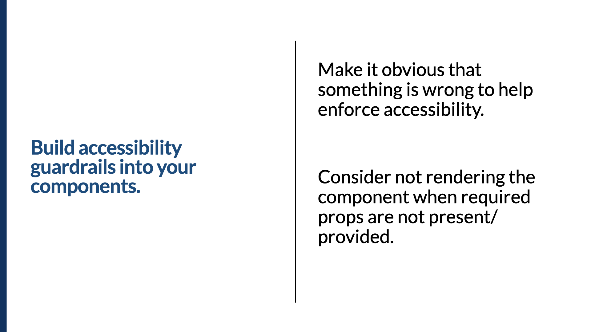
There's another aspect of design systems that can be really useful: enforcement. If you're old like me, you may remember when Netscape 3 would literally not render an entire page if a table element wasn't well-formed — miss a closing </td> and the whole page stopped rendering. It was kind of awesome, because you had no choice but to do it right.
We can take a similar approach to guardrails for your components. Full credit goes to Kathleen McMahon (she's @resource11 on Twitter). I saw her present this concept in 2018 at the Inclusive Design 24 conference, and it's brilliant. She builds the component so that if something required for accessibility isn't provided, the entire component doesn't render. She does it with conditional rendering of an icon as part of a button — no icon name provided, the icon doesn't render, period — and with a required label for a form field, and with managing error states. Guardrails, guardrails, guardrails. (You can find many of Kathleen's decks at noti.st/resource11.) Building guardrails around your components makes it obvious when something's wrong, and it helps enforce accessibility — just like Netscape 3 forced me to learn well-formed tables, the guardrails help people learn accessibility requirements just by using the component.
Lesson 6 — Bring accessibility into your design-system pilots
My friend Dan Mall runs an agency called Superfriendly that focuses exclusively on design systems. I've talked with Dan many times about bringing accessibility and design systems together, and one of the things I loved most was the way he talks about running pilots — how they decide which products are good candidates for a design-system engagement. He told me about their scorecard method, where they score each candidate product on a number of factors. I immediately thought: accessibility should be part of that scorecard.
If we're looking at three different products as candidates, we should factor in accessibility as a measure of efficacy. To give it an accessibility score, ask: Will working on this product give us accessibility wins we can extend to other products? Does it have a higher level of accessibility scrutiny than others? Will it provide great opportunities to include people with disabilities in the process? We should be asking these questions and prioritizing the work where we'll get accessibility wins.
Lesson 7 — Document for the people who *use* the components
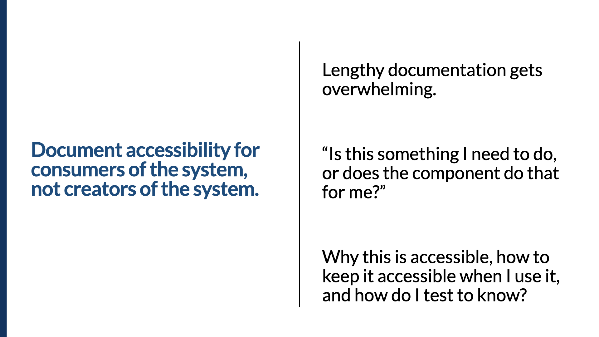
Over the last five years I've reviewed a lot of accessibility documentation in design systems. There's lots of rich detail — but often it's aimed at the wrong audience. We've heard people read documentation and say, "This is great and well explained, but what do I actually need to do?" The documentation was exhaustive and overwhelming, but it read too much like the specs you'd use to build a component from scratch. It became clear we needed to focus documentation on the people using the components, not the people building them.
So focus on three things for component users:
- At a high level, why is this component accessible? Not every detail — just "these are the things we've taken care of for you."
- How do you keep it accessible when you implement it? In other words: these things are your job; the component takes care of the rest.
- How do you test that it's still accessible once you've implemented it?
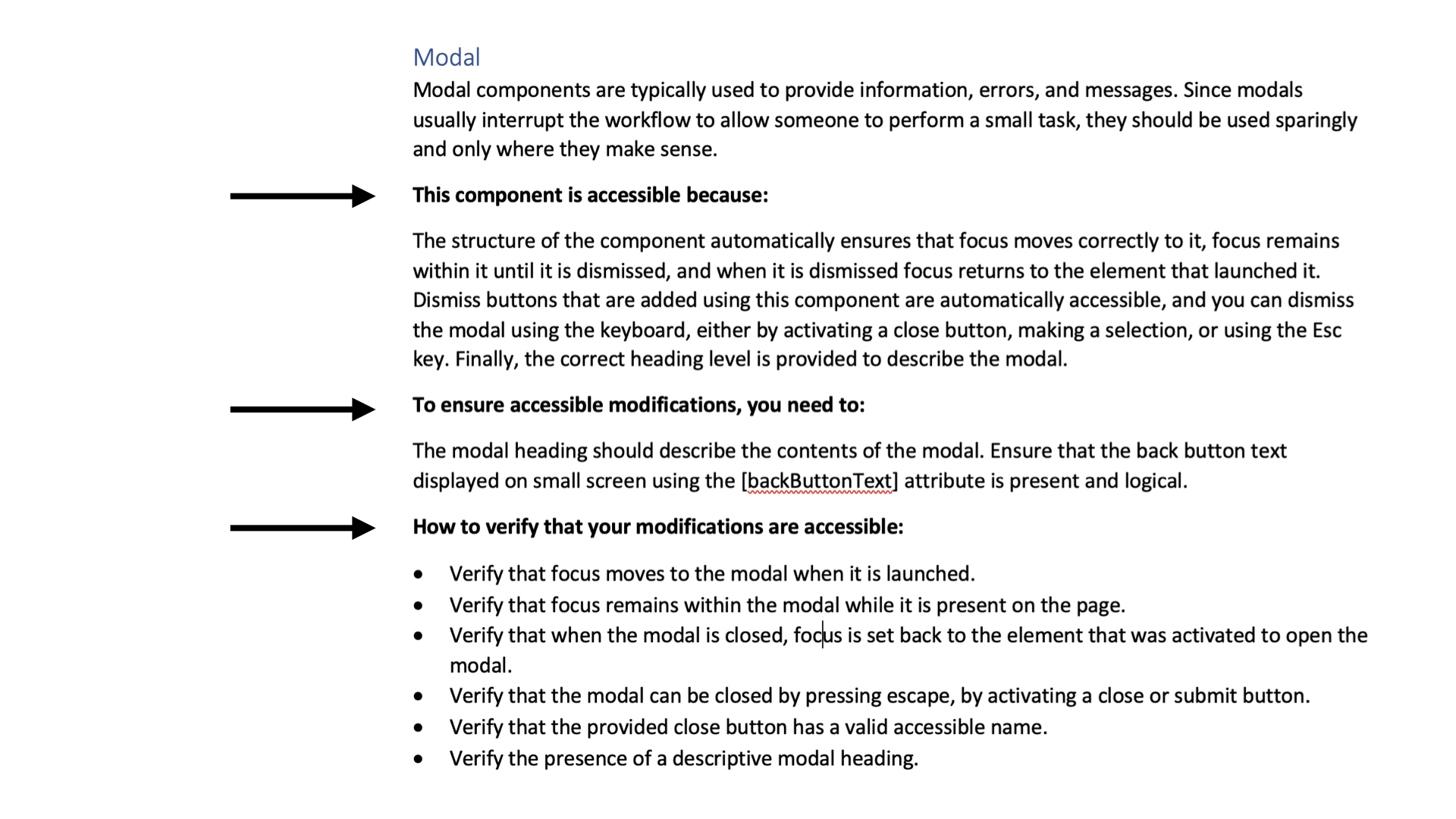
Part of this is making sure people don't randomly remove pieces of components. Here's a dialog, and the same dialog without the heading as its title — because someone decided they didn't want a title. But that title is critical: it communicates the name of the dialog to the audience. So we reinforce that in the documentation. We'd point back to the guidance ("the modal heading should describe the contents of the modal"), show that the actual modal has its "Course selection" notice, and to test it, point to the requirement: "verify the presence of a descriptive modal heading."
The accessibility MVP
Those are some hard-learned lessons over five years, and I hope they serve you well. Now — I've been asked this more often than I care to admit: if you saw all the accessibility criteria gov.uk has for a modal, you saw there were a lot of them. They're all important. But people still ask, "What's the minimum we can do?" I don't love the question — you really do need to do it all — but it doesn't stop people asking. So here's the accessibility MVP for your design system, in three broad categories.
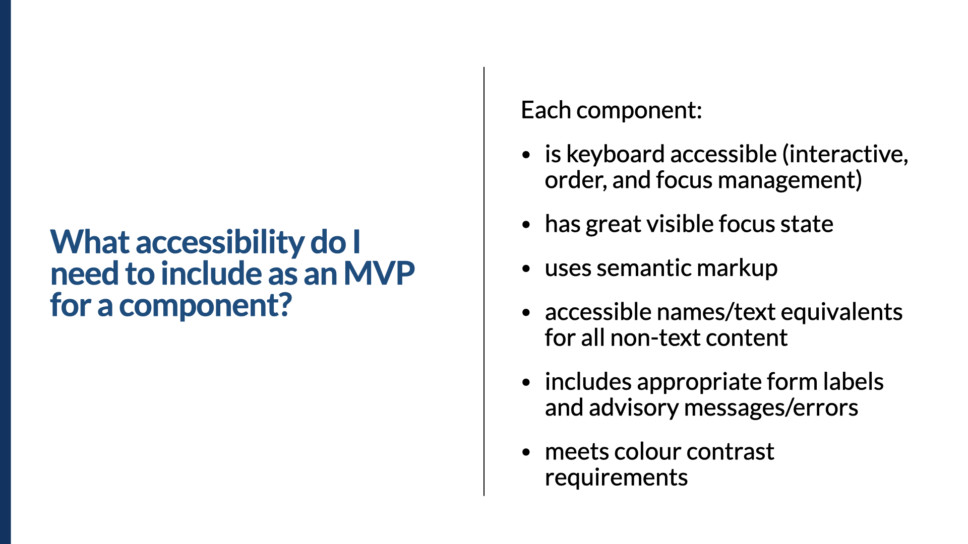
What do you need to include as an MVP for a component? A few years ago we did research into hundreds of thousands of issues we'd logged through our accessibility audits, and close to 70% fell into just a few categories: keyboard-related issues, visible focus indicators, text-equivalent issues, basic semantic markup, forms with labels and error messages, and color contrast. If you can take care of all of those, most components will be in pretty good shape. Your mileage may vary by component, but using this as a starting point sets the tone and prevents you from propagating massively inaccessible components.
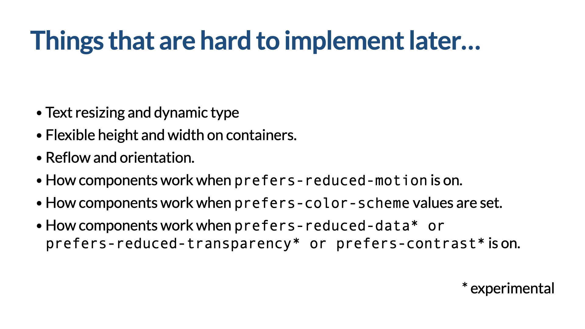
Which accessibility things are really hard to do later? Making components flexible enough to work with text resizing, dynamic type, and general flexibility in height and width. Yes, we have responsive design, but we have to design our components to allow for flexible content. This extends to mobile apps too — orientation, rotating between landscape and portrait, has to be considered from the beginning. And start taking user preferences into account early: have a position and point of view on animation (prefers-reduced-motion is important), and think about prefers-color-scheme, reduced data, reduced transparency, and prefers-contrast. Ask: how should this component work if someone doesn't want any animation? Based on what I've seen on CodePen, you can pretty much animate anything — so take these preferences into account from the beginning, because it's much harder to add later.
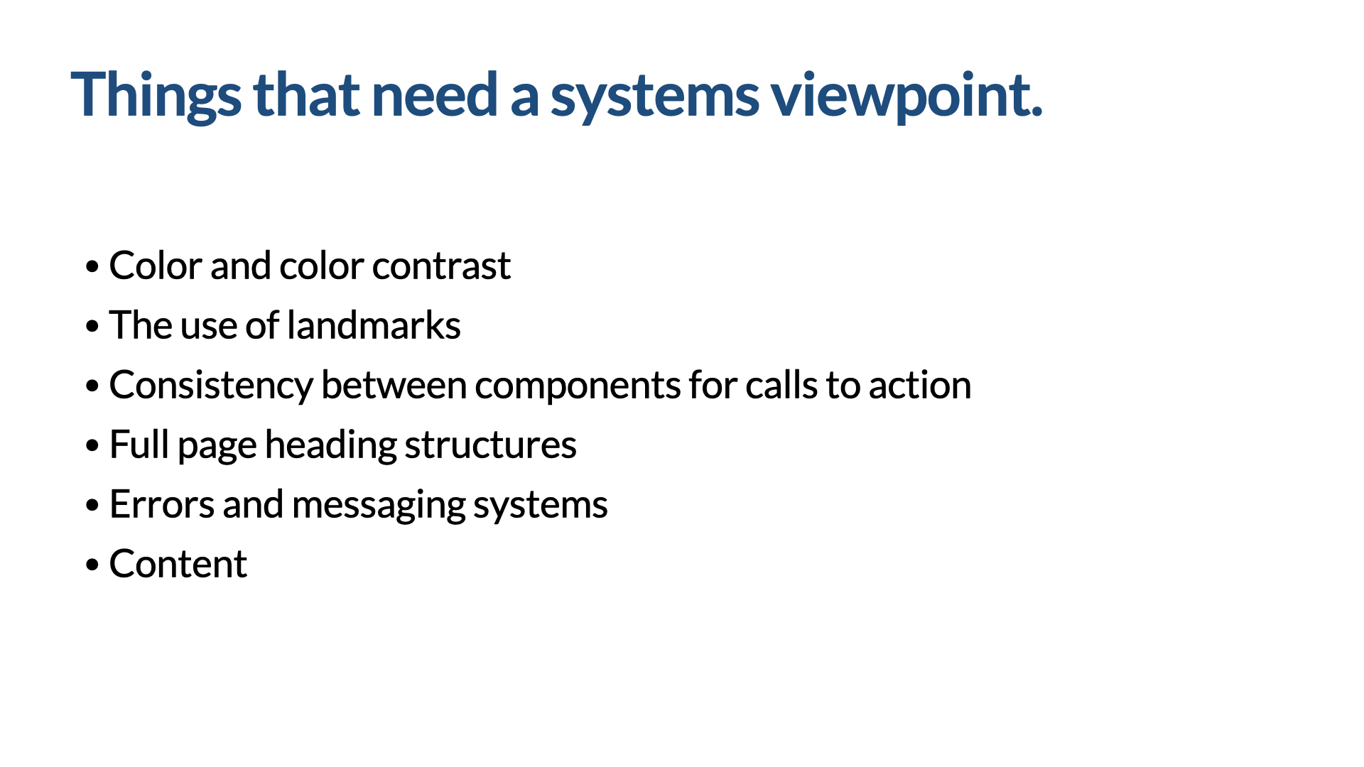
Which things need a more holistic look than individual componentry? Some things need a systems viewpoint rather than a component viewpoint — many of your foundation items: color and color contrast, the use of landmarks, consistency between components for calls to action (links vs. buttons, and the actual content of those calls to action), full-page heading structures, error-messaging systems, and content in general. Just like our Word doc at the beginning, you have to look at the whole for things to make sense. These need review when you're actually building products with the design system.
Test the whole, not just the parts — then feed it back
A quick note on testing. People ask how they should test. We're tempted to test at the most granular level possible — the atoms and molecules. We should test those. But the goal of accessible components is accessible products, so we have to test the products people build: organisms, templates, pages, and full-on flows that aren't even represented in the design system itself. Why? Because we have to test the connections between components — their relationships, the content, the overall order. Did people use components incorrectly, or in ways we couldn't have predicted? Is there something we should make required that wasn't? Do we need to give teams guidance on how to connect component A to component B properly?
Most people will think, "Of course we'll test the product" — and you will. But the part teams often forget is treating the accessibility issues you find in the product as an expression of where the design system could be better. Feed all of that testing back into the components and the documentation. Our goal is to help teams create inclusive designs with those components — and one of the best ways to do that is with really great documentation.
And I don't just mean documentation of the components — I mean annotating your designs. You can have all the right components, but annotating your designs is the glue that holds the end product together; it facilitates great handoff between designer and developer. One of my favorites here is the accessibility library for Figma recently launched by the team at Indeed — if you want the details, look up Stephanie Hagedorn's Medium article, "Building an Accessibility Library." It helps designers annotate their work to express the connections between components — the things the individual components won't take care of for you. Another is the Accessibility Bluelines kit from Jeremy Elder, which has a heavy focus on keystrokes and logical ordering, letting you express the pieces of accessibility that components don't.
In summary
I know this has been a lot, but it's important. There's so much good work we can do, and when we build this into design systems, we set ourselves up to make the digital world much more accessible and inclusive to people with disabilities. Remember:
- Accessible components are the starting point, not the end point.
- Invite people with disabilities into the process where you can.
- Design, build, and test an inclusive design system — and the inclusive products created with it.
This was Inclusive Design Systems. Thank you for your time and attention.