Built In, Not Bolted On
Bolt accessibility on at the end and it costs more, takes longer, and still misses the basics — get it right by building it into every step, from the first question to the final review.
From An Event Apart, my talk Built In, Not Bolted On: How to Get Accessibility Right from the Start. It's built on one idea: when you bolt accessibility on at the end, it costs more, takes longer, and still misses even basic compliance — but when you build it into the process from the very start, accessibility becomes the efficient path, not the expensive afterthought.
A note added since this 2021 talk. I open with Unilever's Degree Inclusive — "the world's first deodorant designed for people with disabilities." Since I gave this talk, that launch has drawn pointed and fair criticism from disabled designers. Liz Jackson, who coined the term "Disability Dongle" in 2019, and her co-authors Alex Haagaard and Rua Williams name Degree Inclusive as an example: it won the Innovation Grand Prix at the Cannes Lions International Festival of Creativity, yet still isn't commercially available. When a product designed with disabled people collects awards but never reaches the people it was made for, the accessibility was the optics, not the outcome.
I've kept the example, because that criticism sharpens the talk's point rather than undermining it. "Built in, not bolted on" is about exactly this line — accessibility as award-bait feature versus accessibility as a function you actually ship. Degree Inclusive sits on both sides of it: a genuinely thoughtful rethink of a product's features, and a caution about what happens when the work stops at the launch and the product never reaches the people who'd use it.
Here's the whole talk, three ways. Watch it, take the two-minute read, or go through the full talk with the slides. Use whichever fits how you work right now.
Watch
Prefer to read? Jump to the full talk. A complete transcript is available in the player's captions and in the narrative below.
The two-minute read
Get accessibility right from the start by building it into the process, instead of bolting it on at the end. When you bolt it on, you're retrofitting: it's harder, it's slower, and you still miss things. When you build it in, it's just part of how the work gets done. That doesn't mean it's perfect... it just means that you're more likely to succeed. This is about mindset and ways of working: treat accessibility as a list of features and it's easy to leave them for later; treat it as how the product needs to function and you almost have no choice but to build it in. It's not the features that make something accessible. It's the features and the function.
Eight steps for success:
- Ask questions first — research with disabled people before you commit to a solution; understand the problem space, not just whether your solution works.
- Figure out the right content and functionality — prioritize and surface what disabled people told you matters, as a deliberate product decision.
- Requirements and prioritization — write requirements as functions, not features. Functions ("one-handed operation") are hard to bolt on; features ("a hook") invite it.
- Test your concepts and designs — early, when the cost to change your mind is still low: color, icons, error messages, notifications.
- Document and annotate your designs — linear order, focus-path changes, accessible names, keystrokes, component types. Put ~30% of your tactical effort here.
- Use accessible components — your design system is leverage; put ~40% of your tactical effort into it (and it's a strategic investment, not just a tactical one).
- Test your development iterations — shift left, and test with the least complex tool that does the job. ~30% of tactical effort.
- Do a final review — content, dev, and design questions you've actually been answering all along.
The single most important idea: make accessibility part of every feature, rather than a feature of its own. The moment it's its own feature, it's too easy to leave in the backlog for "phase never."
And if "that ship has already sailed"? The accessibility MVP: ask three questions of five people with different disabilities at three points — before you start, during the process, and at final review. Test color and contrast, linearization and flow; document the keyboard and focus path; test keyboard and semantics during development; and include at least three disabled people in the final review.
The full talk
This is the narrative I used to present the talk, lightly cleaned for reading. It doubles as the transcript.
In this talk:
- The deodorant
- The scenario
- The ideal process — and reality
- Eight steps for success
- The accessibility MVP
- In summary
The deodorant
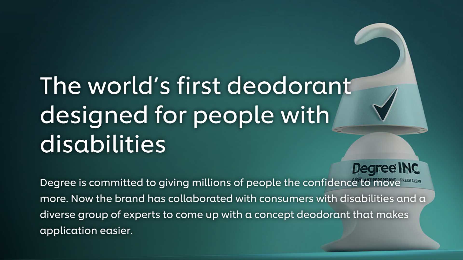
In April of 2021, Unilever announced a new product: Degree Inclusive, a deodorant that was designed with people with disabilities as part of the process. Through interviews and consultations and iterating through multiple prototypes — all of which included people with disabilities — they ended up creating this brilliant, useful design. You may notice some interesting things about the deodorant itself, and I encourage you to go watch videos about the creation of Degree Inclusive. The container uses a hook at the top, and there's a grip at the bottom that lets people with limb differences apply the deodorant effectively. There's a larger-than-typical applicator ball. And there are six magnets that help close the lid.
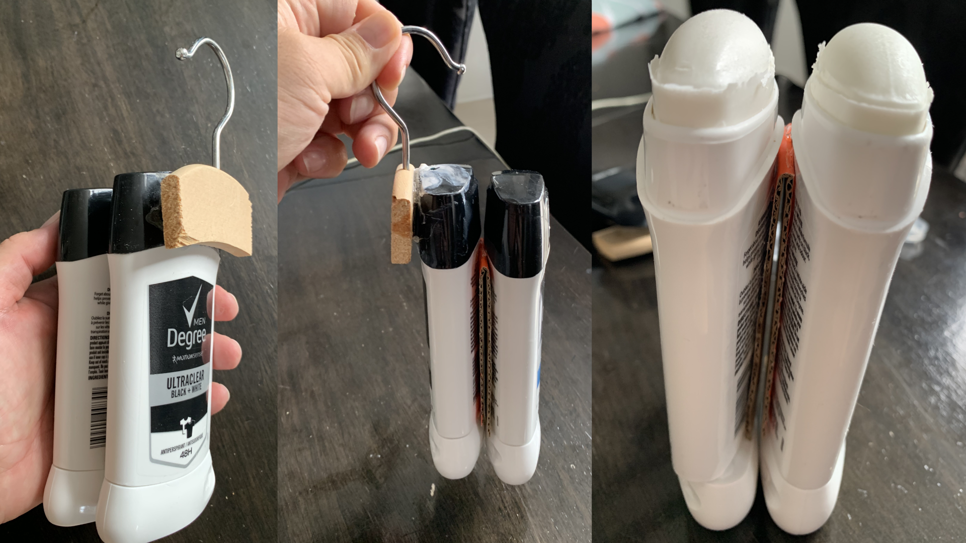
I took a look at that and decided to take a crack at it on my own — but instead of starting from the very beginning, I decided to start with some pre-existing deodorants. Here you can see some of my additions to these existing deodorants to add those accessibility features: the hook on the container, and the large application surface. We'll come back to this a bit later, but there's a clear difference between accessibility being built in versus bolted on.
This entire talk is centered around one goal: getting accessibility right from the start by building it into the process, rather than trying to bolt accessibility on at the end. I'm Derek Featherstone, and I've been working with teams for over 20 years on getting accessibility right — and there have been a lot of things I've learned along the way.
When we get it right from the start, we not only aim to create that seamless experience — we also have a greater chance of meeting the basic accessibility needs of people with disabilities. When accessibility is bolted on or added later, it doesn't feel like part of the product. It feels like an afterthought, and quite often you'll miss meeting even basic levels of accessibility compliance.
The scenario
So: you and your team have won a bid to create a new web app for a Fortune 500 company. Your team worked hard to win the business. Accessibility was one of the requirements, and you won the pitch based on your team's talents, your experience, and your promises to ensure the web app is accessible. You've had some experience with accessibility before — but you've also had your share of bumps and bruises along the way.
On the biggest and most complex web app your team has delivered, you and your team had to rework things after launch because people with disabilities experienced barriers. Even though you did things right and your testing team signed off, there were still things that needed attention. It ended up costing you all the profit margin you'd made on that project, and it definitely ended up on the radar of your leadership team. It's not that you didn't deliver on accessibility — you did. But it took longer, it cost more, and it wasn't efficient.
So here we are, about to dig into this new gig, and it's time to do it right. We want to minimize the chances of having to rework. We want to prevent those accessibility barriers from happening even before we start building the app. So you sit down with your team and ask: how do we do this right?
The ideal process — and reality
Your team puts their heads together, collects the sum of all their varied experiences with accessibility, and creates a guide — the steps you need to follow to ensure your app is accessible from the very start, and maybe even before you got started.
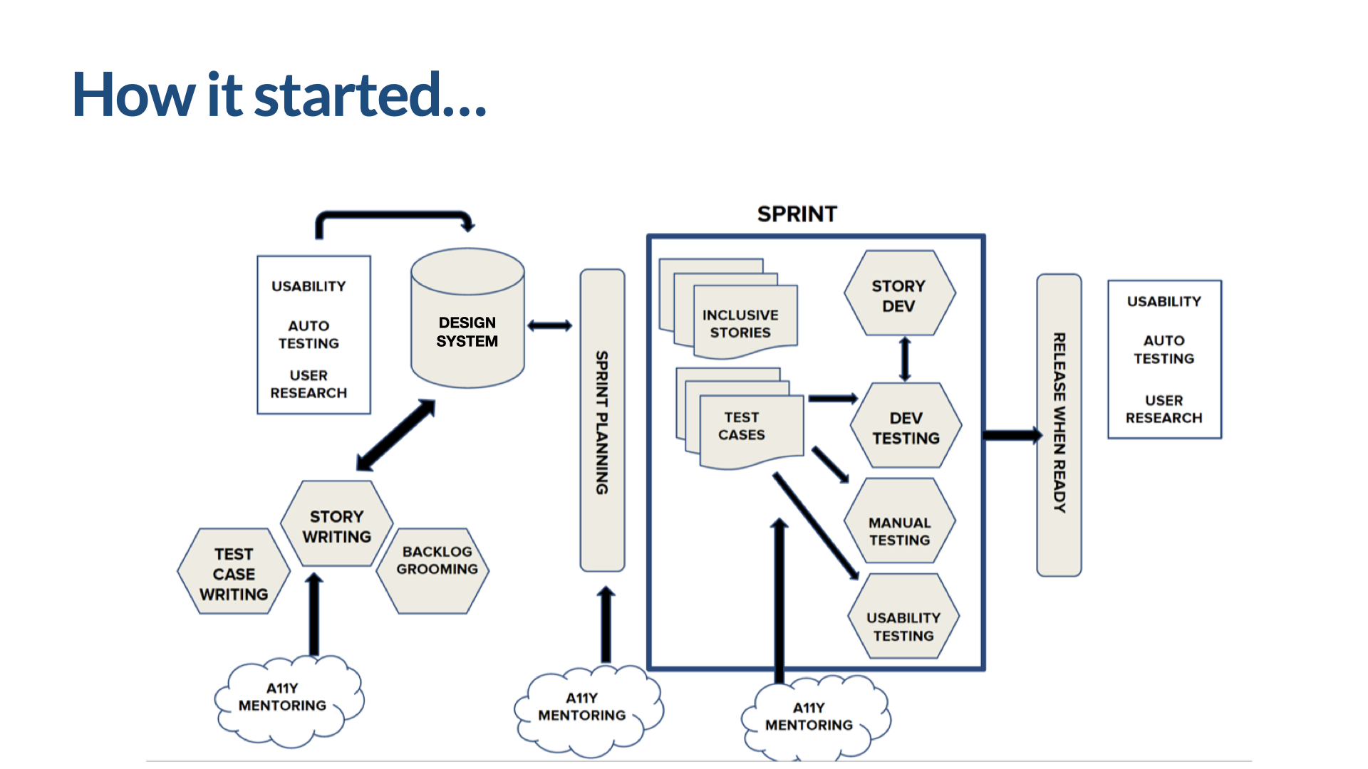
Here's your team's idealized process. It likely isn't perfect, but you can see all the things you'd expect in an agile process: sprints of work that use inclusive stories and accessibility-specific mentoring and coaching during the sprints. There's also mentoring during sprint planning, and working with the product team to write stories, groom the backlog, and get ready to do the work. A similar level of effort went into making sure the components in the design system are accessible, too — which allows for a lot of leverage down the road.
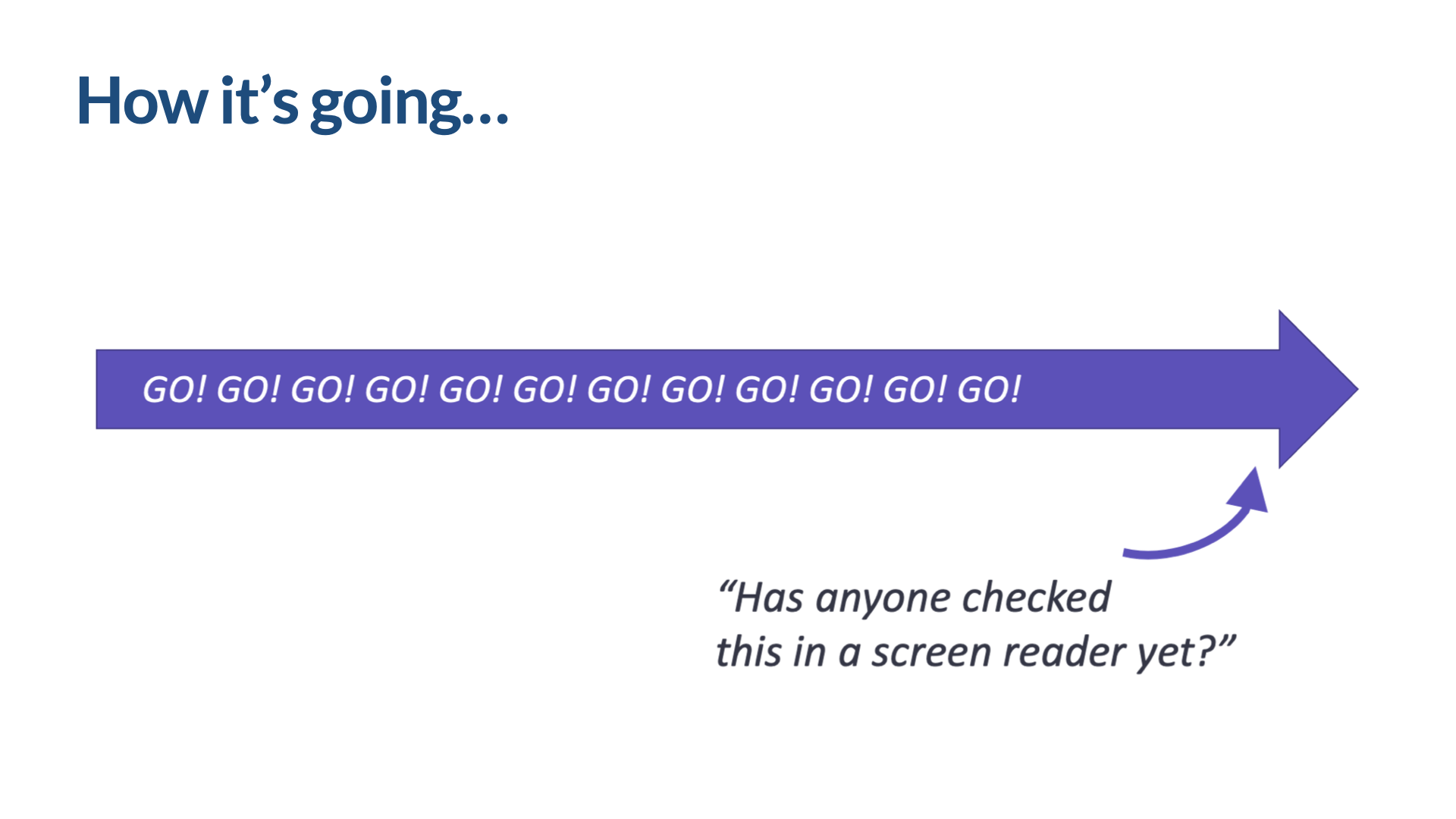
But like I said, this is an ideal. Accessibility coaching and testing is integrated into the process — but sometimes this just isn't reality. The process often ends up more like this: we go in a straight line, as fast as we can, and don't come up for air until we're done. And that's where we face that moment of panic when someone pipes up near the end and says, "Has anyone checked this in a screen reader yet?" The team scrambles, and it doesn't go well.
Eight steps for success
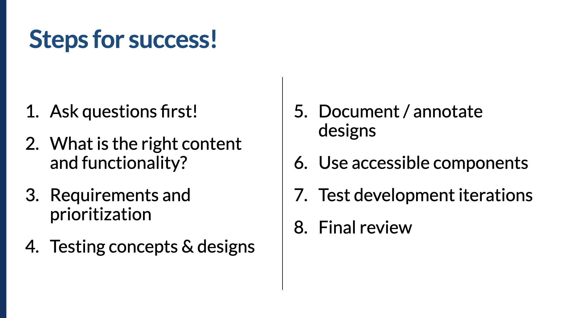
These are the steps your team came up with. They're tried-and-true methods that helped them avoid previous missteps and do more of what's worked well in the past. It doesn't matter exactly how you do these steps, but it does matter that you put time into each one. And keep in mind: this isn't your entire process. This is just how you incorporate accessibility along the way.
To do this well, you should: do research with people with disabilities, using surveys, prototypes, usability studies, and other methods; create content and functionality that prioritizes people with disabilities; understand and incorporate accessibility requirements into the entire process; test your design iterations; document your designs for the development team; implement the design using accessibility-vetted components; test your development iterations along the way; and then do a final accessibility review that includes people with disabilities.
Boiled down into steps for success: we ask questions first, we figure out the right content and functionality, we go through our requirements and prioritization process, we test our concepts and designs, we document those designs, we use accessible components, we test our development iterations, and we do a final review.
1. Ask questions first
If we want to make things accessible and inclusive, we need to ask more questions. It isn't always easy to work this in, particularly if the app has already been envisioned a certain way to solve a certain problem and design has already started. But if you can, find a way to do this early — before you head down the path of creating a solution. Find out more about the barriers people with disabilities face.
Indi Young shares her thoughts on the importance of digging into the problem space and understanding its relationship to the solution space. I love this way of thinking. Once we're in the solution space — already headed down a path, creating a solution, and engaging with people with disabilities there — we're trying to figure out if our solution is right. But when we're in the problem space, we're trying to find out what's the right problem to solve.
There are a lot of ways to engage people with disabilities before you've started working on solutions. Shawn Lawton Henry wrote a book called Just Ask: Integrating Accessibility Throughout Design, full of practical, quick ways to engage people with disabilities in the overall process — surveys, interviews, exploratory usability studies, reviewing prototypes. It's a great place to start with the research process. It could be as simple as asking: "We're working on [blank]. Can you tell us about your experiences using things in this product category, and how it does or doesn't work for you?"
2. The right content and functionality
Once you hear the answers to that, you can start to figure out the right content and functionality. Through the interview process, people with disabilities have told you their priorities. They've told you the barriers they've faced, and the things that might eliminate those barriers. They've told you what matters to them, with competitors' products or your own. They've maybe even told you which barriers will send them packing, and which ones they'll put the effort into working through.
Here's what I mean by prioritizing content and functionality for people with disabilities. Say we interview several people with disabilities, or review some survey responses. We might find that one of the most important factors for someone with a disability when looking for a new job is whether a company values diversity, equity, and inclusion. Organizations can easily add that kind of statement to their About page or company page on a job site. But when they do, it's mixed in with all the other content, and it isn't available in a predictable, named location.
But if we knew that was important — and we ran a site like LinkedIn, for example — we could call it out and make it a bit more formal, like this. We could let companies formally and publicly commit to DE&I by turning this section on on their company page. This functionality doesn't exist today, but it's the kind of thing a company that does research with people with disabilities might find out through its interview and survey process. This subtle difference can make a big difference — and that's what I mean when I say we should create content and functionality that prioritizes people with disabilities. As is almost always the case, given the intersectionality of inclusion, this would be useful to more than just people with disabilities; it would likely help other communities that are so often excluded.
3. Requirements and prioritization
Once we've decided what content and functionality matter, we need to start getting it ready: visual and interaction designs, copy and interface labeling and instructions and error messages and calls to action, infrastructure, and ultimately coding the interface. To do that, we turn to the requirements. And there's a specific way to think about requirements that leads to more success with accessibility.
Going back to Degree Inclusive: you may have noticed the hook on top that lets you hang it up as part of opening and closing, the larger-than-typical applicator ball, and the six magnets that help close the lid. A larger roll-on applicator means the product reaches a greater surface area per swipe. The label also includes instructions in braille. If we examine that more closely, we see a bunch of features listed — and we might think of any of them as requirements: the hooked container, grip placement at the bottom, magnetic lid closures, a large applicator, and a braille label. That gives us a list of things the deodorant needs to have to be accessible.
Like I said, I can create something that meets those requirements fairly readily, by adding onto what already exists. I've got the hooked container. The pre-existing deodorants already have a grip at the bottom, so that requirement's met. I couldn't do magnetic lid closures, so I've decided to leave that in the backlog for later. I've got a large applicator, simply by putting two deodorants together. I don't have the braille label — I'll leave that one in the backlog too.
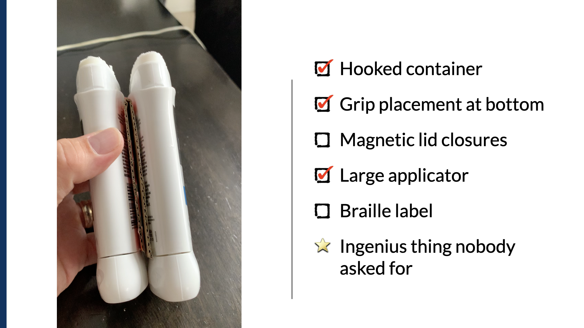
And if you look more closely, I had to create a mechanism to separate these two individual deodorants so I could use the twist bottom. That wasn't in the original features list — but I think you'll agree this is an ingenious thing that absolutely nobody asked for. It definitely gets me a gold star.
So what if we take all those features and instead turn them into something about the way the deodorant functions? What if we design and build with that in mind — the function, not the feature? If we do that, it's not easy to bolt on accessibility. You almost have to build it in.
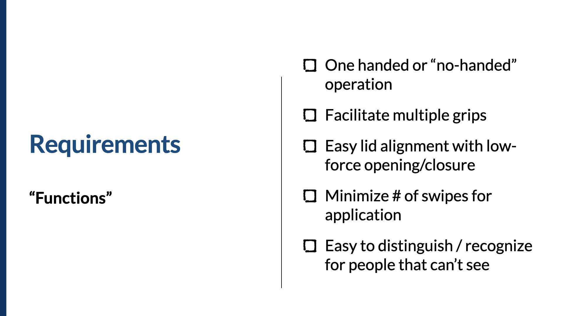
So instead of the hooked container, what if we thought about one-handed or no-handed operation? Instead of a fixed grip, what about facilitating multiple grips? Instead of magnetic closures, what about easy lid alignment with low-force opening and closure? Instead of large applicator, what if we think: minimize the number of swipes for application? And instead of braille label, what if we think: make this easy to distinguish or recognize for people who can't see?
When your requirements are about how something functions, it's easier to build it in from the beginning. When you think about accessibility as a set of features, you're almost tempted to think of it as a thing to be bolted on later.
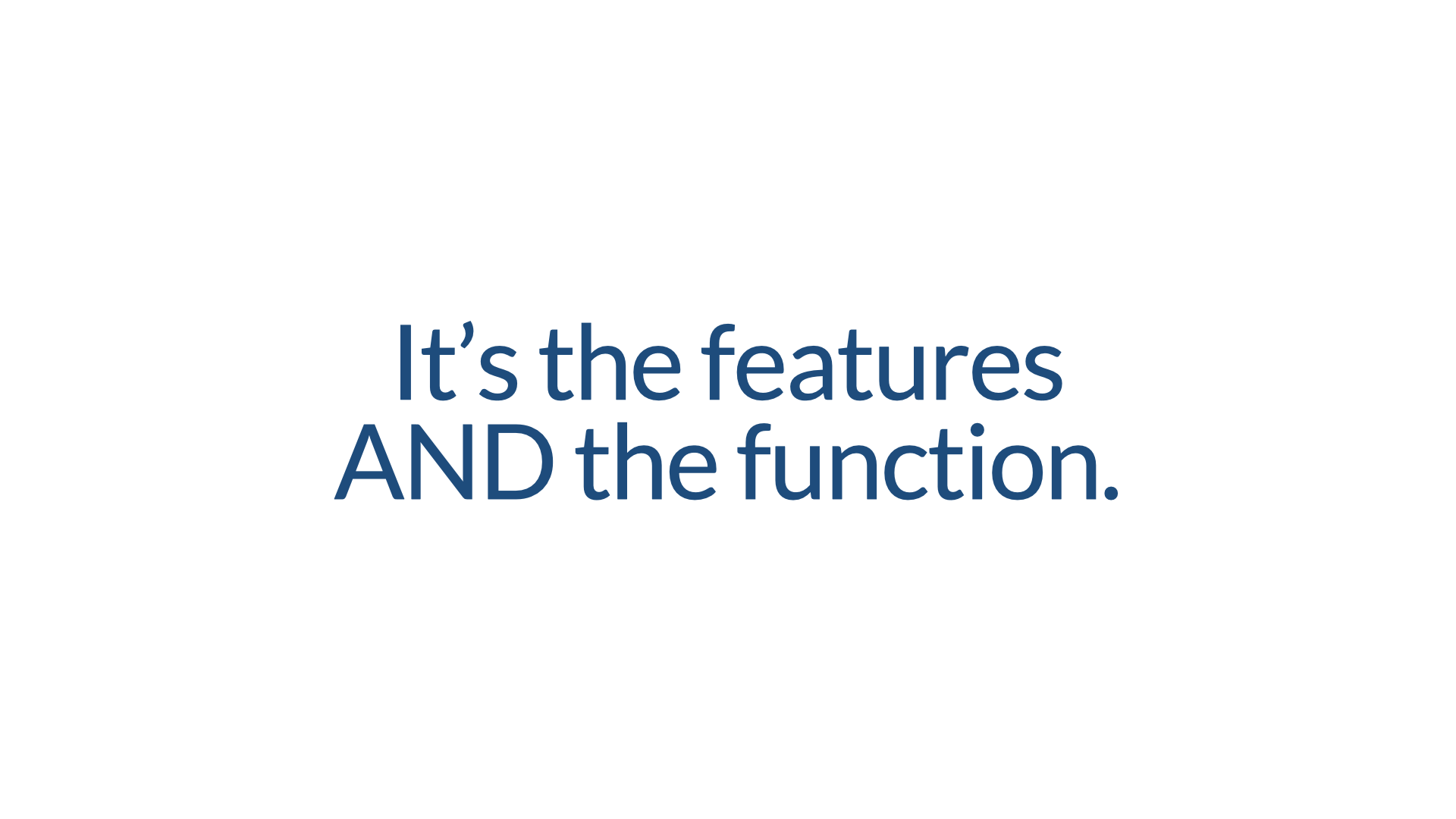
It's not the features that make it accessible. It's the features and the function.
To represent accessibility well in your process, incorporate it into three main areas. (This assumes you're using agile, but you don't have to be.) First, your definition of done — so it's well-defined beforehand and everyone agrees on what needs to happen for something to be released. Some examples: there are no automated test errors, there are no P1 or P2 issues, and we scored 3.5 or higher for all key task flows. Notice that third one — that's a way of building in that you've worked with people with disabilities to make sure things work reasonably well. Scoring things on a task-flow basis almost implies you're working with disabled people to test key task flows, rather than just doing technical and automated testing. We're not asking for perfection — but we do want things to work reasonably well.
The second place is your design system. When you build necessary behaviors and attributes into your design system, you get a lot of accessibility with low implementation effort. That's serious leverage, and it helps propagate good accessibility across the products you build.
And finally, build accessibility in at the execution level — integrate it into your stories and annotations. Building accessibility into stories is useful because it lets you add the one-off notes your design system components may not account for. Things like: "After updating the color swatch, the system announces the new color, and focus moves to the next available color for the product." Or: "When the modal date filter is closed, focus returns to the latest date in the month that is selected."
On the whole, this tends to be the domain of product managers and owners. So if you're one of those, a few things to think about: Is accessibility part of your MVP? Have you included accessibility in your stories or other non-functional requirements? Is it part of your definition of done? Have you built it into the ceremonies and processes your teams use? If you can answer yes to those four, you're well on your way.
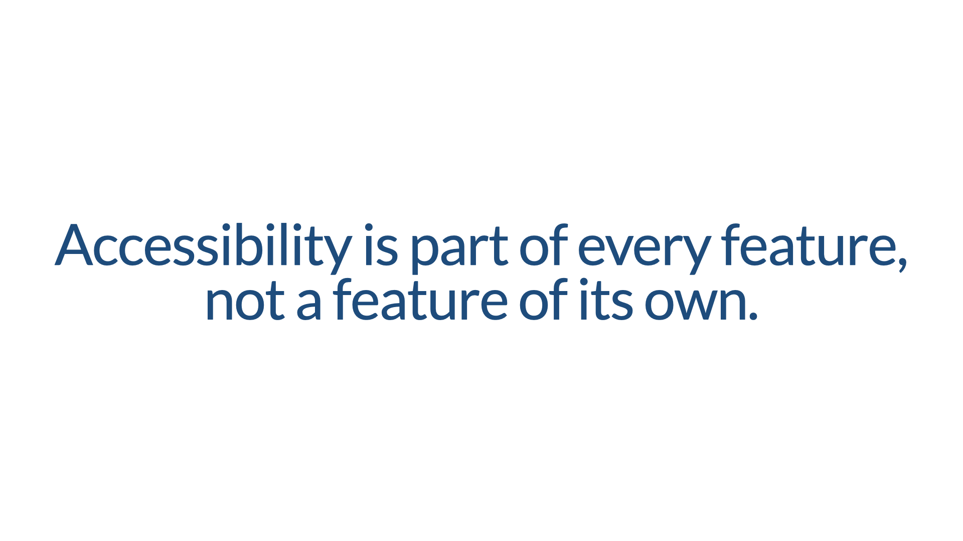
And perhaps the single most important thing you can do as a product owner or manager is this: ensure accessibility is a part of every feature, rather than a feature of its own. When it's a feature of its own, it becomes way too easy to leave it in the backlog for phase never.
4. Test your concepts and designs
Once that's done, we turn to designing and building. Getting early feedback on your designs is always useful. The longer you go without feedback, the harder it is to change.
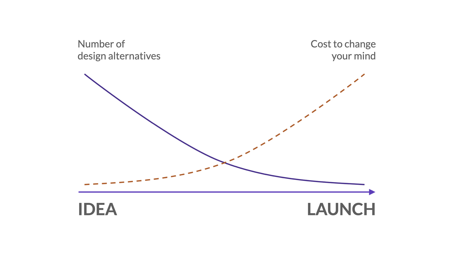
I'll always be grateful for having seen Jeff Veen speak earlier in my career. I remember him sharing this at a conference. At the beginning of the process, when you're working with ideas, you have all kinds of design alternatives and it costs you almost nothing to change your mind and go another direction. But as you approach launch, your number of design alternatives goes down and the cost to change your mind goes way up. I think I saw him present this graph in 2005, and it shaped the way I looked not only at design, but at accessibility. The sooner you get feedback on accessibility, the less it will cost you to change your mind if you weren't doing it right.
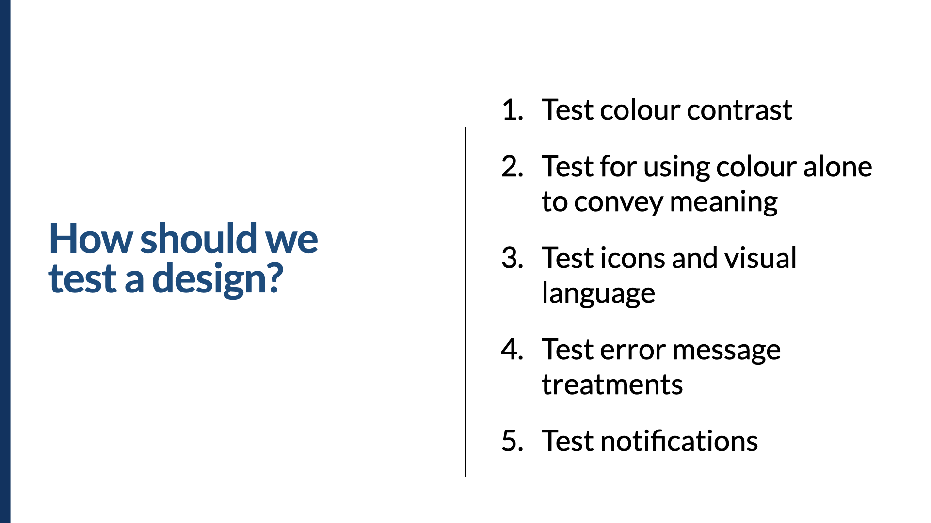
So how should we test a design? Most people think of color contrast, but I like to push it further. We need to check that we aren't using color alone to convey meaning. An example I always think of: when you're editing a document online collaboratively and more than one person has the same initials, how do you know who's who? Google Docs uses colors and icons associated with names and accounts. Microsoft Word 365 uses different colored circles with initials in them — so if two people have the same initials, the only way to tell them apart is the color of their circle. In that case, they're using color alone to convey meaning.
You also want to test your icons and visual language, early. Put your icons in front of a diverse group of people, especially including people with low vision. Check whether they work when magnified or blurry. Are they recognizable? Distinguishable from one another? Do the shapes work? Down the left-hand side of a screen, a set of icons all have meaning — but for someone with low vision, a gear and a speech bubble may look too similar.
Test your error messages and treatments, again particularly with people with low vision. Are the error messages in a good place? Is the text too small? Is it a color that's hard to read at magnification? Is it italicized in red? The combination of italics and red is notoriously harder to read in long passages for people with low vision.
And test your notifications. Are you using toasts? Are they up in the top right, or in the middle of the screen? Do they persist? How easy is it to learn where to look for them, and can someone find them before they disappear — or not notice them at all? All of these things can be tested at a prototype stage, or in a live product. But you could test them much earlier, in a mock-up stage, if that's where you are. The earlier the better — and if you can iterate to check your changes, even better.
Before the next section, one quick reference. I'm about to go into a bit more detail on the Web Content Accessibility Guidelines version 2.1, so I want to point you to the WCAG quick reference — one of my favorites. It's up to date, and it's filterable not only by level (A, AA, AAA) but by role. So if you're a designer or a developer, you can find what's specific to you. In the next section we'll talk about some specific success criteria; if you're not familiar with them as we go, that's totally fine — just make a note to come back to this quick reference and learn about them afterward.
Some statistics
I work at a company called Level Access. We're an accessibility software and services company, and we've been in business for more than 24 years. Most of our time and effort is spent working with teams, helping them improve their accessibility process — and one of the ways we do that is by testing their software, websites, and applications. We have statistics going back well over 20 years, logging both automated and manual accessibility issues.
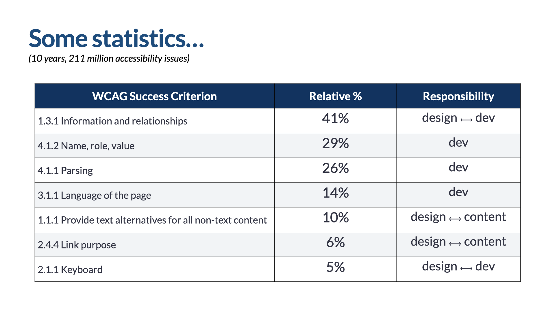
I pulled the data for the last 10 years and found that in that time we'd identified 211 million accessibility issues. The number one issue by frequency was 1.3.1 Information and Relationships, showing up 41% of the time — meaning over 80 million of those 211 million issues are all about 1.3.1. Then 4.1.2 Name, Role, and Value at 29%; 4.1.1 Parsing at 26%; 3.1.1 Language of the Page at 14%; 1.1.1 Text Alternatives for all Non-Text Content at 10%; 2.4.4 Link Purpose at 6%; and 2.1.1 Keyboard at 5%.
I bring these up not for numbers' sake, but to focus on some specific areas of responsibility. Who's responsible for success in each one? Information and relationships needs really close collaboration between design and developers, to make sure the information and visual relationships in a design actually get translated into code and presented to people using different forms of assistive technology. Name, role, value; parsing; and language of the page rest squarely on the shoulders of developers. Text alternatives requires heavy collaboration between design and content — same for link purpose. And keyboard is again heavily reliant on significant collaboration between design and dev. So with those statistics about where we've typically failed as an industry, keep them in mind as we look at the next steps in an ideal accessibility process.
5. Document and annotate your designs
Our fifth step is to document and annotate our designs really well. I'd suggest you put about 30% of your tactical accessibility effort into ensuring clarity between designers and developers.
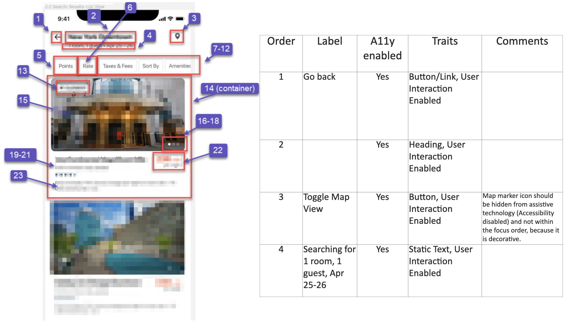
Here's one example. On the left is a screen annotated with numbered callouts; those callouts refer to the table on the right, which lists the order of the components, the label for each, whether each is accessibility-enabled, its traits, and any comments. This is an iOS app, which is why the language is about labels, accessibility being enabled, and traits — common terms for iOS accessibility. In web terms: the label might be the text equivalent; accessibility-enabled is whether something should take focus when a screen reader is used; and the traits are the type of object it is — a button or a link, a heading. These are the web equivalent of the role something has.
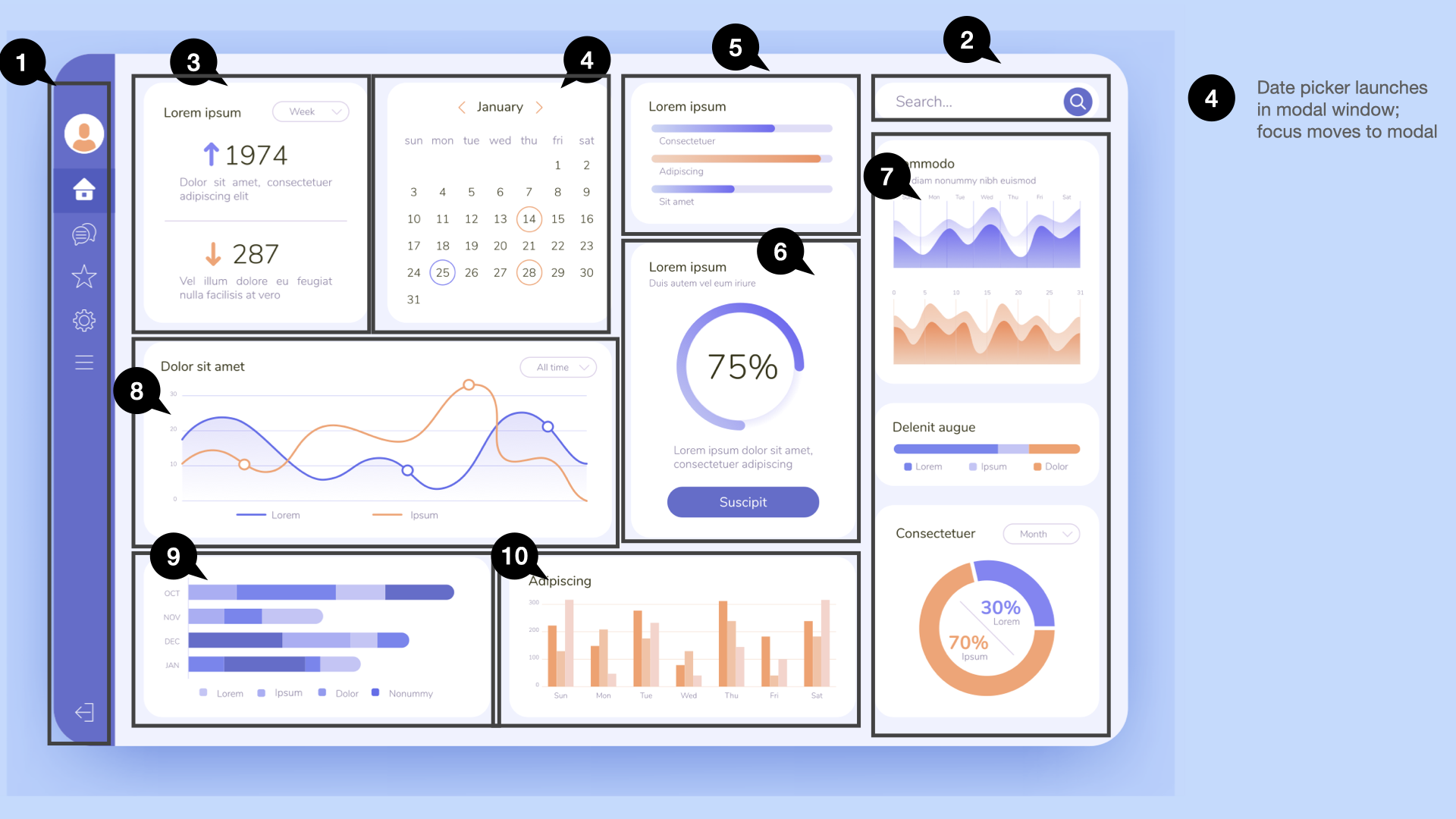
Here's the web app we're working on. We've annotated everything in terms of order, with those little speech-bubble callouts. Based on patterns of use, we've decided the most efficient keyboard path goes from the navigation on the left over to the search box on the right, then through each widget on the dashboard from top-left to bottom-right. You'll also notice in the right margin the date-picker callout, telling us the date picker launches in a modal window, and that focus should move to the modal itself.
There's another possible logical order, too: start with the navigation, move across the top to the search box, then down through the other widgets. You may notice other callouts calling attention to specific keystrokes — using the Escape key to collapse the navigation; the Tab key to move between widgets; the arrow keys within a widget; and the Escape key to stop interacting with a widget. That lets you move from one widget to the next with Tab, while keeping the rest of keyboard functionality within the widget. These aren't the only ways to do annotations — they're just examples of the kinds of things to include.
There are lots of great tools for this. Many people use Figma, and there are great accessibility annotation kits in the Figma community: one from the team at Indeed, heavily influenced by Stephanie Hagedorn, who's written much about this; a similar one called Accessibility Bluelines from GitLab; the Accessibility Annotation Library from Twitter; and the Accessibility Notation library from Microsoft. All work in Figma. Take a look not just at the notation libraries, but at the examples they use and the ways they document their designs — and use that to drive how you document yours.
So here's what I think are the must-haves for documentation and annotation to be successful. You must document or annotate the linear order of a design. You must note any specific notable focus-path changes. You need to note the labels or accessible names. If there are any keystrokes required to operate something, note that. Note the type of control or component being used. And note headings and any other semantics of note to that design.
6. Use accessible components
Step six: use accessible components. I'd estimate you need to put about 40% of your tactical accessibility effort into your design system, if you're using one. And keep in mind — putting accessibility effort into a design system is also a strategic thing, not just a tactical one.
7. Test your development iterations
Step seven: test your development iterations. This is traditionally what people mean when they talk about shifting accessibility left — instead of testing at the end, let's test during development. I'd estimate you should put about 30% of your tactical accessibility effort into testing throughout your process.
How should we test our dev work? Some critical questions: Does our code reflect the visual relationships, hierarchy, position, and proximity present in the design? Is our code clean, semantic markup? And does all functionality work efficiently with a keyboard?
There are a lot of tools out there, and people ask me all the time which they should use. My advice is this: conduct accessibility testing with the least complex tool available that requires the least learning and provides the most value.
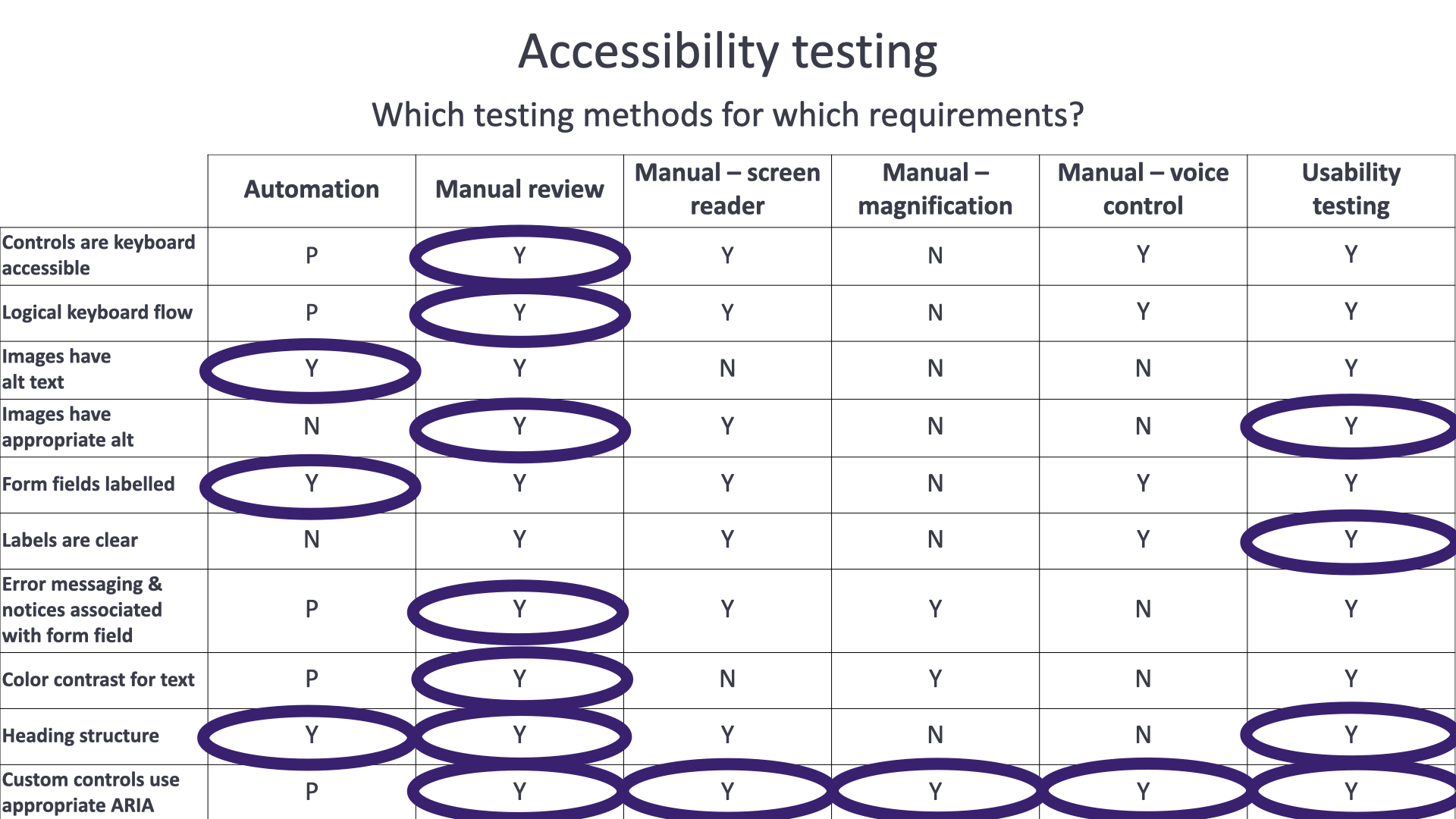
Here's an accessibility testing matrix. Down the left are requirements: controls are keyboard accessible, there's a logical keyboard flow, images have alt text, images have appropriate alt, form fields are labeled, labels are clear, error messaging and notices are associated with form fields, you have the right color contrast for text, you have a good heading structure, and custom controls use appropriate ARIA. Across the top are six mechanisms for testing: automation, manual review, manual with a screen reader, manual with a magnifier, manual with voice control or voice recognition, and usability testing.
Could you test each requirement with each method? Possibly. You can partially test some with automation, you can test all of them with manual review, some you could manually test with a screen reader, some with magnification, some with voice control — and they'd all show up in usability testing. But which should you use? The least complex tool available that requires the least learning and gives you the most value. To see if controls are keyboard accessible, you'd probably test with manual review, even though other methods could achieve the same thing. Think the same way for logical keyboard flow, or any other requirement in the grid.
One of the very first things teams ask me is, "Which screen reader should we check with?" Well — it doesn't make sense to check everything manually with a screen reader. Yes, you could check heading structure with a screen reader, but you can also check it with automation or manual review. You don't need to fire up a screen reader to test heading structure. So: conduct accessibility testing with the least complex tool available that requires the least learning and provides the most value.
If you want to get more into testing tools, the W3C's Web Accessibility Initiative maintains a list of accessibility evaluation tools — right now it includes 157 tools, and you can filter through them. I won't comment on them, and the W3C doesn't either, but it'll get you to all kinds of tools that can help through the testing process.
8. The final review
Step eight: your final review. Keep in mind this is not the first time you've tested these things — these are questions you should be answering as early in the process as you can. I summarize them here because they're the targets we want to hit.
For content: Do our page titles accurately reflect the content or functionality of the page or screen? Do our headings set the right expectation for the content that follows? Do our calls to action map consistently to the content presented next? Do our text equivalents reflect the intent and function of their media? And do we use plain language wherever possible?
On the dev side, three critical questions we've already seen: Does our code reflect the visual relationships — hierarchy, position, and proximity — present in the design? Is our code clean, semantic markup? And does all functionality work efficiently with the keyboard?
From a design perspective, three questions: Which things should be focusable, and in what order, for keyboard efficiency? What is the name of each thing? And is there a visible feedback mechanism for an interaction? All of these go back to your annotated design, and to the things you think about when testing a design.
The accessibility MVP
I've presented this as an ideal accessibility process. But teams often come to me and say, "Well, that ship has already sailed. We've already started. We can't do all that." So here's the accessibility MVP.
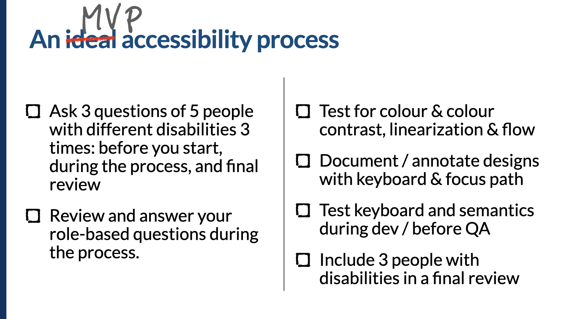
If you can't do research, surveys, or usability studies, think of it this way: ask three questions of five people with different disabilities at three times during the process — before you start, during, and in final review. If you've already started and can't go back in time to ask before you start, then ask during the process and during final review. And if it's too late — the process is almost over and you're in final review — ask those questions in final review, and remember to ask earlier next time.
Review and answer your role-based questions during the process. In this talk I've presented four sets of questions — one for product, one for content, one for designers, one for developers. If you can answer those as you go, you'll be in a much better position to deliver on accessibility.
At a minimum: test for color and color contrast, linearization, and flow. Document and annotate those designs in some way, with both the keyboard and key focus-path deviations. Test with keyboard and for semantics during development and before QA. And if you can, include at least three people with disabilities in a final review.
In summary
So, to summarize. These are the eight steps I see as essential to accessibility success, and we need to build them into our process. If we build it in from the beginning, we do a much better job of fulfilling our promise of creating an accessible web app — or iOS or Android app, or website, whatever it is. If we're building and taking action on accessibility from the beginning, we're in a much better position to succeed.
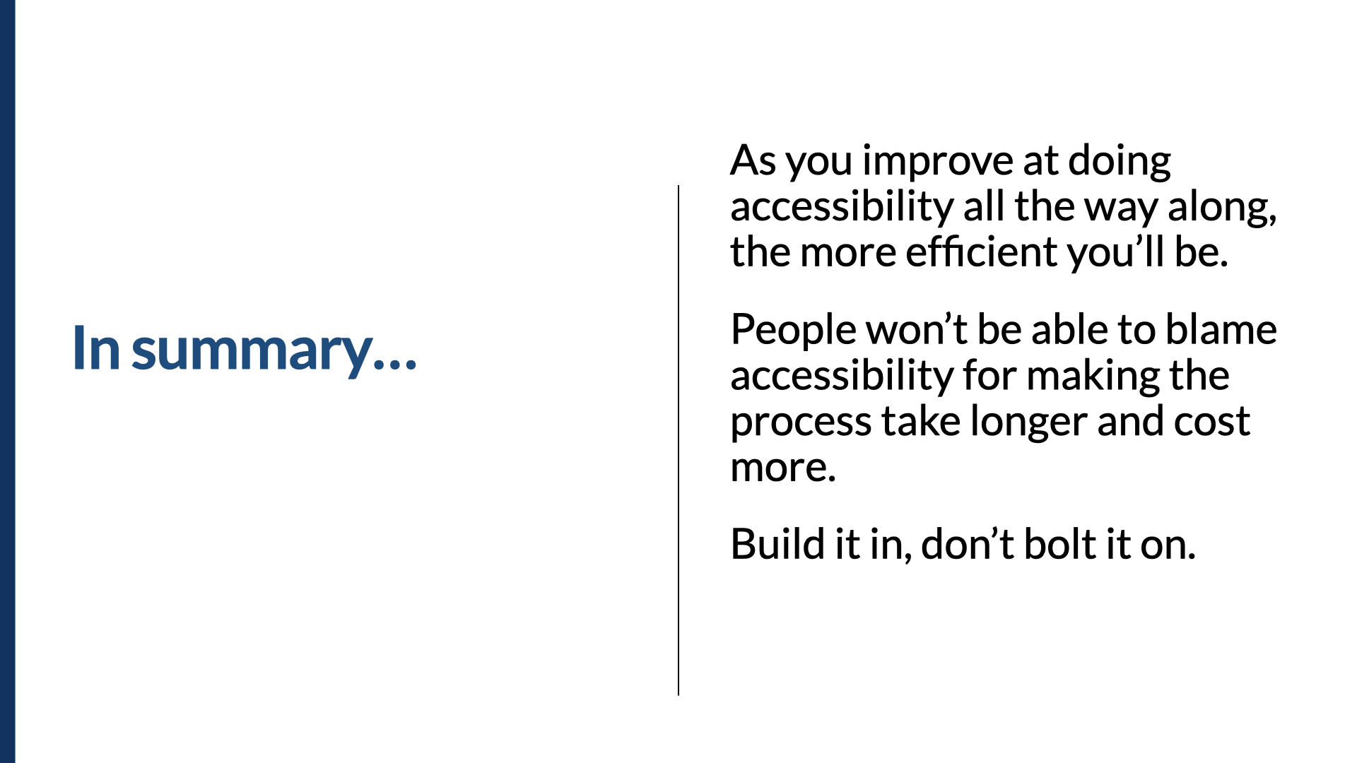
As you get better at doing accessibility all the way along, the more efficient you'll be. And when you become more efficient, people won't be able to blame accessibility for making the process take longer and cost more. The only reason those things happen now is because it's not already baked into the process. It needs to be built in. It costs more money and takes longer when you try to bolt it on. So build it in, don't bolt it on. We want to be aiming for this, not this.
Thank you. I'm Derek Featherstone. This has been Built In, Not Bolted On: How to Get Accessibility Right from the Start. Thank you so much for your time.